

About
A hover- and focus-triggered tooltip bubble rendered in a portal, plus an info-icon trigger for inline form hints, with flip-on-overflow positioning and keyboard dismissal.
Built with React and Tailwind. Copy the prompt and paste it into Claude Code, Cursor or Lovable: your agent adds Tooltip to your project and fits it to your theme.
Code
How Tooltip is used: the demo's code. The component's own source comes with a free account.
Usage.tsx
import Tooltip, { InfoTooltip } from "@/components/ui/tooltip";

export default function TooltipDemo() {
  return (
    <div className="flex min-h-[480px] w-full items-center justify-center bg-background p-10 text-foreground">
      <div className="w-full max-w-md space-y-8">
        <div className="flex items-center justify-center gap-8">
          <Tooltip content="Opens above the trigger" placement="top">
            <button className="rounded-md border border-border bg-card px-3 py-1.5 text-sm text-foreground hover:bg-muted">
              Top
            </button>
          </Tooltip>
          <Tooltip content="Opens below the trigger" placement="bottom">
            <button className="rounded-md border border-border bg-card px-3 py-1.5 text-sm text-foreground hover:bg-muted">
              Bottom
            </button>
          </Tooltip>
          <Tooltip content="Opens to the left" placement="left">
            <button className="rounded-md border border-border bg-card px-3 py-1.5 text-sm text-foreground hover:bg-muted">
              Left
            </button>
          </Tooltip>
          <Tooltip content="Opens to the right" placement="right">
            <button className="rounded-md border border-border bg-card px-3 py-1.5 text-sm text-foreground hover:bg-muted">
              Right
            </button>
          </Tooltip>
        </div>

        <div className="space-y-4 rounded-lg border border-border bg-card p-5">
          <div className="flex items-center gap-1.5">
            <label
              htmlFor="demo-webhook"
              className="text-sm font-medium text-foreground"
            >
              Webhook URL
            </label>
            <InfoTooltip
              content="Payloads are POSTed here whenever an order status changes. Must respond 2xx within 5s."
              label="More information about webhook URL"
            />
          </div>
          <input
            id="demo-webhook"
            type="text"
            readOnly
            value="https://example.com/hooks/orders"
            className="w-full rounded-md border border-border bg-background px-3 py-2 text-sm text-foreground"
          />

          <div className="flex items-center gap-1.5">
            <label
              htmlFor="demo-retry"
              className="text-sm font-medium text-foreground"
            >
              Retry policy
            </label>
            <InfoTooltip
              content="Failed deliveries are retried with exponential backoff for up to 24 hours before being marked dead."
              label="More information about retry policy"
              wide
            />
          </div>
          <input
            id="demo-retry"
            type="text"
            readOnly
            value="Exponential backoff, 24h"
            className="w-full rounded-md border border-border bg-background px-3 py-2 text-sm text-foreground"
          />
        </div>

        <div className="flex items-center justify-center gap-8 rounded-lg bg-slate-900 p-6">
          <Tooltip
            content="Light bubble reads clearly on this dark surface"
            variant="light"
          >
            <button className="rounded-md border border-slate-700 bg-slate-800 px-3 py-1.5 text-sm text-white hover:bg-slate-700">
              Light variant
            </button>
          </Tooltip>
          <Tooltip content="Single line" multiline={false}>
            <button className="rounded-md border border-slate-700 bg-slate-800 px-3 py-1.5 text-sm text-white hover:bg-slate-700">
              Nowrap
            </button>
          </Tooltip>
        </div>
      </div>
    </div>
  );
}
Dependencies
More by haassiib
View all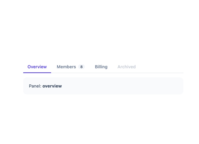
Tabs
9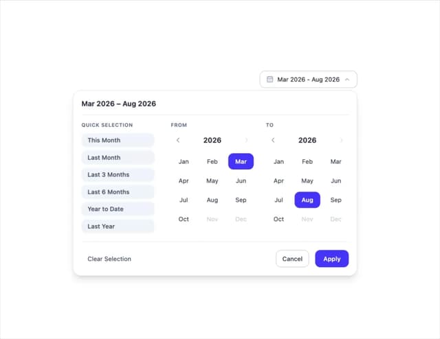
Month Range Picker
2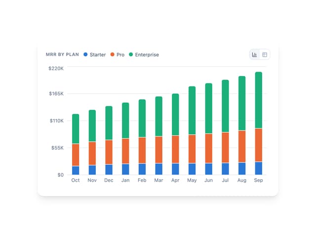
Bar Chart
1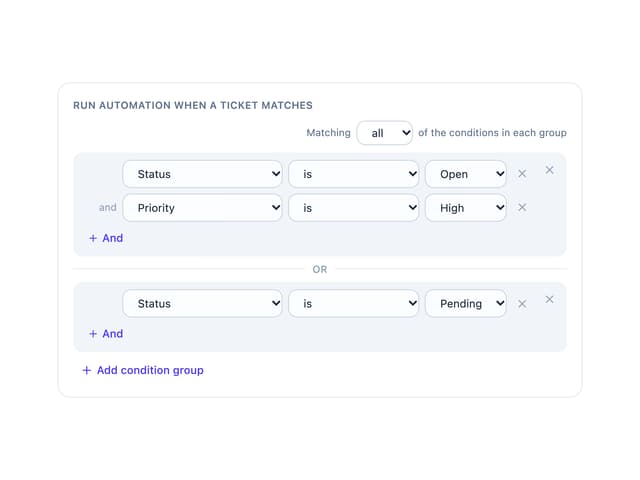
Condition Groups Builder
1
Sortable List
Checkbox
Draggable Resizable Modal
Filter Panel
More in Forms
View all

Premium Auth
500

Login 1
52

Book A Demo 3
83
Authentication Card
47
Book A Demo 1
69

Contact Card
1K

Login Card
32

Login 2
7
