
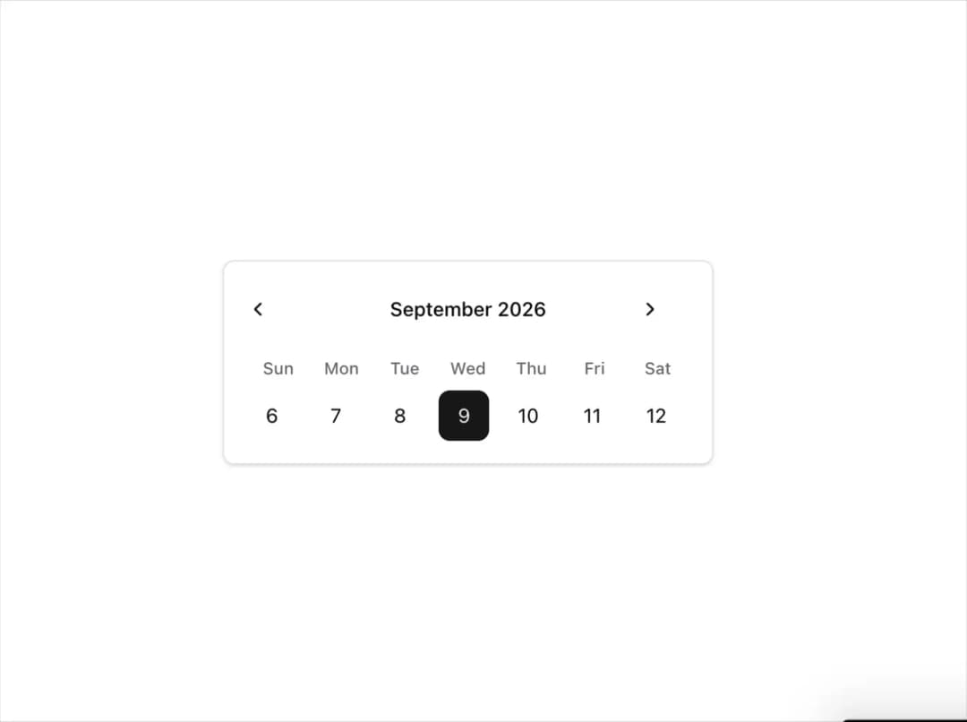
About
This is a sleek and responsive mini calendar component built using React and TailwindCSS, designed to display weekly views with a focus on minimalism and clarity. The selected day is highlighted with a bold background and primary accent color (blue-600), while adjacent dates remain subtle for visual hierarchy. Navigation arrows allow users to switch between months smoothly. The component is ideal for dashboards, schedulers, or date-picking interfaces.
Built with React and Tailwind. Copy the prompt and paste it into Claude Code, Cursor or Lovable: your agent adds Mini Calendar to your project and fits it to your theme.
Code
How Mini Calendar is used: the demo's code. The component's own source comes with a free account.
Usage.tsx
"use client";

import * as React from "react";
import { Calendar } from "@/components/ui/mini-calendar";

const DemoMiniCalendar = () => {
  return (
    <div className="w-[350px]">
      <Calendar />
    </div>
  );
};

export { DemoMiniCalendar };
Dependencies
More by Hardik Kubavat
View all
Download Hover Button
285
Animated Hover Button
More in Cards
View all

Statistics Card 2
264

Course Design Cards
1.1K
Card
70
Stats cards with links
39
The Item one
3

Card Studio
7
Statistics Card 7
292

Item
10
