
About
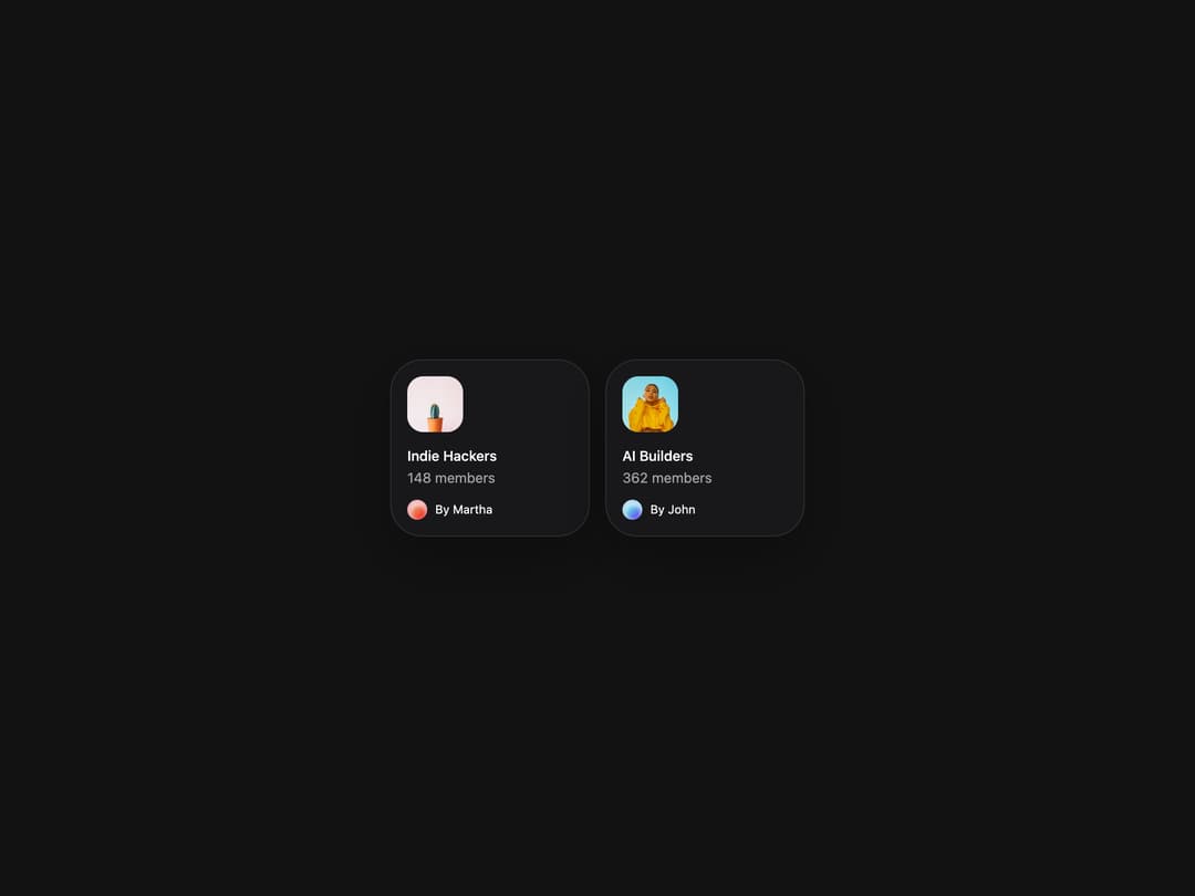
Flexible container component for grouping related content and actions.
Built with React and Tailwind. Copy the prompt and paste it into Claude Code, Cursor or Lovable: your agent adds Card to your project and fits it to your theme.
Code
How Card is used: the demo's code. The component's own source comes with a free account.
Usage.tsx
import { Card } from "@/components/ui/heroui-card";

const communities = [
  {
    title: "Indie Hackers",
    members: "148 members",
    byline: "By Martha",
    image: "https://cdn.21st.dev/assets/mirror/b1/b18655204b951fe5837e478777ab2631cb0004530fd3b670160c3a96d0a839eb.jpg",
    imageAlt: "Indie Hackers community",
    avatar: "https://cdn.21st.dev/assets/mirror/81/81b92cb17f6c3c142a5cdb568904f7bb147d17fe3454737b9187aafca340412c.jpg",
    avatarAlt: "Martha's avatar",
  },
  {
    title: "AI Builders",
    members: "362 members",
    byline: "By John",
    image: "https://cdn.21st.dev/assets/mirror/78/78c4eec27e3cdc658fe5595a273a4003f3eef78a480cc2a46a4f36dcf54033aa.jpg",
    imageAlt: "AI Builders community",
    avatar: "https://cdn.21st.dev/assets/mirror/de/defa32ddb23b6307c5cb8d701022186645dfcee057d2b0ba9ec1955dea22db70.jpg",
    avatarAlt: "John's avatar - blue themed",
  },
];

export default function CardWithAvatarDemo() {
  return (
    <div className="flex min-h-screen w-full items-center justify-center overflow-hidden bg-background p-8">
      <div className="flex flex-wrap justify-center gap-4">
        {communities.map((community) => (
          <Card className="w-[200px] gap-2" key={community.title}>
            <img
              alt={community.imageAlt}
              className="pointer-events-none aspect-square w-14 rounded-2xl object-cover select-none"
              src={community.image}
            />
            <Card.Header>
              <Card.Title>{community.title}</Card.Title>
              <Card.Description>{community.members}</Card.Description>
            </Card.Header>
            <Card.Footer className="flex gap-2">
              <span className="size-5 overflow-hidden rounded-full">
                <img alt={community.avatarAlt} className="size-full object-cover" src={community.avatar} />
              </span>
              <span className="text-xs">{community.byline}</span>
            </Card.Footer>
          </Card>
        ))}
      </div>
    </div>
  );
}

export { CardWithAvatarDemo };
More by Hero Ui
View all

DatePicker
465
Chip
440
The Pagination
361
HeroUI Color Picker
105
Skeleton
104
HeroUI Table
100
HeroUI Disclosure Group
94
HeroUI AlertDialog
80
More in Cards
View all

Statistics Card 2
264

Course Design Cards
1.1K
Card
70
Stats cards with links
39
The Item one
3

Card Studio
7
Statistics Card 7
292

Item
10
