
About
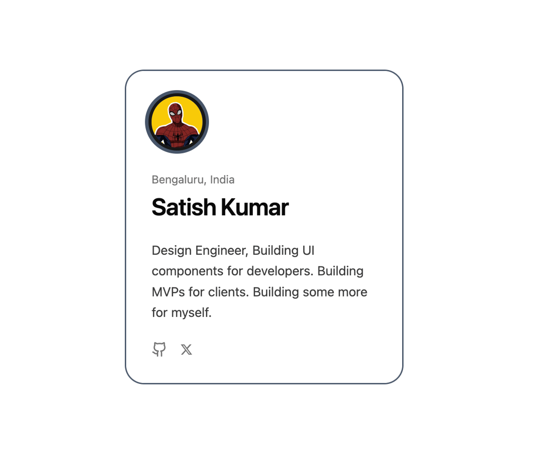
Here is Animated Profile Card component
Built with React and Tailwind. Copy the prompt and paste it into Claude Code, Cursor or Lovable: your agent adds Animated Profile Card to your project and fits it to your theme.
Code
How Animated Profile Card is used: the demo's code. The component's own source comes with a free account.
Usage.tsx
'use client';

import * as React from 'react';
import {
AnimatedProfileCard,
ProfileCardContent,
SocialLink,
} from '@/components/ui/animated-profile-card';

// --- Helper Data & Icons ---
const GithubIcon = (props: React.SVGProps<SVGSVGElement>) => (
<svg xmlns="http://www.w3.org/2000/svg" width="24" height="24" viewBox="0 0 24 24" fill="none" stroke="currentColor" strokeWidth="2" strokeLinecap="round" strokeLinejoin="round" {...props}><path d="M15 22v-4a4.8 4.8 0 0 0-1-3.5c3 0 6-2 6-5.5.08-1.25-.27-2.48-1-3.5.28-1.15.28-2.35 0-3.5 0 0-1 0-3 1.5-2.64-.5-5.36-.5-8 0C6 2 5 2 5 2c-.3 1.15-.3 2.35 0 3.5A5.403 5.403 0 0 0 4 9c0 3.5 3 5.5 6 5.5-.39.49-.68 1.05-.85 1.65-.17.6-.22 1.23-.15 1.85v4" /><path d="M9 18c-4.51 2-5-2-7-2" /></svg>
);
const TwitterIcon = (props: React.SVGProps<SVGSVGElement>) => (
<svg xmlns="http://www.w3.org/2000/svg" viewBox="0 0 512 512" fill="currentColor" {...props}><path d="M389.2 48h70.6L305.6 224.2 487 464H345L233.7 318.6 106.5 464H35.8L200.7 275.5 26.8 48H172.4L272.9 180.9 389.2 48zM364.4 421.8h39.1L151.1 88h-42L364.4 421.8z" /></svg>
);

const cardData = {
avatarSrc:
  'https://cdn.21st.dev/assets/mirror/16/16d96106ee3035c37e4e4586a228e9ff6efb00f78fc38956d081dd3f803ce7c2.png',
avatarFallback: 'SK',
name: 'Satish Kumar',
location: 'Bengaluru, India',
bio: 'Design Engineer, Building UI components for developers. Building MVPs for clients. Building some more for myself.',
socials: [
  { id: 'github', url: 'https://github.com/satishkumarsajjan', label: 'GitHub', icon: <GithubIcon className="h-5 w-5" /> },
  { id: 'twitter', label: 'X (Twitter)', url: 'https://x.com/iamsatish4564', icon: <TwitterIcon className="h-4 w-4" /> },
] as SocialLink[],
};

export default function AnimatedProfileCardSlateDemo() {
return (
  <div className="flex min-h-[500px] w-full items-center justify-center bg-background p-4">
    <AnimatedProfileCard
      accentColor="#475569"
      baseCard={
        <ProfileCardContent {...cardData} variant="default" showAvatar={false} />
      }
      overlayCard={
        <ProfileCardContent
          {...cardData}
          variant="on-accent"
          showAvatar={true}
          cardStyle={{ backgroundColor: 'var(--accent-color)' }}
        />
      }
    />
  </div>
);
}
Dependencies
More by iamsatish4564
View all

Portfolio and Image Gallery
1K
Micro Expander
352
Morph Button
110
Curtain Button
76
Prime Button
63
Eclipse Button
39
More in Cards
View all

Statistics Card 2
264

Course Design Cards
1.1K
Card
70
Stats cards with links
39
The Item one
3

Card Studio
7
Statistics Card 7
292

Item
10
