
About
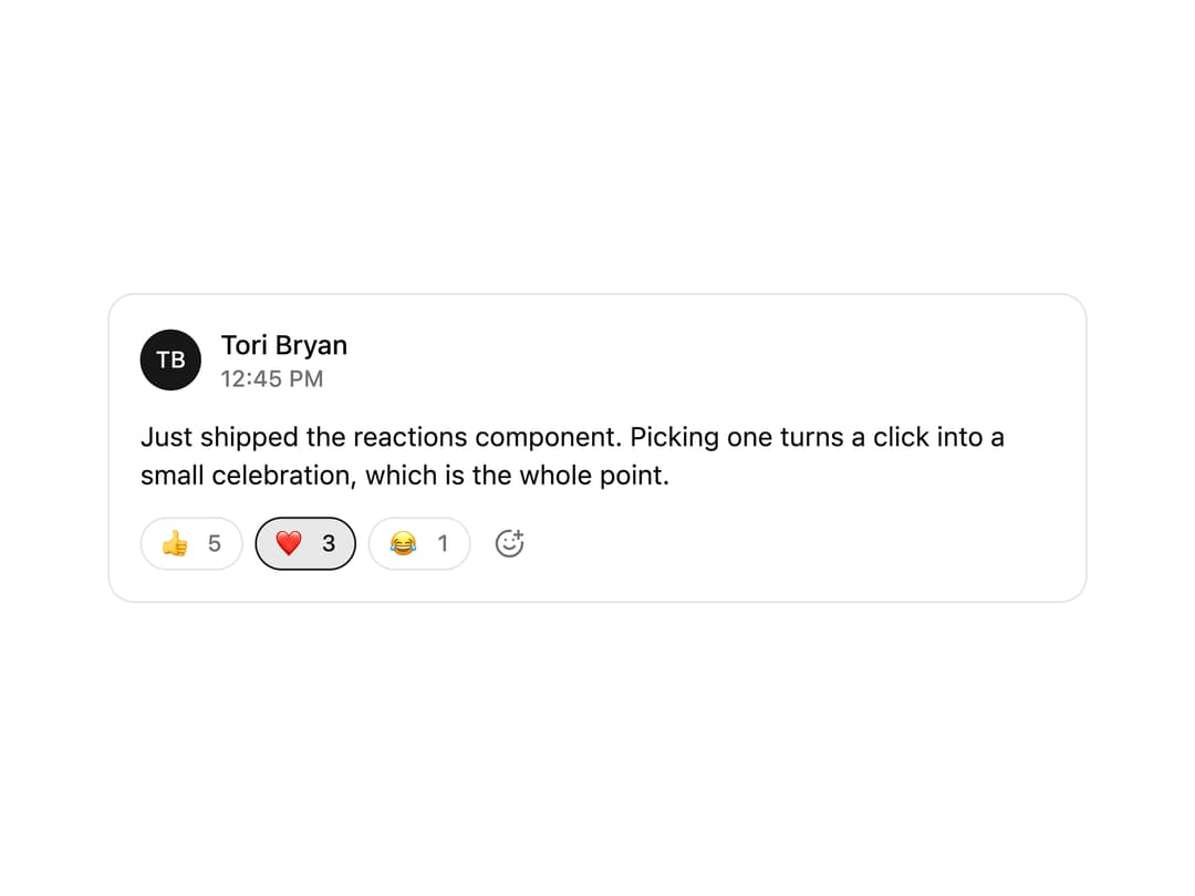
Lets people respond to content with an emoji in one tap.
Built with React and Tailwind. Copy the prompt and paste it into Claude Code, Cursor or Lovable: your agent adds Reactions to your project and fits it to your theme.
Code
How Reactions is used: the demo's code. The component's own source comes with a free account.
Usage.tsx
"use client"

import { Reactions, type Reaction } from "@/components/ui/reactions"

const seeded: Reaction[] = [
  { emoji: "👍", label: "Thumbs up", count: 5 },
  { emoji: "❤️", label: "Heart", count: 3, active: true },
  { emoji: "😂", label: "Laughing", count: 1 },
]

export default function ReactionsDemo() {
  return (
    <div className="w-full max-w-lg rounded-xl border border-border bg-card p-4">
      <div className="flex items-center gap-2.5">
        <span className="grid size-8 place-content-center rounded-full bg-primary text-xs font-medium text-primary-foreground">
          TB
        </span>
        <div className="flex flex-col">
          <span className="text-sm font-medium text-card-foreground">
            Tori Bryan
          </span>
          <span className="text-xs font-medium text-muted-foreground">
            12:45 PM
          </span>
        </div>
      </div>
      <p className="mt-3 mb-3 text-sm text-card-foreground">
        Just shipped the reactions component. Picking one turns a click into a
        small celebration, which is the whole point.
      </p>
      <Reactions defaultReactions={seeded} />
    </div>
  )
}
Dependencies
More by Tori Bryan
View all

Portfolio Banner
33
Token Flow
29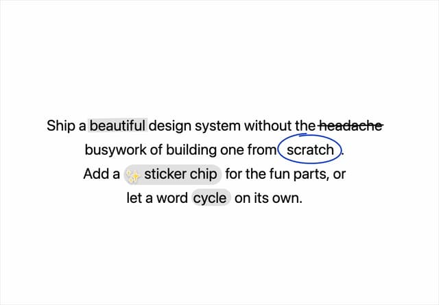
Annotated Text
9
Count
Pixel snail
Integration Orbit
Filter menu