
About
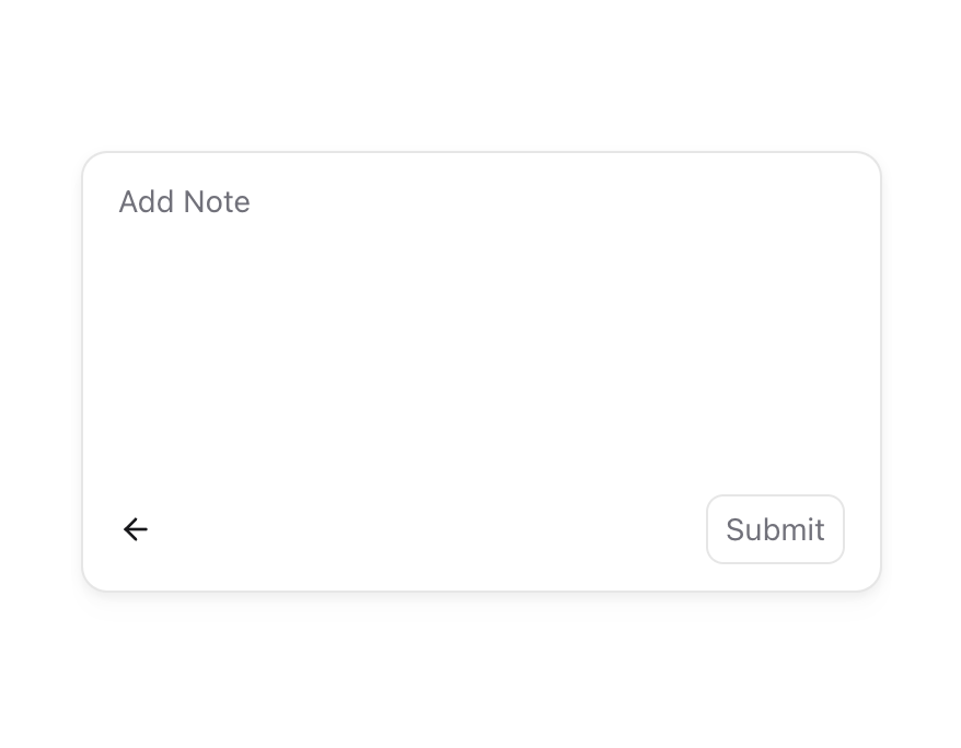
A popover that transforms from its trigger into the content using layout animations. It visually morphs instead of appearing as a separate element.
Built with React and Tailwind. Copy the prompt and paste it into Claude Code, Cursor or Lovable: your agent adds Morphing Popover to your project and fits it to your theme.
Code
How Morphing Popover is used: the demo's code. The component's own source comes with a free account.
Usage.tsx
'use client';
import {
  MorphingPopover,
  MorphingPopoverTrigger,
  MorphingPopoverContent,
} from '@/components/ui/morphing-popover';
import { motion } from 'motion/react';
import { useId, useState } from 'react';
import { ArrowLeftIcon } from 'lucide-react';

export function MorphingPopoverTextarea() {
  const uniqueId = useId();
  const [note, setNote] = useState('');
  const [isOpen, setIsOpen] = useState(false);

  const closeMenu = () => {
    setNote('');
    setIsOpen(false);
  };

  return (
    <MorphingPopover
      transition={{
        type: 'spring',
        bounce: 0.05,
        duration: 0.3,
      }}
      open={isOpen}
      onOpenChange={setIsOpen}
    >
      <MorphingPopoverTrigger className='flex h-9 items-center rounded-lg border border-zinc-950/10 bg-white px-3 text-zinc-950 dark:border-zinc-50/10 dark:bg-zinc-700 dark:text-zinc-50'>
        <motion.span layoutId={`popover-label-${uniqueId}`} className='text-sm'>
          Add Note
        </motion.span>
      </MorphingPopoverTrigger>
      <MorphingPopoverContent className='rounded-xl border border-zinc-950/10 bg-white p-0 shadow-[0_9px_9px_0px_rgba(0,0,0,0.01),_0_2px_5px_0px_rgba(0,0,0,0.06)] dark:bg-zinc-700'>
        <div className='h-[200px] w-[364px]'>
          <form
            className='flex h-full flex-col'
            onSubmit={(e) => {
              e.preventDefault();
            }}
          >
            <motion.span
              layoutId={`popover-label-${uniqueId}`}
              aria-hidden='true'
              style={{
                opacity: note ? 0 : 1,
              }}
              className='absolute top-3 left-4 text-sm text-zinc-500 select-none dark:text-zinc-400'
            >
              Add Note
            </motion.span>
            <textarea
              className='h-full w-full resize-none rounded-md bg-transparent px-4 py-3 text-sm outline-none focus:outline-none focus:ring-0'
              autoFocus
              onChange={(e) => setNote(e.target.value)}
            />
            <div key='close' className='flex justify-between py-3 pr-4 pl-2'>
              <button
                type='button'
                className='flex items-center rounded-lg bg-white px-2 py-1 text-sm text-zinc-950 hover:bg-zinc-100 dark:bg-zinc-700 dark:text-zinc-50 dark:hover:bg-zinc-600'
                onClick={closeMenu}
                aria-label='Close popover'
              >
                <ArrowLeftIcon
                  size={16}
                  className='text-zinc-900 dark:text-zinc-100'
                />
              </button>
              <button
                className='relative ml-1 flex h-8 shrink-0 scale-100 appearance-none items-center justify-center rounded-lg border border-zinc-950/10 bg-transparent px-2 text-sm text-zinc-500 transition-colors select-none hover:bg-zinc-100 hover:text-zinc-800 focus-visible:ring-2 active:scale-[0.98] dark:border-zinc-50/10 dark:text-zinc-50 dark:hover:bg-zinc-800'
                type='submit'
                aria-label='Submit note'
                onClick={() => {
                  closeMenu();
                }}
              >
                Submit
              </button>
            </div>
          </form>
        </div>
      </MorphingPopoverContent>
    </MorphingPopover>
  );
}
Dependencies
More by Julien Thibeaut
View all

Dock
3.1K
Text Effect
1.6K
Infinite Slider
1.5K
Text Shimmer
1.3K
Text Scramble
1.1K
Progressive blur
683
Glow Effect
610
Tailwind CSS Background Snippet
535