About
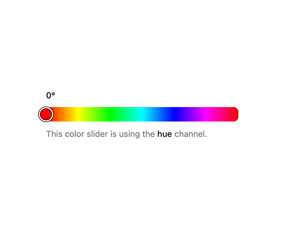
A horizontal or vertical slider for adjusting a single color channel such as hue, saturation, or brightness, built on React Aria Components.
Built with React and Tailwind. Copy the prompt and paste it into Claude Code, Cursor or Lovable: your agent adds Color Slider to your project and fits it to your theme.
Code
How Color Slider is used: the demo's code. The component's own source comes with a free account.
Usage.tsx
"use client";

import {
  ColorSlider,
  ColorSliderOutput,
  ColorSliderTrack,
} from "@/components/ui/color-slider";
import { ColorThumb } from "@/components/ui/color-slider-utils/color-thumb";
import { Description } from "@/components/ui/field";

export default function ColorSliderDemo() {
  return (
    <div className="flex w-full justify-center p-6">
      <ColorSlider
        channel="hue"
        defaultValue="hsl(0, 100%, 50%)"
        className="w-full max-w-xs"
      >
        <ColorSliderOutput />
        <ColorSliderTrack>
          <ColorThumb />
        </ColorSliderTrack>
        <Description>
          This color slider is using the{" "}
          <strong className="font-medium text-fg">hue</strong> channel.
        </Description>
      </ColorSlider>
    </div>
  );
}
Dependencies
More by Intent UI
View all

Radar Chart
217
Radial Chart
77
Bar Chart
44
Pie Chart
31
Toggle Group
26
Loader
23
Progress Bar
19
File Trigger 13
10