HomeBookmarks
Intent UIIntent UI
Intent UI

Intent UI

Accessible React components to copy, customize, and make your own.

IUby Intent UI
35components123.3Kviews572bookmarks

Installs all 84 components. Without our CLI, run instead.

Auto-indexed

Intent UI contents
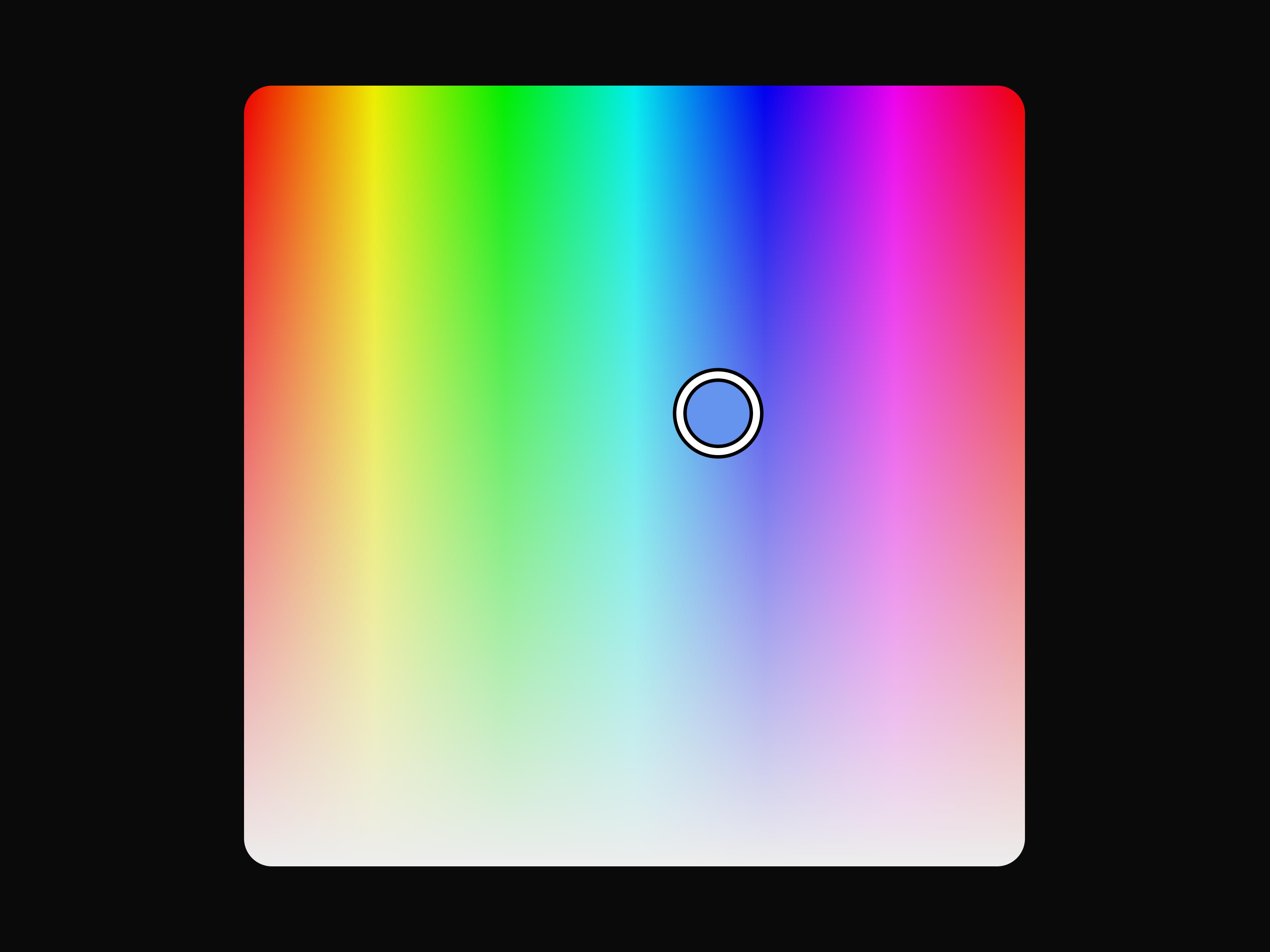
  • Color AreaColor Area

    Color Area

  • List BoxList Box

    List Box

  • Disclosure Group

    Disclosure Group

  • Choice BoxChoice Box

    Choice Box

  • Radio GroupRadio Group

    Radio Group

  • Color Slider

    Color Slider

  • SeparatorSeparator

    Separator

  • LeaderboardLeaderboard

    Leaderboard

  • Use ClipboardUse Clipboard

    Use Clipboard

  • Tag Group

    Tag Group

  • Container

    Container

  • Progress Circle

    Progress Circle

  • Progress Bar

    Progress Bar

  • Keyboard

    Keyboard

  • Heading

    Heading

  • Field

    Field

  • File Trigger 13

    File Trigger 13

  • File Trigger 13

    File Trigger 13

  • File Trigger 13

    File Trigger 13

  • File Trigger 13

    File Trigger 13

  • File Trigger 13

    File Trigger 13

  • File Trigger 13

    File Trigger 13
  • File Trigger 13

    File Trigger 13

  • Loader

    Loader

  • About Intent UI

    Intent UI publishes a shadcn registry at intentui.com, with 84 components installable through the shadcn CLI.

    Components
    84
    GitHub stars
    1,977
    Last commit
    Oct 25, 2026
    Repository
    irsyadadl/intentui

    Also in the Intent UI registry

    Copy a prompt for your agent, copy the install command, or open the docs that ship it.

    • area-chart

      area-chart

      recharts1 file
      Docs ↗
    • auth-01

      auth-01

      react-aria-components1 file
    • auth-02

      auth-02

      react-aria-components1 file
    • auth-03

      auth-03

      react-aria-components1 file
    • breadcrumbs

      breadcrumbs

      @heroicons/react, react-aria-components, tailwind-merge1 file
      Docs ↗
    • button-group

      button-group

      tailwind-merge, tailwind-variants1 file
      Docs ↗
    • chart-01

      chart-01

      1 file
    • chart-02

      chart-02

      1 file
    • chart-03

      chart-03

      1 file
    • color-picker

      color-picker

      @heroicons/react, @react-stately/color, react-aria-components, tailwind-merge1 file
      Docs ↗
    • color-swatch

      color-swatch

      react-aria-components1 file
      Docs ↗
    • color-swatch-picker

      color-swatch-picker

      react-aria-components1 file
      Docs ↗
    • color-thumb

      color-thumb

      react-aria-components1 file
      Docs ↗
    • color-wheel

      color-wheel

      react-aria-components1 file
      Docs ↗
    • combo-box

      combo-box

      @heroicons/react, react-aria-components1 file
      Docs ↗
    • command-menu

      command-menu

      @heroicons/react, react-aria-components, tailwind-merge1 file
      Docs ↗
    • date-field

      date-field

      react-aria-components, tailwind-merge1 file
      Docs ↗
    • date-range-picker

      date-range-picker

      @heroicons/react, @internationalized/date, react-aria-components, tailwind-merge1 file
      Docs ↗
    • description-list

      description-list

      tailwind-merge1 file
      Docs ↗
    • dropdown

      dropdown

      @heroicons/react, react-aria-components, tailwind-merge, tailwind-variants1 file
      Docs ↗
    • drop-zone

      drop-zone

      react-aria-components, tailwind-merge1 file
      Docs ↗
    • grid-list

      grid-list

      react-aria-components, tailwind-merge1 file
      Docs ↗
    • line-chart

      line-chart

      recharts1 file
    • link

      link

      react-aria-components1 file
      Docs ↗
    • menu

      menu

      @heroicons/react, react-aria-components, tailwind-merge, tailwind-variants1 file
      Docs ↗
    • meter

      meter

      react-aria-components, tailwind-merge1 file
      Docs ↗
    • multiple-select

      multiple-select

      react-aria-components1 file
      Docs ↗
    • native-select

      native-select

      @heroicons/react, tailwind-merge1 file
      Docs ↗
    • navbar

      navbar

      @heroicons/react, motion, tailwind-merge1 file
      Docs ↗
    • navbar-01

      navbar-01

      3 files
    • navbar-02

      navbar-02

      3 files
    • navbar-03

      navbar-03

      3 files
    • navbar-04

      navbar-04

      3 files
    • navbar-05

      navbar-05

      3 files
    • note

      note

      @heroicons/react, tailwind-merge1 file
      Docs ↗
    • number-field

      number-field

      @heroicons/react, react-aria-components1 file
      Docs ↗
    • preview

      preview

      react-aria-components1 file
    • range-calendar

      range-calendar

      react-aria-components, tailwind-merge1 file
      Docs ↗
    • show-more

      show-more

      react-aria-components, tailwind-variants1 file
      Docs ↗
    • sidebar-01

      sidebar-01

      3 files
    • sidebar-02

      sidebar-02

      3 files
    • sidebar-03

      sidebar-03

      3 files
    • sidebar-04

      sidebar-04

      3 files
    • sidebar-05

      sidebar-05

      3 files
    • sidebar-06

      sidebar-06

      3 files
    • sidebar-07

      sidebar-07

      3 files
    • sidebar-08

      sidebar-08

      3 files
    • sidebar-09

      sidebar-09

      3 files
    • sidebar-12

      sidebar-12

      3 files
    • sidebar-15

      sidebar-15

      3 files
    • sidebar-16

      sidebar-16

      3 files
    • sidebar-17

      sidebar-17

      3 files
    • sidebar-18

    • sidebar-19

      sidebar-19

      3 files
    • snippet

      snippet

      react-aria-components1 file
      Docs ↗
    • text

      text

      tailwind-merge, tailwind-variants1 file
      Docs ↗
    • toolbar

      toolbar

      react-aria-components, tailwind-merge1 file
      Docs ↗
    • tracker

      tracker

      react-aria-components, tailwind-merge1 file
    • tree

      tree

      @heroicons/react, react-aria-components, tailwind-merge1 file
      Docs ↗

    From the Intent UI readme

    Intent UI

    Intent UI is a chill set of React components, built on top of React Aria Components, all about keeping the web accessible. Easy to customize and just copy & paste into your React projects. Plus, it includes Tailwind CSS for sleek styling right out of the box.

    Documentation

    Swing by intentui.com to peep the docs and get the lowdown on getting started!

    Agent Skills

    Official component, premium design, and v3-to-v4 migration workflows are in skills/. Install them with npx skills add irsyadadl/intentui.

    Blocks & Templates

    Design pages faster than ever with design..

    Sponsor

    Your support helps fund ongoing development, maintenance, and new components. I will sponsor now

    Contributing

    Make sure to check out the contributing guide, and join our awesome list of contributors. We can't wait to see what you bring to the table!

    License

    Licensed under the MIT license, so feel free to tweak, share, and remix as long as you give the proper shout-out!

    Read the rest on GitHub →

    What Intent UI builds on

    The packages and primitives its components pull in, counted across the registry.

    primitive51

    Hooks and utilities

    • avatar
    • badge
    • button
    • calendar
    • card
    • carousel
    • chart
    • checkbox
    • date-picker
    • dialog
    • input
    • input-otp
    • pagination
    • popover
    • scroll-area
    • select
    • separator
    • sheet
    • sidebar
    • skeleton
    • slider
    • switch
    • table
    • tabs
    • textarea
    • toast
    • toggle
    • toggle-group
    • tooltip
    • use-clipboard
    • use-media-query
    • use-mobile

    What Intent UI shipped recently

    Every appearance and removal our crawl has seen in the registry index.

    • bar-listremovedOct 14, 2026
    • bar-list-controlled-exampleremovedOct 14, 2026
    • bar-list-exampleremovedOct 14, 2026
    • context-menuremovedOct 13, 2026
    • dialog-controlled-exampleaddedOct 13, 2026
    • dialog-exampleaddedOct 13, 2026
    • dialog-size-exampleaddedOct 13, 2026
    • dialog-sticky-exampleaddedOct 13, 2026
    • dialog-triggered-by-menu-exampleaddedOct 13, 2026
    • modalremovedOct 13, 2026
    • dialog-nested-exampleaddedOct 13, 2026
    • drawerremovedOct 9, 2026
    • drawer-basic-exampleremovedOct 9, 2026
    • drawer-controlled-exampleremovedOct 9, 2026
    • drawer-float-exampleremovedOct 9, 2026
    • drawer-nested-exampleremovedOct 9, 2026
    • drawer-side-exampleremovedOct 9, 2026
    • drawer-sticky-exampleremovedOct 9, 2026
    • drawer-without-notch-exampleremovedOct 9, 2026
    • menu-infinite-scroll-exampleaddedSep 2, 2026

    Registries like Intent UI

    coss

    coss

    by coss

    74

    components

    ReUI

    ReUI

    by Sean Hello

    262

    components

    Dice UI

    Dice UI

    by Dice UI

    19

    components

    Bundui

    Bundui

    by Shadcn UI Kit

    56

    components

    uiable

    uiable

    by uiable

    168

    components

    Pace UI

    Pace UI

    by Pace UI

    12

    components

    Browse every shadcn registry we track →

    1. Components
    2. /
    3. Intent UI
    4. /
    5. Intent UI

    Related libraries

    Ruixen UI

    Ruixen UI

    by Ruixen UI

    347

    components

    Efferd

    Efferd

    by Efferd

    114

    components

    shadcn/ui

    shadcn/ui

    by shadcn

    87

    components

    Dali Agents

    Dali Agents

    by Liana Pepanyan

    46

    components

    Tailark

    Tailark

    by Méschac Irung

    56

    components

    UI Layouts

    UI Layouts

    by UI Layouts

    127

    components

    About Intent UI

    Intent UI is a component library on 21st.dev by Intent UI with 25 public React components. Every component ships with a live interactive preview and full TSX source — copy the code, install it through the shadcn CLI, or pull it into Cursor or Claude Code over MCP.

    All 25 Intent UI components

    • Bar Chart
    • Choice Box
    • Color Area
    • Color Slider
    • Container
    • Disclosure Group
    • Field
    • File Trigger
    • File Trigger 13
    • Heading
    • Keyboard
    • Leaderboard
    • List Box

    Browse all component libraries →

  • Loader
  • Pie Chart
  • Progress Bar
  • Progress Circle
  • Radar Chart
  • Radial Chart
  • Radio Group
  • Separator
  • Tag Group
  • Toggle
  • Toggle Group
  • Use Clipboard