
About
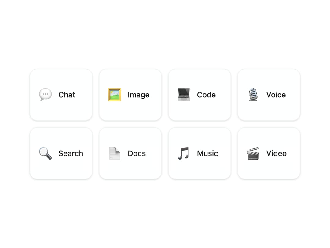
An interactive animated card selector that uses Framer Motion to smoothly reveal a chosen option while fading out the others with randomized stagger effects. Perfect for onboarding flows, preference pickers, or feature selection UIs where visual engagement and clarity are key.
Built with React and Tailwind. Copy the prompt and paste it into Claude Code, Cursor or Lovable: your agent adds Animated Card Options to your project and fits it to your theme.
Code
How Animated Card Options is used: the demo's code. The component's own source comes with a free account.
Usage.tsx
"use client";

import {
  AnimatedCardOptions,
  type CardOption,
} from "@/components/ui/animated-card-options";

const settings = {
  stiffness: 500,
  damping: 25,
  scale: 1.05,
  y: 20,
  columns: 4,
};

const options: CardOption[] = [
  { id: "chat", icon: "💬", name: "Chat" },
  { id: "image", icon: "🖼️", name: "Image" },
  { id: "code", icon: "💻", name: "Code" },
  { id: "voice", icon: "🎙️", name: "Voice" },
  { id: "search", icon: "🔍", name: "Search" },
  { id: "docs", icon: "📄", name: "Docs" },
  { id: "music", icon: "🎵", name: "Music" },
  { id: "video", icon: "🎬", name: "Video" },
];

export default function Demo(props: Partial<typeof settings>) {
  const s = { ...settings, ...props };
  return (
    <div className="h-screen w-screen flex items-center justify-center p-8">
      <AnimatedCardOptions
        options={options}
        columns={s.columns}
        stiffness={s.stiffness}
        damping={s.damping}
        scale={s.scale}
        y={s.y}
      />
    </div>
  );
}
Dependencies
More by Isaiah
View all
Agent Plan
2.2K
Video Scroll Hero
1.4K
Voice Powered Orb
1.3K
Reveal Text
1.1K
Leads Data Table
935
Portfolio Gallery
923
Message Dock
833
Ruler Carousel
617
More in Cards
View all
Stats cards with links
33

Course Design Cards
1.1K

Card
70
Statistics Card 2
264
Statistics Card 10
263

Card
17

Card Studio
9
The Item one
3
