
About
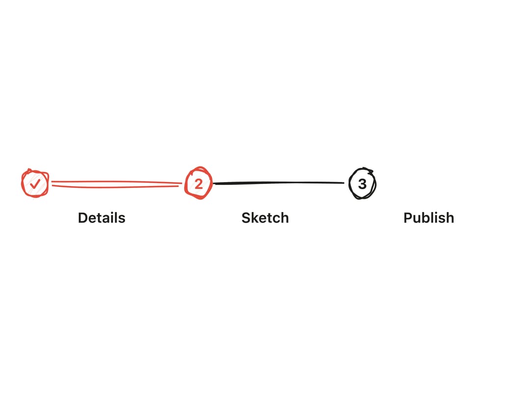
A numbered step indicator with hand-drawn circles and connecting lines that shows progress through a multi-step flow, with completed and active states.
Built with React and Tailwind. Copy the prompt and paste it into Claude Code, Cursor or Lovable: your agent adds Stepper to your project and fits it to your theme.
Code
How Stepper is used: the demo's code. The component's own source comes with a free account.
Usage.tsx
"use client";

import { Stepper } from "@/components/ui/stepper";

export default function StepperDemo() {
  return (
    <div className="w-full max-w-md">
      <Stepper steps={["Details", "Sketch", "Publish"]} current={1} />
    </div>
  );
}
More by kanchanasw
View all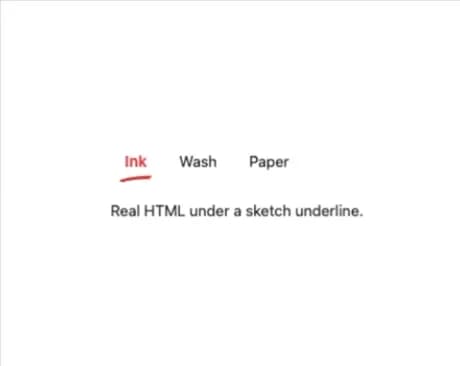
Sketch Tabs
52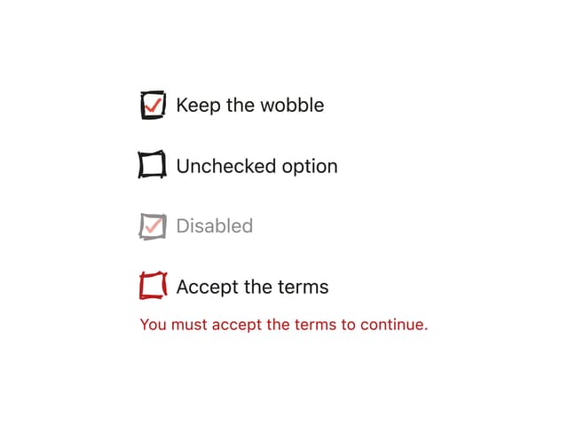
Hand-Drawn Checkbox
40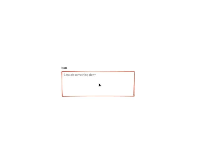
Sketch Textarea
21
Sketch Button
20
Sketch Hover Card
15
Pagination
5
Radial Menu
1
Hand-Drawn Progress Bar
1