

About
Halftone wordmark footer: an enormous brand word cropped by the bottom edge and printed in halftone dots that part around the pointer on springs and warm in colour as they move; click to send a shock ring through the letters. Studio line, tracked link columns, back-to-top and print grain. React only, no assets.
Built with React and Tailwind. Copy the prompt and paste it into Claude Code, Cursor or Lovable: your agent adds Halftone Wordmark Footer to your project and fits it to your theme.
Code
How Halftone Wordmark Footer is used: the demo's code. The component's own source comes with a free account.
Usage.tsx
"use client"

import HalftoneWordmarkFooter from "@/components/ui/halftone-wordmark-footer"

export default function Demo() {
  // w-full matters: 21st centres demos in a flex wrapper, and a flex item
  // left at width:auto shrinks the canvas to 0px wide.
  return (
    <div className="w-full">
      <HalftoneWordmarkFooter />
    </div>
  )
}
More by Kedhareswer Naidu
View all

Glassmorphism Folder Cards
2.6K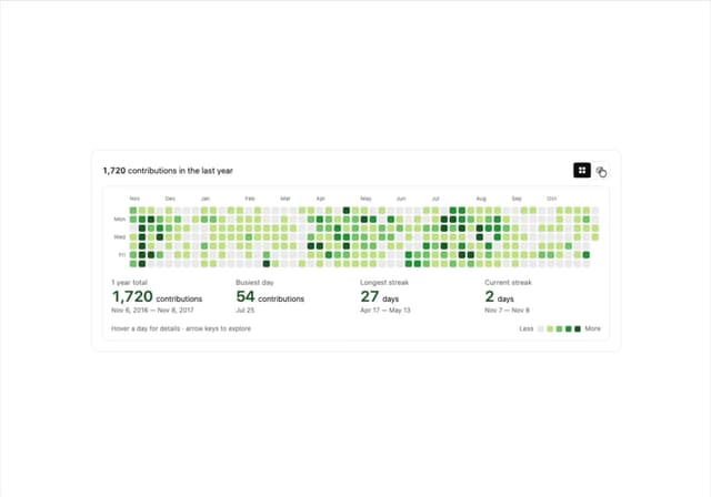
GitHub Contribution Graph 3D Heatmap
1.8K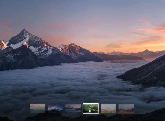
Morph Gallery
1.4K
Hanging Polaroid Image Carousel
716
Glass Cards
716
Particle Animation
645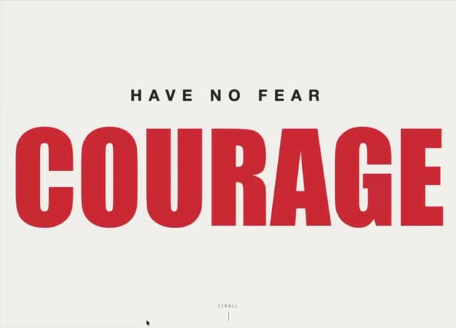
Tiger Tear Reveal
638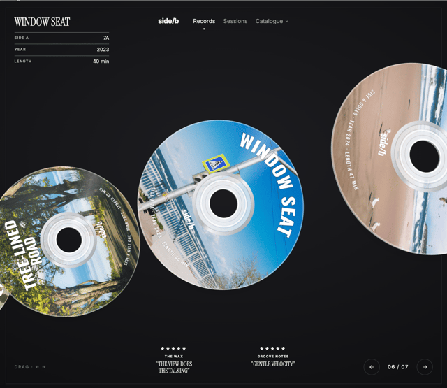
3D CD Disc Carousel
476
More in Footers
View all

Footer 7
555
Footer section
1.9K
Footer column
265

Footer 2
201
Footer
446

Footer
80
Large Name Footer
193
Feature Section
32


