
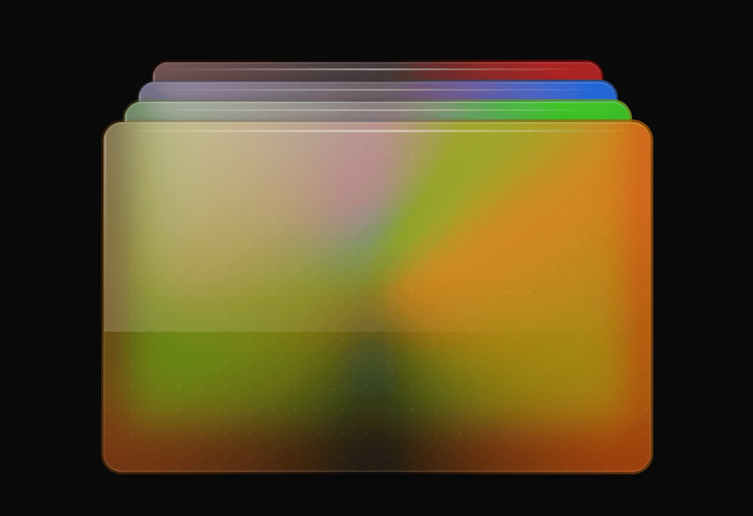
About
Glassmorphism hover stack cards: neumorphic and frosted-glass cards layered in a stack, with smooth GSAP animations and interactive hover effects. Use for feature highlights, pricing tiers or product showcases on modern landing pages.
Built with React and Tailwind. Copy the prompt and paste it into Claude Code, Cursor or Lovable: your agent adds Glass Cards to your project and fits it to your theme.
Code
How Glass Cards is used: the demo's code. The component's own source comes with a free account.
Usage.tsx
import React from 'react';
import { StackedCards } from '../components/ui/glass-cards';
import '../index.css';

// Demo component showcasing the stacked cards with different configurations
export const DefaultDemo: React.FC = () => {
  return (
    <div style={{
      minHeight: '100vh',
      background: 'linear-gradient(135deg, #667eea 0%, #764ba2 100%)'
    }}>
      <StackedCards />
    </div>
  );
};

// Alternative demo with different styling
export const AlternativeDemo: React.FC = () => {
  return (
    <div style={{
      minHeight: '100vh',
      background: 'linear-gradient(135deg, #ff9a9e 0%, #fecfef 50%, #fecfef 100%)'
    }}>
      <div style={{ padding: '2rem' }}>
        <h1 style={{
          textAlign: 'center',
          color: 'white',
          marginBottom: '2rem',
          fontSize: '2.5rem',
          textShadow: '0 4px 8px rgba(0, 0, 0, 0.3)'
        }}>
          Alternative Style Demo
        </h1>
        <StackedCards />
      </div>
    </div>
  );
};

export default DefaultDemo;
Dependencies
More by Kedhareswer Naidu
View all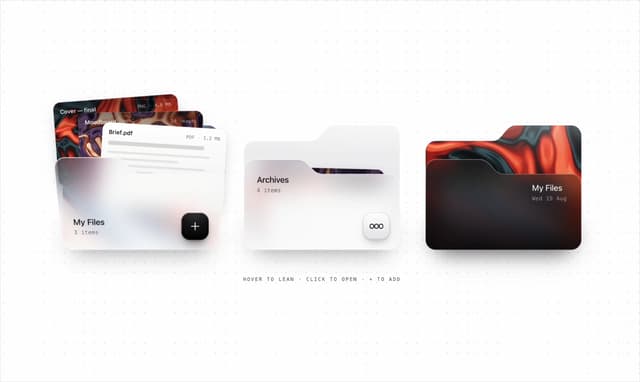

Glassmorphism Folder Cards
2.5K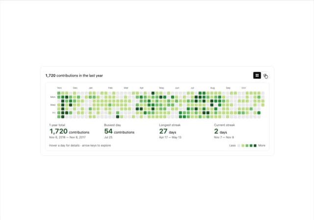
GitHub Contribution Graph 3D Heatmap
1.8K
Morph Gallery
1.4K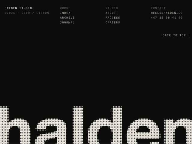
Halftone Wordmark Footer
1.1K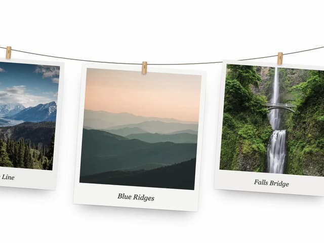
Hanging Polaroid Image Carousel
692
Particle Animation
641
Tiger Tear Reveal
623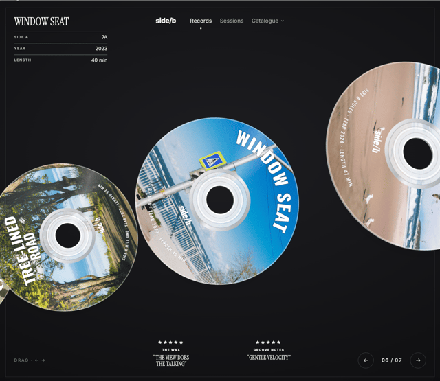
3D CD Disc Carousel
464
More in Cards
View all
Stats cards with links
120

Course Design Cards
1.1K

Statistics Card 2
259
Card
56

Card Studio
9
Statistics Card 7
289
The Item one
3

Weather Card
53
