
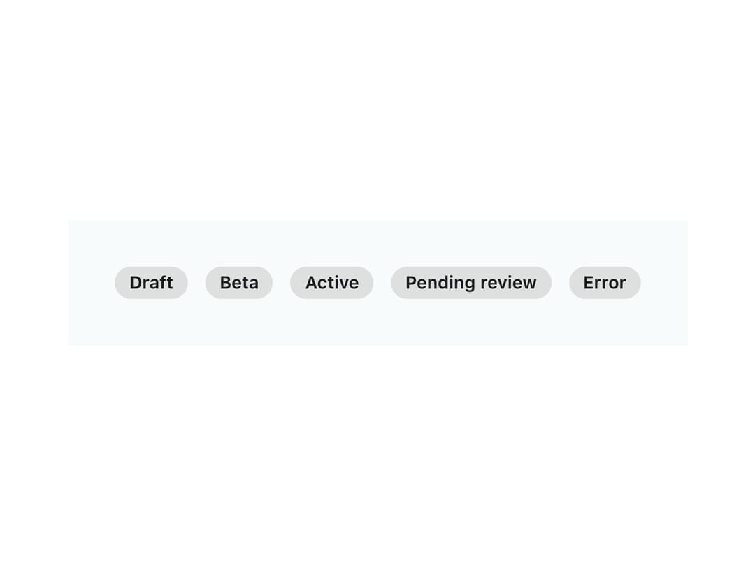
About
A small inline status label with neutral/accent/success/warning/danger color variants and an optional status dot, ported from the ngx-aurora-ui Angular library's au-badge component.
Built with React and Tailwind. Copy the prompt and paste it into Claude Code, Cursor or Lovable: your agent adds Aurora Badge to your project and fits it to your theme.
Code
How Aurora Badge is used: the demo's code. The component's own source comes with a free account.
Usage.tsx
import Badge from "@/components/ui/badge";

export default function BadgeDemo() {
  return (
    <div
      className="flex flex-wrap items-center gap-3 p-8"
      style={{ background: "var(--au-bg)" }}
    >
      <Badge variant="neutral">Draft</Badge>
      <Badge variant="accent">Beta</Badge>
      <Badge variant="success" dot>
        Active
      </Badge>
      <Badge variant="warning" dot>
        Pending review
      </Badge>
      <Badge variant="danger" dot>
        Error
      </Badge>
    </div>
  );
}
More by konicamaheshwarii
View all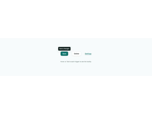
Tooltip
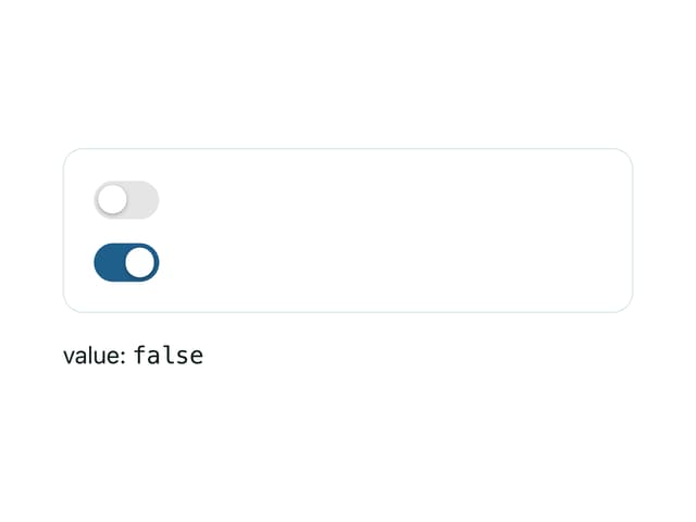
Aurora Switch
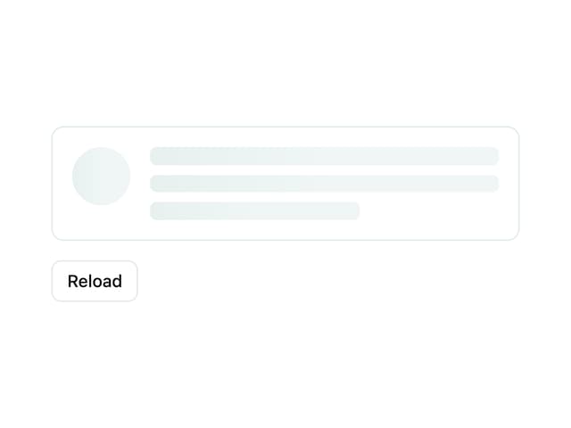
Skeleton Loader
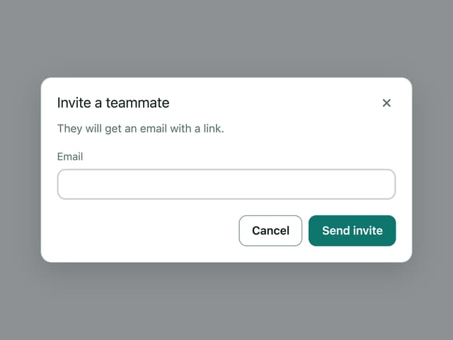
Aurora Dialog