
About
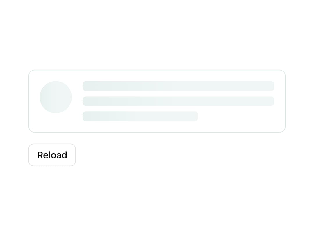
A shimmering placeholder block that stands in for text, images, or avatars while content is loading. Ported from the Angular Aurora UI library (ngx-aurora-ui) by Konica Maheshwari.
Built with React and Tailwind. Copy the prompt and paste it into Claude Code, Cursor or Lovable: your agent adds Skeleton Loader to your project and fits it to your theme.
Code
How Skeleton Loader is used: the demo's code. The component's own source comes with a free account.
Usage.tsx
"use client";

import Skeleton from "@/components/ui/skeleton";
import { useState } from "react";

export default function SkeletonDemo() {
  const [loading, setLoading] = useState(true);

  const reload = () => {
    setLoading(true);
    setTimeout(() => setLoading(false), 1500);
  };

  return (
    <div className="flex flex-col gap-4 w-full max-w-sm">
      <div
        className="grid grid-cols-[3rem_1fr] gap-4 items-start rounded-lg border p-4"
        style={{
          borderColor: "var(--au-border)",
          background: "var(--au-surface)",
        }}
        aria-busy={loading}
        aria-live="polite"
      >
        {loading ? (
          <>
            <Skeleton shape="circle" width="3rem" />
            <div className="flex flex-col gap-1">
              <Skeleton lines={3} />
            </div>
          </>
        ) : (
          <>
            <div
              className="w-12 h-12 rounded-full grid place-items-center font-bold"
              style={{
                background: "var(--au-accent)",
                color: "var(--au-accent-contrast)",
              }}
              aria-hidden="true"
            >
              GH
            </div>
            <div className="flex flex-col gap-1">
              <strong>Grace Hopper</strong>
              <span className="text-muted-foreground text-sm">
                Rear admiral, compiler pioneer.
              </span>
            </div>
          </>
        )}
      </div>
      <button
        onClick={reload}
        className="self-start rounded-md border px-3 py-1.5 text-sm font-medium hover:bg-accent"
      >
        Reload
      </button>
    </div>
  );
}
More by konicamaheshwarii
View all
Tooltip
Aurora Switch
Aurora Dialog
Aurora Badge