

About
A collapsible content card with a header trigger that smoothly morphs its width and height open to reveal more detail, built for dense dashboards or FAQ-style summaries.
Built with React and Tailwind. Copy the prompt and paste it into Claude Code, Cursor or Lovable: your agent adds Expandable Card to your project and fits it to your theme.
Code
How Expandable Card is used: the demo's code. The component's own source comes with a free account.
Usage.tsx
import { ExpandableCard } from "@/components/ui/expandable-card";

export default function ExpandableCardDemo() {
  return (
    <div className="flex w-full items-center justify-center p-10">
      <ExpandableCard
        title="What's included in the Pro plan?"
        description="Unlimited projects, priority support, and analytics."
        width={420}
        expandedWidth={520}
      >
        <p>
          The Pro plan includes unlimited projects, priority support with a
          4-hour response time, advanced analytics dashboards, and access to
          every integration we ship. Upgrade or downgrade at any time from your
          billing settings.
        </p>
      </ExpandableCard>
    </div>
  );
}
Dependencies
More by kuratlielia
View all
Activity Heatmap
341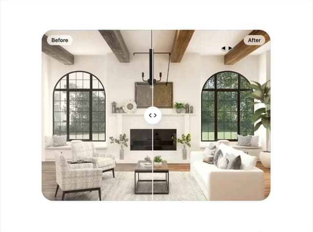
Image Compare
104
User Menu
93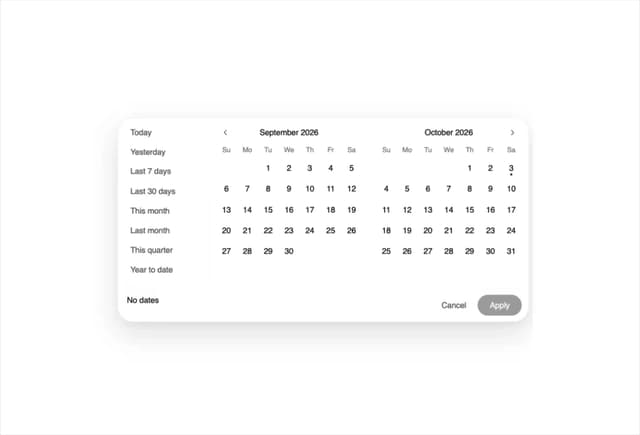
Date Range Picker
62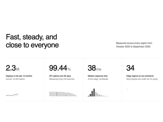
Stats Band
52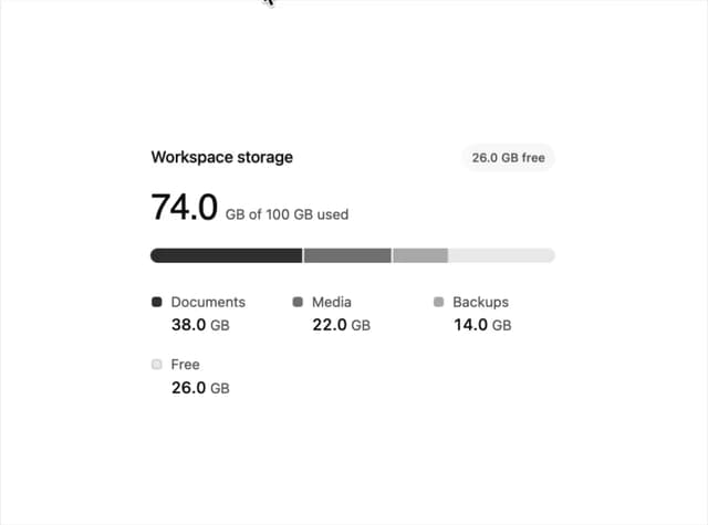
Usage Meter
45
Signature Pad
37
Timeline
33
More in Cards
View all
Stats cards with links
39

Statistics Card 2
261

Course Design Cards
1.1K
The Item one
3
Card
70

Card Studio
7
Statistics Card 7
289

Card
17
