
About
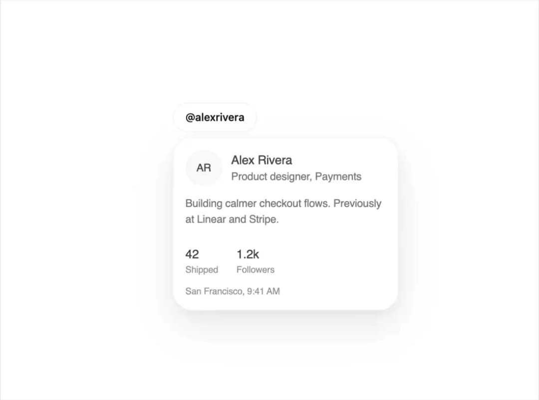
A rich preview panel that opens over a mention, avatar, or link after a brief hover or keyboard focus, used to show a person's profile or linked content without leaving the page.
Built with React and Tailwind. Copy the prompt and paste it into Claude Code, Cursor or Lovable: your agent adds Hover Card to your project and fits it to your theme.
Code
How Hover Card is used: the demo's code. The component's own source comes with a free account.
Usage.tsx
"use client";

import { HoverCard, HoverCardProfile } from "@/components/ui/hover-card";

export default function HoverCardDemo() {
  return (
    <div className="flex min-h-[400px] w-full items-center justify-center bg-[var(--background)]">
      <HoverCard
        content={
          <HoverCardProfile
            name="Alex Rivera"
            role="Product designer, Payments"
            bio="Building calmer checkout flows. Previously at Linear and Stripe."
            stats={[
              { label: "Shipped", value: 42 },
              { label: "Followers", value: "1.2k" },
            ]}
            meta="San Francisco, 9:41 AM"
          />
        }
      >
        <button className="rounded-full border border-[var(--border)] bg-[var(--surface)] px-4 py-2 text-sm font-medium text-[var(--foreground)]">
          @alexrivera
        </button>
      </HoverCard>
    </div>
  );
}
Dependencies
More by kuratlielia
View all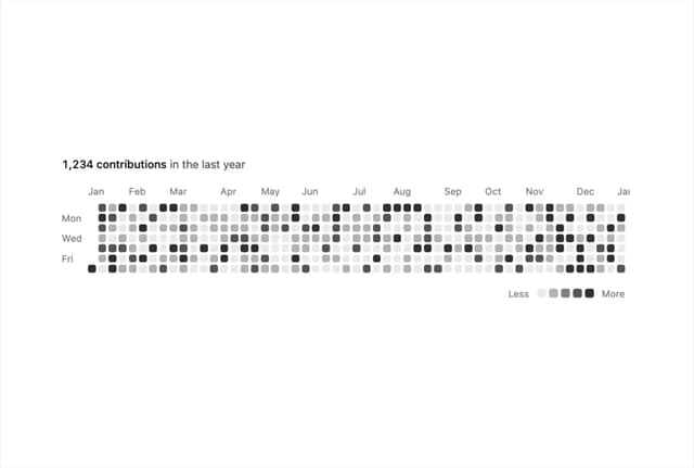
Activity Heatmap
340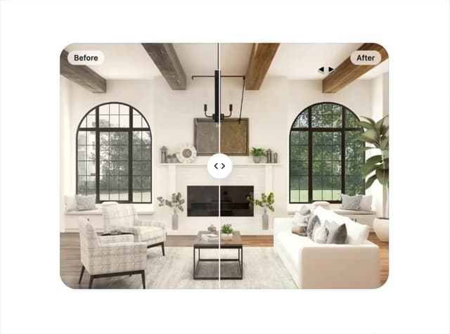
Image Compare
104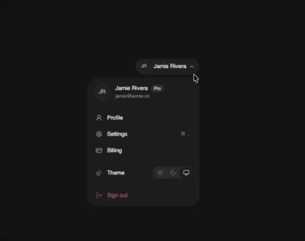
User Menu
93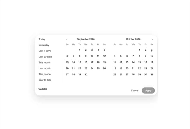
Date Range Picker
62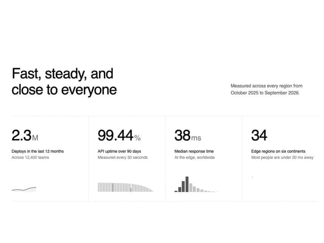
Stats Band
52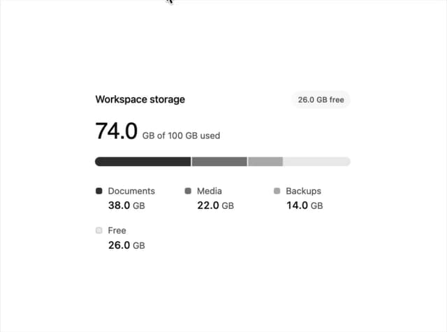
Usage Meter
45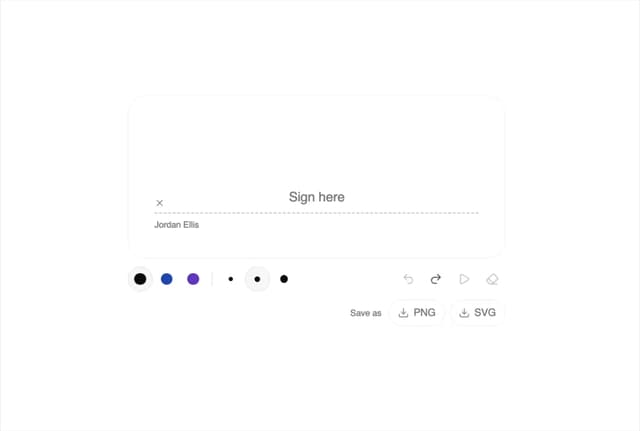
Signature Pad
37
Timeline
33
More in Cards
View all

Course Design Cards
1.1K
Stats cards with links
79

Statistics Card 2
259
Card
56

Card Studio
9
The Item one
3
Statistics Card 7
289

Weather Card
54
