
About
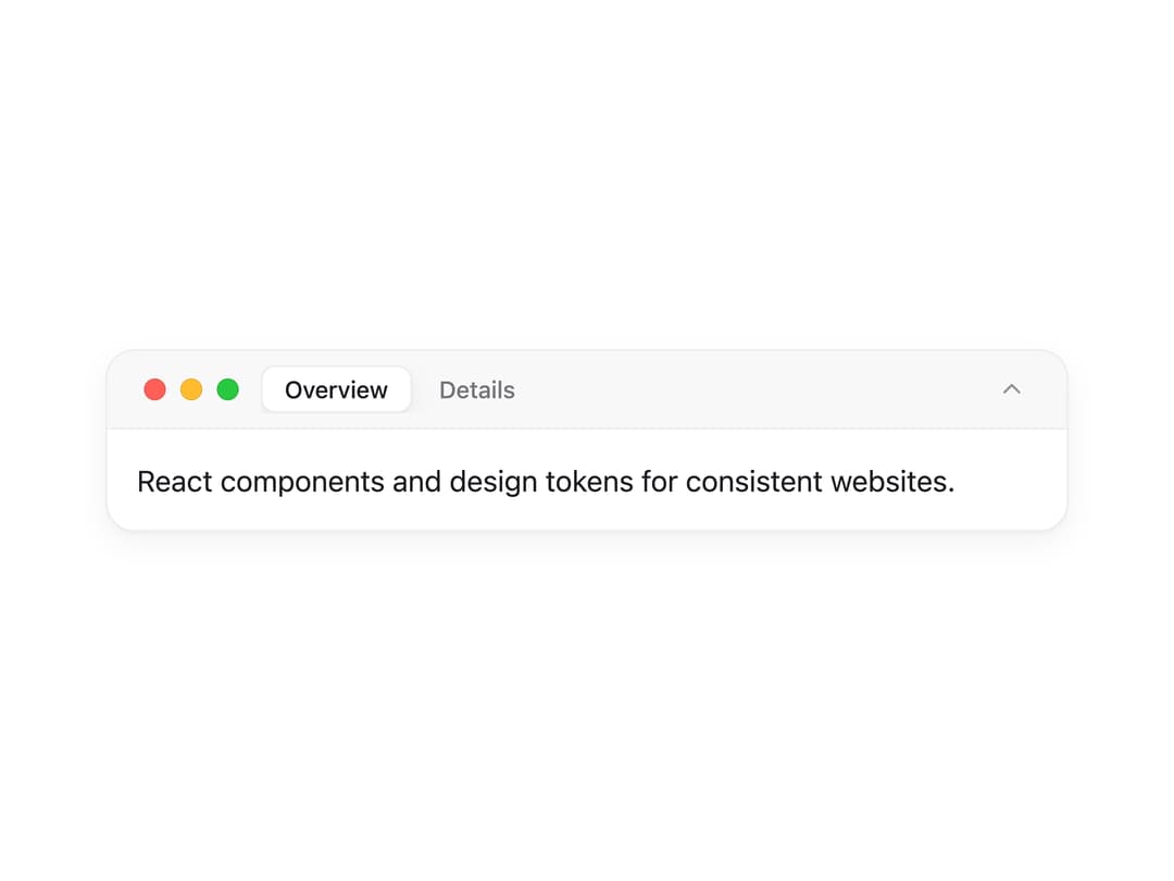
A collapsible, mac-style window panel with a tab strip in its title bar that animates its viewport height to the active tab's content.
Built with React and Tailwind. Copy the prompt and paste it into Claude Code, Cursor or Lovable: your agent adds Window Panel to your project and fits it to your theme.
Code
How Window Panel is used: the demo's code. The component's own source comes with a free account.
Usage.tsx
import WindowPanel from "@/components/ui/window-panel";

export default function WindowPanelDemo() {
  return (
    <div className="w-full max-w-xl p-6">
      <WindowPanel
        tabs={[
          {
            label: "Overview",
            content: (
              <p>React components and design tokens for consistent websites.</p>
            ),
          },
          {
            label: "Details",
            content: (
              <p>Follows the system theme and supports keyboard navigation.</p>
            ),
          },
        ]}
        collapseLabel="Collapse"
        expandLabel="Expand"
      />
    </div>
  );
}
Dependencies
More by lailai0916
View all
Dialog
1
Window Bar
Tabs

Scrollable Data Table

Skip Link
Site Header

Skeleton
Segmented