
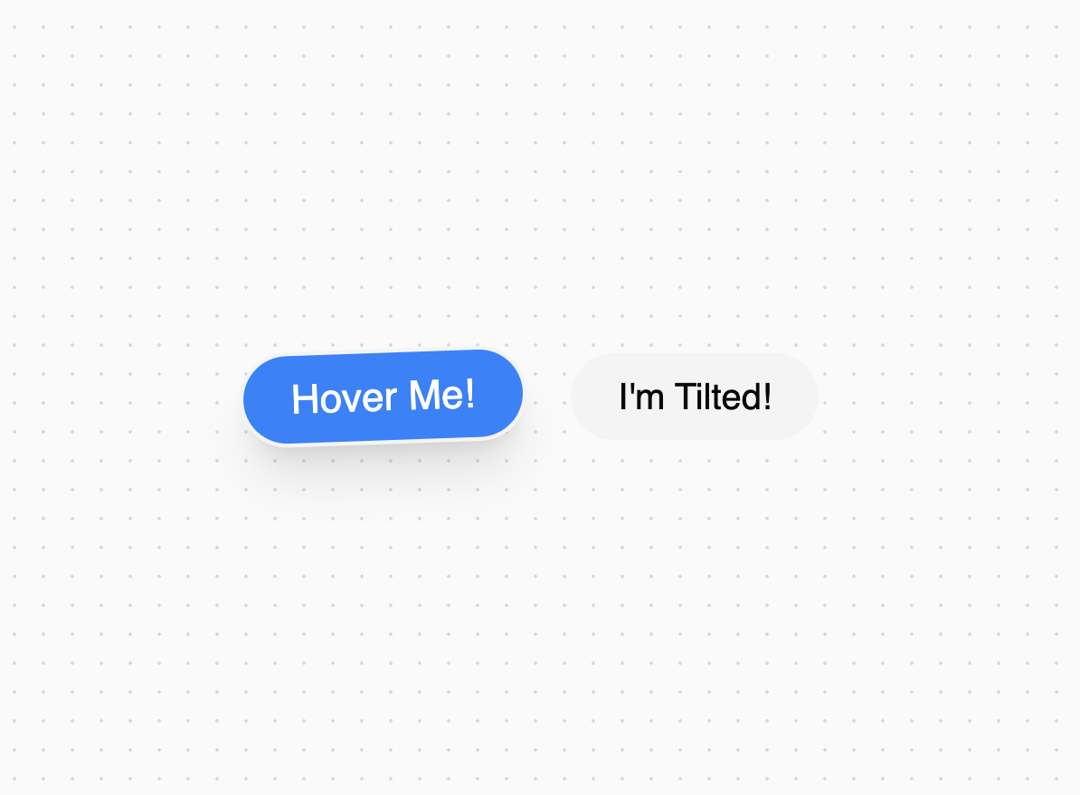
The TiltCard component is a stylish, interactive card that tilts and scales when hovered over, providing a dynamic visual effect. It's perfect for highlighting important information or adding a touch of interactivity to your UI. Features - Interactive Hover Effect: Tilts and scales on hover for a dynamic look. - Customizable Hover Color: Easily change the hover background color using Tailwind CSS classes. - Theming Support: Integrated with shadcn theme for consistent styling. - Responsive Design: Adapts to different screen sizes and layouts. Props - title: string - The text displayed on the card. - hoverColor: string - Tailwind CSS class for the hover background color (e.g., hover:bg-blue-500). - className: string - Additional classes for custom styling.
Built with React and Tailwind. Copy the prompt and paste it into Claude Code, Cursor or Lovable: your agent adds Tilt Card to your project and fits it to your theme.
Code
How Tilt Card is used: the demo's code. The component's own source comes with a free account.
Usage.tsx
import { TiltCard } from "@/components/ui/tilt-card";

function DefaultDemo() {
  return (
    <div className="flex items-center justify-center min-h-screen">
      <TiltCard title="Hover Me!" hoverColor="hover:bg-blue-500" className="m-4" />
      <TiltCard title="I'm Tilted!" hoverColor="hover:bg-green-500" className="m-4" />
    </div>
  );
}

export { DefaultDemo };More in Cards
View all

Statistics Card 2
263
Card
70
Stats cards with links
39

Course Design Cards
1.1K
The Item one
3

Card Studio
7
Statistics Card 7
290

Item
10
