
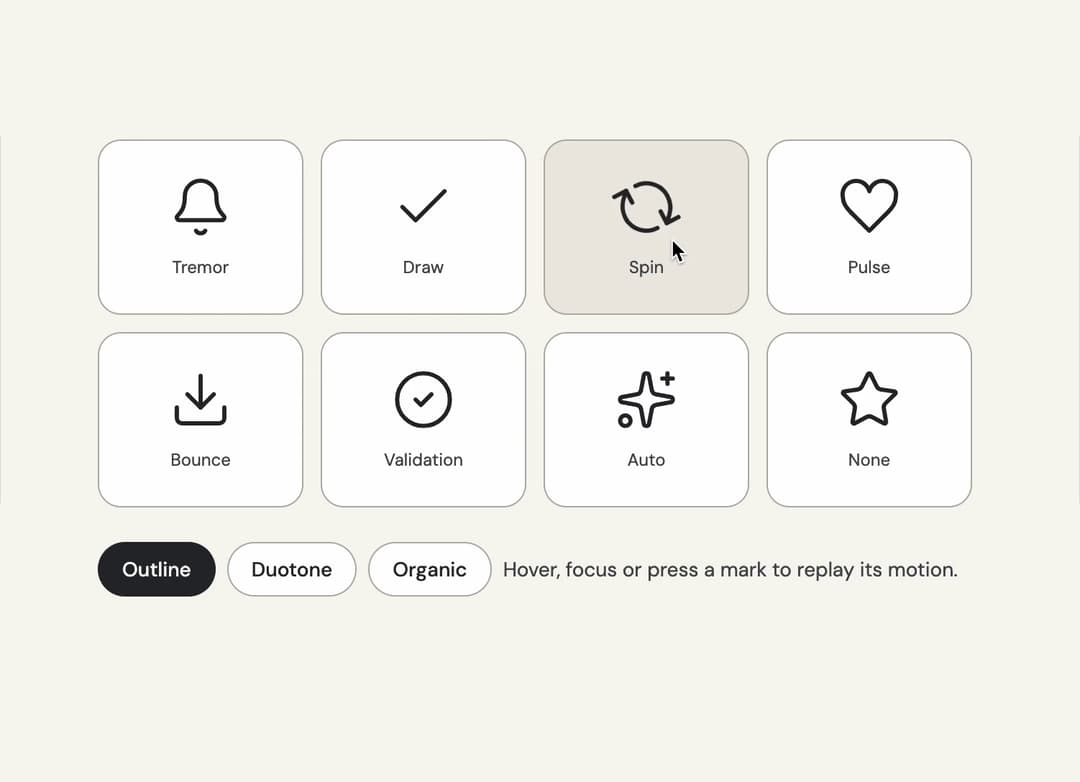
About
Replayable micro-interactions for the full Cojeev icon library, with semantic motion families and optional visual treatments.
Built with React and Tailwind. Copy the prompt and paste it into Claude Code, Cursor or Lovable: your agent adds Animated Icon to your project and fits it to your theme.
Code
How Animated Icon is used: the demo's code. The component's own source comes with a free account.
Usage.tsx
"use client";

import * as React from "react";
import { AnimatedIcon, type IconMotion } from "@/components/ui/animated-icon";

const specimens: { name: string; preset: IconMotion; note: string }[] = [
  { name: "bell", preset: "tremor", note: "Tremor" },
  { name: "check", preset: "draw", note: "Draw" },
  { name: "refresh-cw", preset: "spin", note: "Spin" },
  { name: "heart", preset: "pulse", note: "Pulse" },
  { name: "download", preset: "bounce", note: "Bounce" },
  { name: "circle-check", preset: "validation", note: "Validation" },
  { name: "sparkles", preset: "auto", note: "Auto" },
  { name: "star", preset: "none", note: "None" },
];
const treatments = ["outline", "duotone", "organic"] as const;

/** The demo brings its own 000h canvas, so it looks right on any host page (the component package sets nothing global). */
function DemoSurface({ children }: { children: import("react").ReactNode }) {
  return <div className="grid min-h-screen w-full place-items-center bg-[var(--v-canvas)] p-4 font-[family-name:var(--font-text)] text-[length:var(--fs-body)] leading-[var(--lh-body)] text-[var(--v-text)]">{children}</div>;
}

export default function Demo() {
  const [treatment, setTreatment] = React.useState<(typeof treatments)[number]>("outline");
  const [replay, setReplay] = React.useState(0);
  return (
    <DemoSurface>
      <div className="mx-auto grid w-full max-w-2xl gap-6 p-8">
        <div className="grid grid-cols-2 gap-3 sm:grid-cols-4">
          {specimens.map((specimen) => (
            <button
              key={specimen.name}
              type="button"
              aria-label={`Replay ${specimen.note}`}
              onClick={() => setReplay((value) => value + 1)}
              className="group grid place-items-center gap-3 rounded-2xl border border-[var(--v-border)] bg-[var(--v-paper)] px-3 py-6 text-[var(--v-text)] transition-colors hover:bg-[var(--v-beige)]"
            >
              <AnimatedIcon
                key={`${specimen.name}:${treatment}:${replay}`}
                name={specimen.name}
                preset={specimen.preset}
                treatment={treatment}
                tone="pink"
                active={replay > 0 ? true : undefined}
                style={{ width: 44, height: 44 }}
              />
              <span className="text-xs text-[var(--v-text-2)]">{specimen.note}</span>
            </button>
          ))}
        </div>
        <div role="group" aria-label="Icon treatment" className="flex flex-wrap items-center gap-2">
          {treatments.map((option) => (
            <button
              key={option}
              type="button"
              aria-pressed={treatment === option}
              onClick={() => setTreatment(option)}
              className="rounded-full border border-[var(--v-border)] bg-[var(--v-paper)] px-4 py-2 text-sm font-medium capitalize text-[var(--v-text)] transition-colors hover:bg-[var(--v-beige)] aria-pressed:border-[var(--v-ink)] aria-pressed:bg-[var(--v-ink)] aria-pressed:text-[var(--v-on-ink)]"
            >
              {option}
            </button>
          ))}
          <span className="text-sm text-[var(--v-text-2)]">Hover, focus or press a mark to replay its motion.</span>
        </div>
      </div>
    </DemoSurface>
  );
}
Dependencies
More by Sanjay Kumar
View all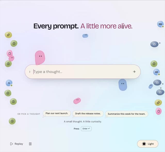
Prompt Bond
95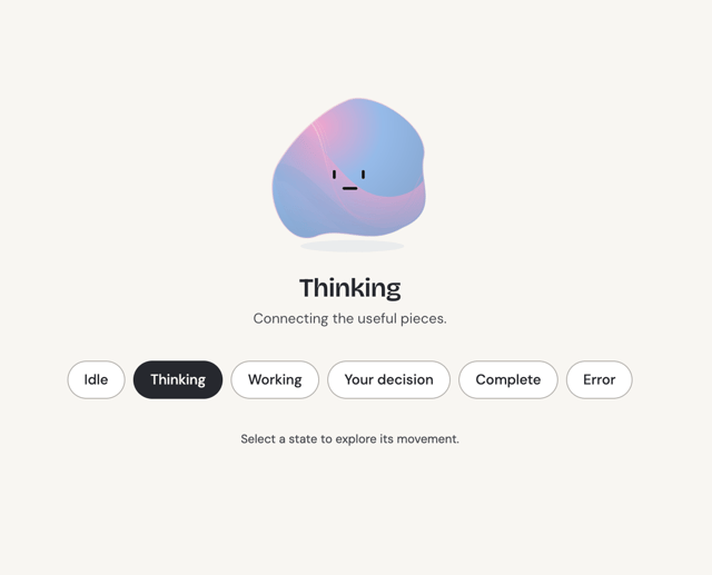
Agent State
47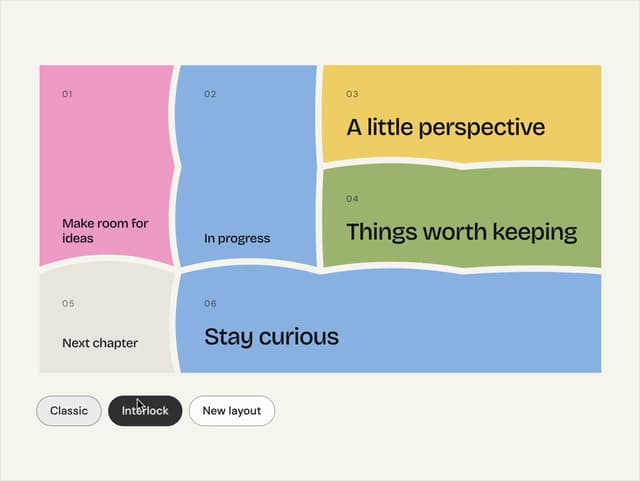
Bento Grid
34
Theme Toggle
23
Variable Proximity
18
Dock
15
Shape
14
Meta Balls
12