
About
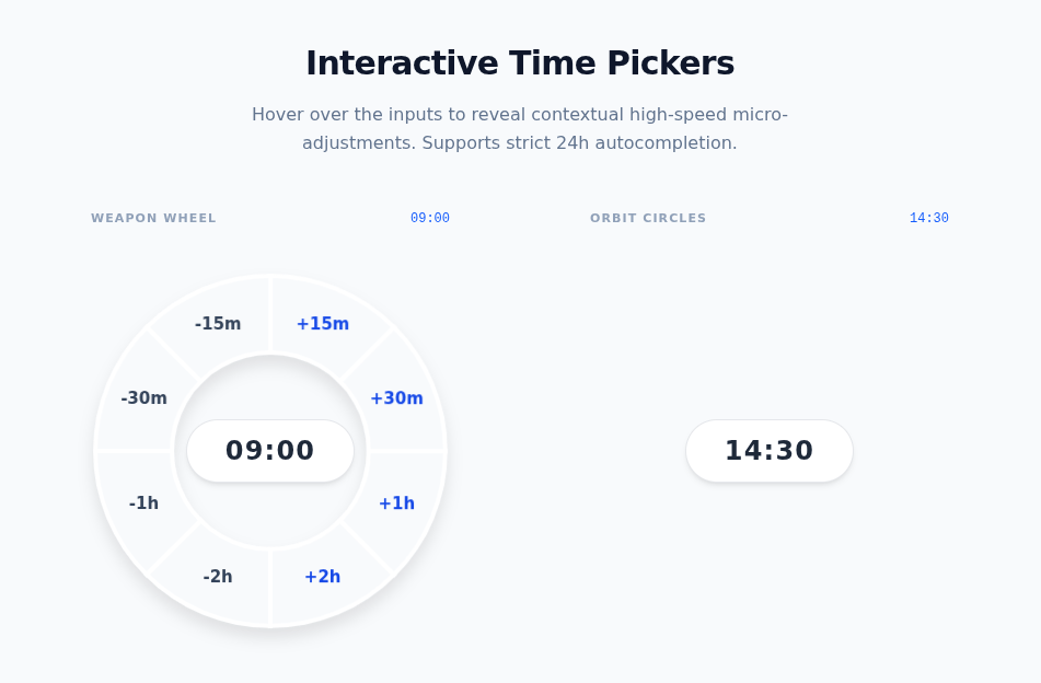
Interactive time inputs featuring a radial weapon wheel and orbit circles for high-speed micro-adjustments. Built with Framer Motion, strict 24h autocompletion, and native dark mode.
Built with React and Tailwind. Copy the prompt and paste it into Claude Code, Cursor or Lovable: your agent adds Radial Time Picker to your project and fits it to your theme.
Code
How Radial Time Picker is used: the demo's code. The component's own source comes with a free account.
Usage.tsx
// demo.tsx
"use client";

import React, { useState } from 'react';
import { TimeWheelPicker, TimeCirclePicker } from "@/components/ui/radial-time-picker";

export default function TimePickerDemo() {
  const [wheelTime, setWheelTime] = useState('09:00');
  const [circleTime, setCircleTime] = useState('14:30');

  return (
    <div className="min-h-screen w-full flex flex-col items-center justify-center p-4 sm:p-8 font-sans bg-slate-50 dark:bg-zinc-950 transition-colors duration-300 overflow-x-hidden">

      {/* Title & Description section added here */}
      <div className="max-w-xl text-center mb-12 px-4">
        <h1 className="text-2xl sm:text-3xl font-extrabold text-slate-900 dark:text-zinc-100 mb-4 tracking-tight">
          Interactive Time Pickers
        </h1>
        <p className="text-sm sm:text-base text-slate-500 dark:text-zinc-400 leading-relaxed">
          Hover over the inputs to reveal contextual high-speed micro-adjustments.
          Supports strict 24h autocompletion.
        </p>
      </div>

      <div className="flex flex-col md:flex-row items-center justify-center gap-16 md:gap-24 w-full max-w-5xl">
        {/* Scale wrappers applied to gracefully handle narrow mobile screens without breaking the strict SVG size math */}
        <div className="flex flex-col items-center gap-6 transform scale-[0.85] sm:scale-100 origin-center">
          <div className="flex items-center justify-between w-full px-4">
            <span className="text-[11px] font-bold uppercase tracking-widest text-slate-400 dark:text-zinc-500">Weapon Wheel</span>
            <span className="text-xs font-mono text-blue-600 dark:text-blue-400">{wheelTime}</span>
          </div>
          <TimeWheelPicker
            defaultValue={wheelTime}
            onChange={setWheelTime}
          />
        </div>

        <div className="flex flex-col items-center gap-6 transform scale-[0.85] sm:scale-100 origin-center">
          <div className="flex items-center justify-between w-full px-4">
            <span className="text-[11px] font-bold uppercase tracking-widest text-slate-400 dark:text-zinc-500">Orbit Circles</span>
            <span className="text-xs font-mono text-blue-600 dark:text-blue-400">{circleTime}</span>
          </div>
          <TimeCirclePicker
            defaultValue={circleTime}
            onChange={setCircleTime}
          />
        </div>
      </div>
    </div>
  );
}
Dependencies
More by Mathew
View all
Trail Grid
100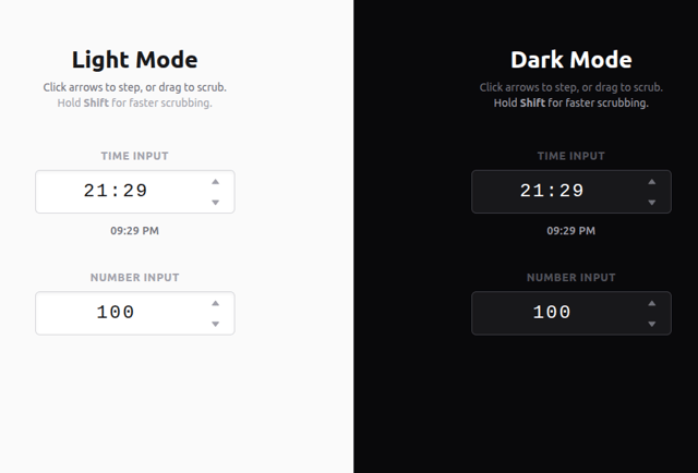
Scrubbable Inputs
1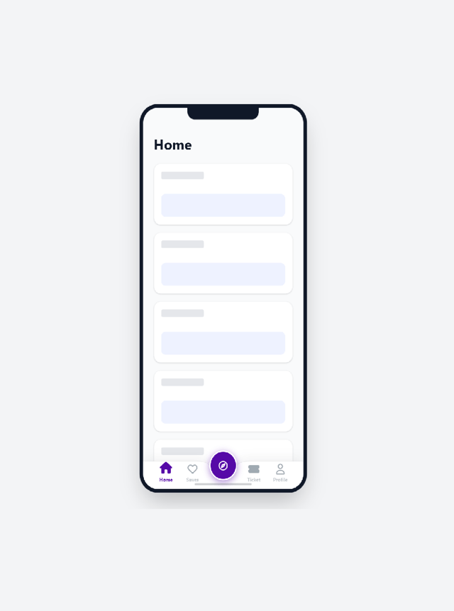
"Native" Mobile Nav

NexusOrb