
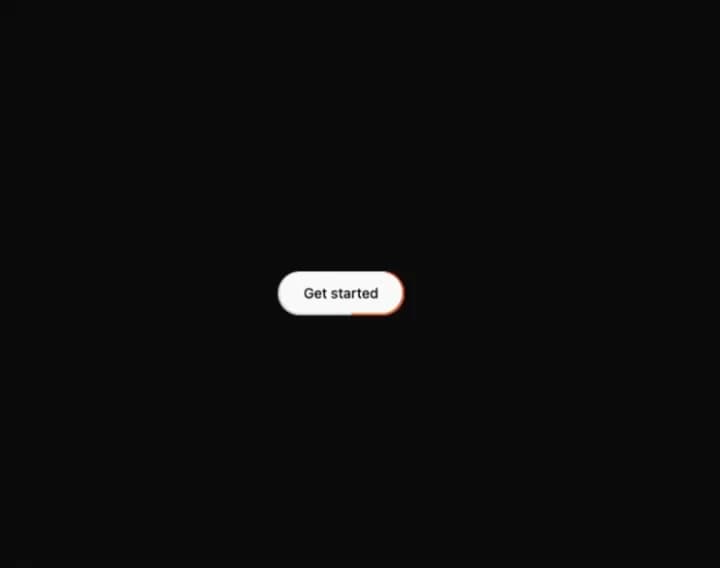
About
Pill button with a light beam circling its edge and a soft sheen on hover.
Built with React and Tailwind. Copy the prompt and paste it into Claude Code, Cursor or Lovable: your agent adds Tweenly Shine Button to your project and fits it to your theme.
Code
How Tweenly Shine Button is used: the demo's code. The component's own source comes with a free account.
Usage.tsx
"use client";
import {ThemeProvider as LibraryDemoThemeProvider} from "next-themes";
import { ShineButton } from "@/components/ui/tweenly-shine-button"

export function Demo() {
  return (
    <ShineButton>
      Get started
    </ShineButton>
  )
}

function SourceSpecimen(){return <Demo/>}
export default function LibraryRegistryPreview(){return <LibraryDemoThemeProvider defaultTheme="dark" enableSystem={false}><div data-component-demo data-demo-theme="dark" data-theme="dark" className="dark" style={{background:"var(--background)",color:"var(--foreground)"}}><div className="relative w-full min-w-0 max-w-5xl min-h-[400px] flex items-center justify-center"><SourceSpecimen/></div></div></LibraryDemoThemeProvider>}
Dependencies
More by mirukullacode
View all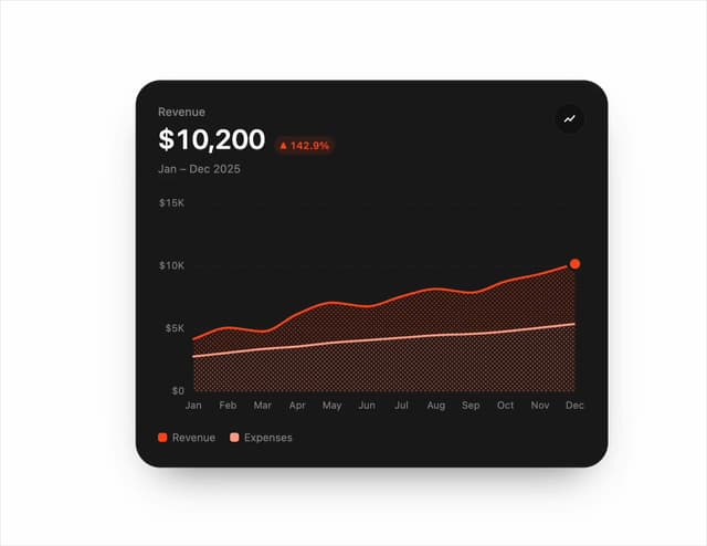
Chart Line
33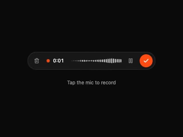
Tweenly AI Recorder
29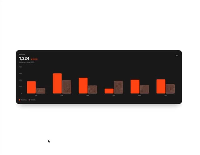
Animated Bar Chart
28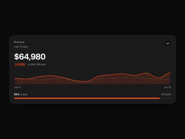
Tweenly Chart KPI
18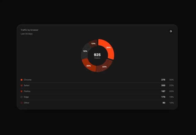
Tweenly Chart Radial
16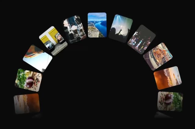
Tweenly Image Arc
15
Tweenly Hero Background
12
Tweenly Curved Carousel
12