
About
A stack of same-size cards pinned on scroll. The front card lifts away, then the next, one by one.
Built with React and Tailwind. Copy the prompt and paste it into Claude Code, Cursor or Lovable: your agent adds Tweenly Sticky Cards to your project and fits it to your theme.
Code
How Tweenly Sticky Cards is used: the demo's code. The component's own source comes with a free account.
Usage.tsx
"use client";
import {ThemeProvider as LibraryDemoThemeProvider} from "next-themes";
import { StickyCards } from "@/components/ui/tweenly-sticky-cards"

const cards = [
  {
    "id": "card-1",
    "tag": "01 / Code Review",
    "title": "Review every PR with agents that know your standards",
    "image": "https://trytweenly.vercel.app/sticky-cards/01.jpg"
  },
  {
    "id": "card-2",
    "tag": "02 / Test Coverage",
    "title": "Coverage that climbs, suites that stay green",
    "image": "https://trytweenly.vercel.app/sticky-cards/02.jpg"
  },
  {
    "id": "card-3",
    "tag": "03 / Migrations",
    "title": "Modernizations as a program, not a weekend project",
    "image": "https://trytweenly.vercel.app/sticky-cards/03.jpg"
  },
  {
    "id": "card-4",
    "tag": "04 / Automations",
    "title": "Recurring engineering work as a repeatable workflow",
    "image": "https://trytweenly.vercel.app/sticky-cards/04.jpg"
  },
  {
    "id": "card-5",
    "tag": "05 / Team Standards",
    "title": "Your best workflow becomes everyone's default",
    "image": "https://trytweenly.vercel.app/sticky-cards/05.jpg"
  }
];

export function Demo() {
  return (
    <StickyCards cards={cards} />
  )
}

function SourceSpecimen(){return <Demo/>}
export default function LibraryRegistryPreview(){return <LibraryDemoThemeProvider defaultTheme="dark" enableSystem={false}><div data-component-demo data-demo-theme="dark" data-theme="dark" className="dark" style={{background:"var(--background)",color:"var(--foreground)"}}><div className="relative w-full min-w-0 max-w-5xl min-h-[400px] flex items-center justify-center"><SourceSpecimen/></div></div></LibraryDemoThemeProvider>}
Dependencies
More by mirukullacode
View all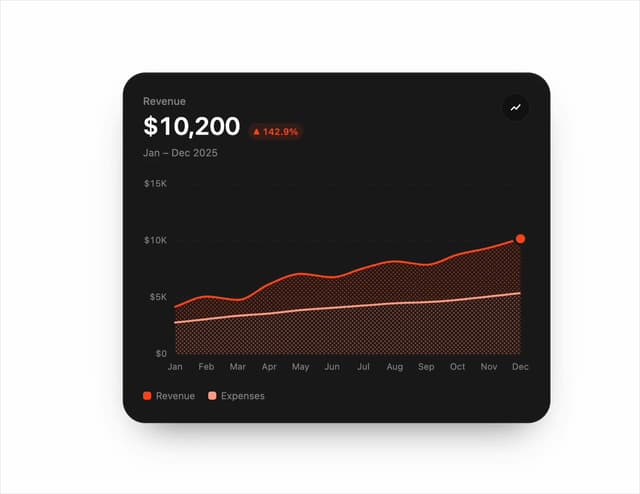
Chart Line
33
Tweenly AI Recorder
29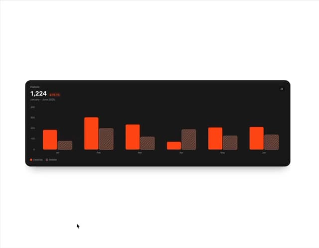
Animated Bar Chart
28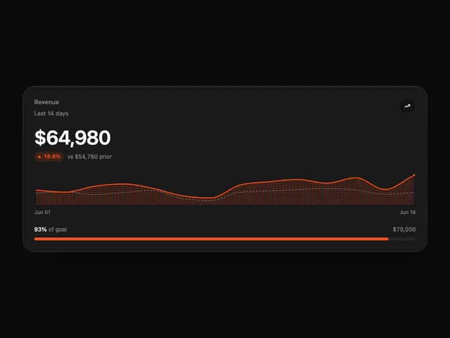
Tweenly Chart KPI
18
Tweenly Chart Radial
16
Tweenly Image Arc
15
Tweenly Hero Background
12
Tweenly Curved Carousel
12