
About
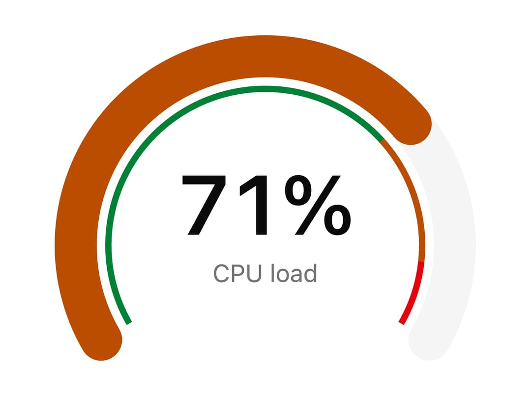
Radial SVG gauge for a single reading on a scale, with threshold bands that recolour the arc, an animated sweep and a centred value and caption. Any start and end angle, from a half circle to a full ring.
Built with React and Tailwind. Copy the prompt and paste it into Claude Code, Cursor or Lovable: your agent adds Gauge to your project and fits it to your theme.
Code
How Gauge is used: the demo's code. The component's own source comes with a free account.
Usage.tsx
import {
  Gauge,
  GaugeTrack,
  GaugeBands,
  GaugeIndicator,
  GaugeValue,
  GaugeLabel,
} from "@/components/ui/gauge";

export default function GaugeDemo() {
  return (
    <div className="flex w-full items-center justify-center p-10">
      <Gauge
        value={71}
        size="lg"
        tone="success"
        thresholds={[
          { value: 0, tone: "success", label: "Normal" },
          { value: 70, tone: "warning", label: "High" },
          { value: 90, tone: "destructive", label: "Critical" },
        ]}
      >
        <GaugeTrack />
        <GaugeBands />
        <GaugeIndicator />
        <GaugeValue format={(v) => `${v}%`} />
        <GaugeLabel>CPU load</GaugeLabel>
      </Gauge>
    </div>
  );
}
More by Mohammad Shehadeh
View all
Feature Problem Cards
84
Feature Grid Spotlight Cards
69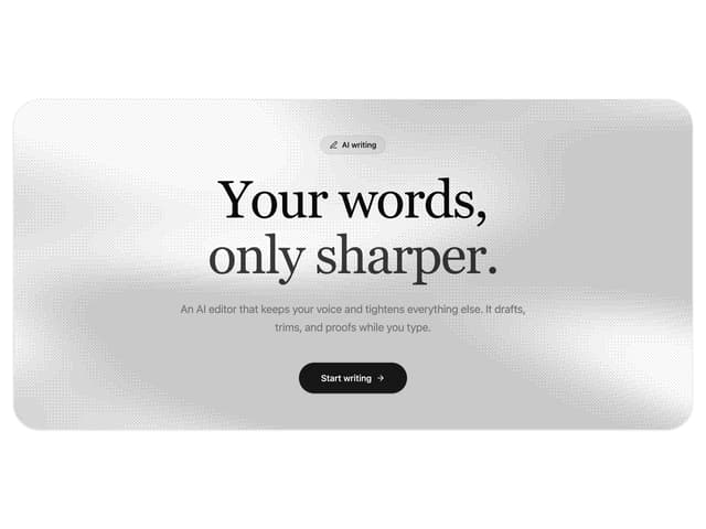
Dithered Shader CTA
63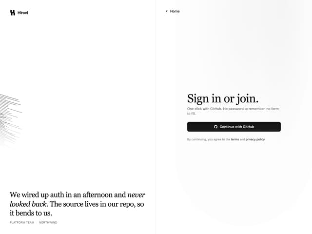
Split Login
60
FAQ Two Column
59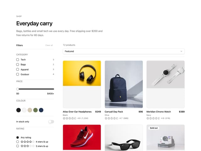
Ecommerce Category Page
58
Comparison Table
58
Comparison Section
56
More in Dashboards
View all
Dashboard with Collapsible Sidebar
2.4K

Sidebar
229

SaaS Template
2.4K

Financial Bento Grid
69

Chat template
597
Stats Bento
1.1K

Statistics Card 2
263
Stats cards with links
39


