
About
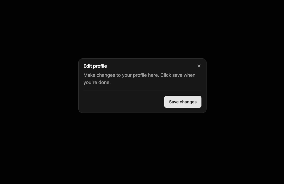
A pop-up layered above the application window or dialog, which makes the background content inert.
Built with React and Tailwind. Copy the prompt and paste it into Claude Code, Cursor or Lovable: your agent adds Dialog to your project and fits it to your theme.
Code
How Dialog is used: the demo's code. The component's own source comes with a free account.
Usage.tsx
import {  Dialog,
  DialogContent,
  DialogDescription,
  DialogFooter,
  DialogHeader,
  DialogTitle,
  DialogTrigger, } from "@/components/ui/dialog";

import {Button} from '@/components/ui/button'

export default function DemoOne() {
  return <Dialog>
      <DialogTrigger asChild>
        <Button variant="outline">Open Dialog</Button>
      </DialogTrigger>
      <DialogContent className="sm:max-w-[425px]">
        <DialogHeader>
          <DialogTitle>Edit profile</DialogTitle>
          <DialogDescription>
            Make changes to your profile here. Click save when you're done.
          </DialogDescription>
        </DialogHeader>

        <DialogFooter>
          <Button type="submit">Save changes</Button>
        </DialogFooter>
      </DialogContent>
    </Dialog>;
}
Dependencies
More by Rushil Dhinoja
View all

Morphing Square
435
Voice Input
311
Warp Dialog
264
Orbital Loader
204
Bouncing Dots
193
Vignette Grid Background
190
Wave Loader
131
Discussion
85
More in Buttons
View all

Button
14
Button
34
Texture Button
92
Button Save
46

Button
64

Button Group
3

App Store Button
454

Notification Button
103

