About
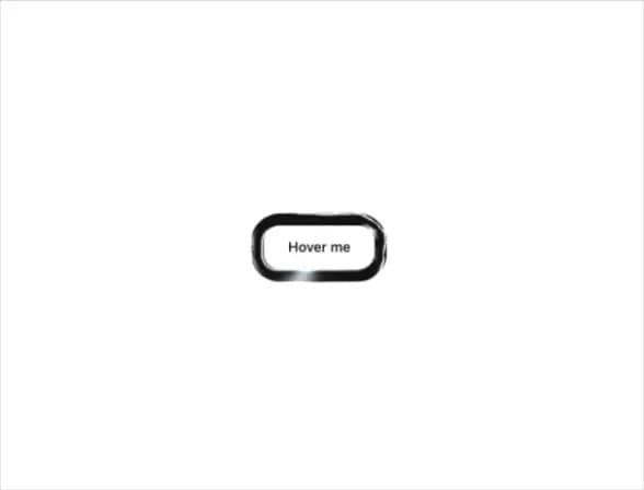
A wrapper that surrounds any element with an animated liquid-metal ring rendered in WebGL, reacting to hover, press, and release for buttons or avatars.
Built with React and Tailwind. Copy the prompt and paste it into Claude Code, Cursor or Lovable: your agent adds Border Chrome Ring to your project and fits it to your theme.
Code
How Border Chrome Ring is used: the demo's code. The component's own source comes with a free account.
Usage.tsx
"use client";

import BorderChromeRing from "@/components/ui/border-chrome-ring";

export default function BorderChromeRingDemo() {
  return (
    <div className="flex min-h-[400px] w-full items-center justify-center bg-background p-10">
      <BorderChromeRing radius={16} ringWidth={14}>
        <button className="rounded-2xl bg-background px-6 py-3 text-sm font-medium text-foreground">
          Hover me
        </button>
      </BorderChromeRing>
    </div>
  );
}
More by nikolas-sapa
View all

Dye Whorl
138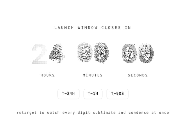
Countdown Vapor Digits
122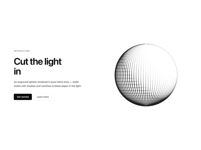
Hero Burin Hatch
62
Background ASCII Wake
54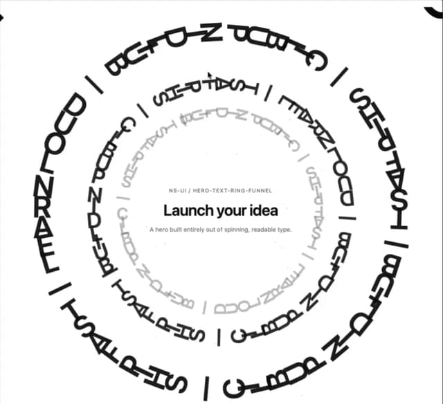
Hero Text Ring Funnel
48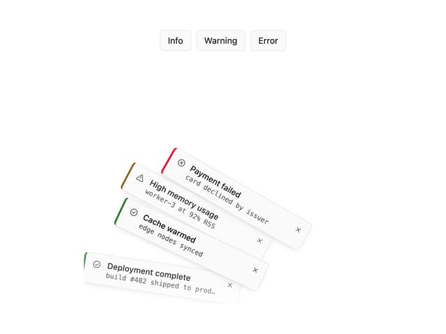
Toast Gravity Stack
46
Hero ASCII Schlieren
45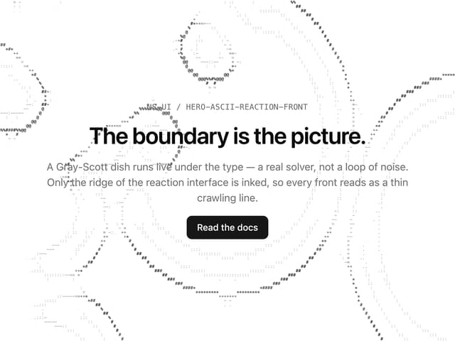
Hero ASCII Reaction Front
41
More in Shaders
View all
Glass Fold
209

Neural Noise
717
Wave
685
LightSpeed
207
animated pattern cloud
616

Background Shader
304
Shader Background
2K

Line Shader Homlu UI
48


