About
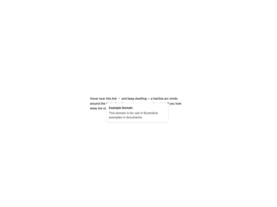
A hover-triggered link preview card that only opens once the pointer dwells long enough to fully wind a small animated arc around the trigger, and visibly unwinds if you move away early instead of just canceling.
Built with React and Tailwind. Copy the prompt and paste it into Claude Code, Cursor or Lovable: your agent adds Hover Card Dwell to your project and fits it to your theme.
Code
How Hover Card Dwell is used: the demo's code. The component's own source comes with a free account.
Usage.tsx
import HoverCardDwell from "@/components/ui/hover-card-dwell";

export default function HoverCardDwellDemo() {
  return (
    <div className="flex min-h-[400px] w-full items-center justify-center bg-background p-10">
      <p className="max-w-md text-sm leading-relaxed text-foreground">
        Hover over{" "}
        <HoverCardDwell
          href="https://example.com"
          preview={
            <span className="block space-y-1">
              <span className="block font-medium text-foreground">
                Example Domain
              </span>
              <span className="block text-ns-muted">
                This domain is for use in illustrative examples in documents.
              </span>
            </span>
          }
        >
          this link
        </HoverCardDwell>{" "}
        and keep dwelling — a hairline arc winds around the dot before the
        preview opens, and unwinds if you look away too soon.
      </p>
    </div>
  );
}
More by nikolas-sapa
View all

Dye Whorl
138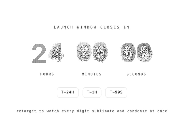
Countdown Vapor Digits
122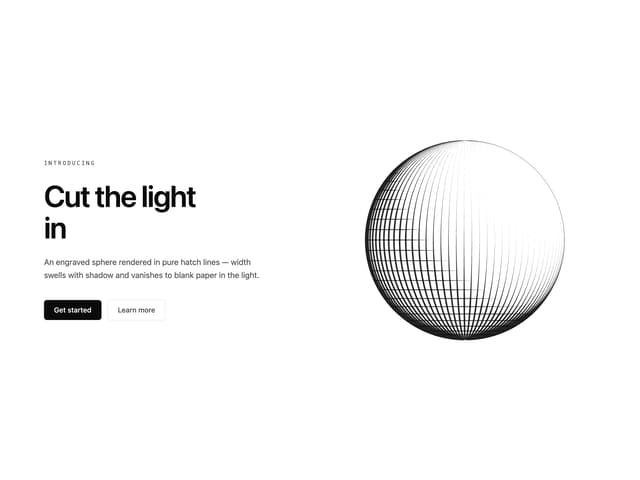
Hero Burin Hatch
62
Background ASCII Wake
55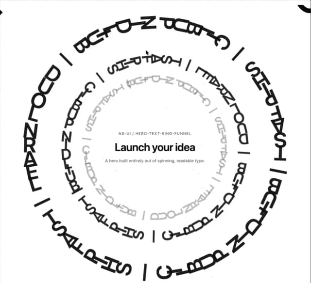
Hero Text Ring Funnel
48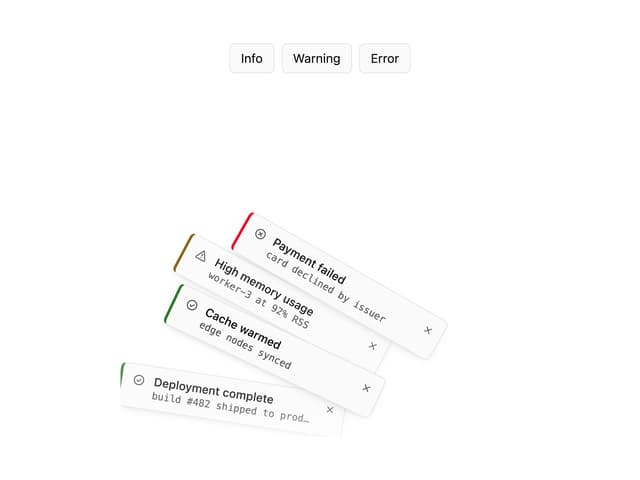
Toast Gravity Stack
46
Hero ASCII Schlieren
45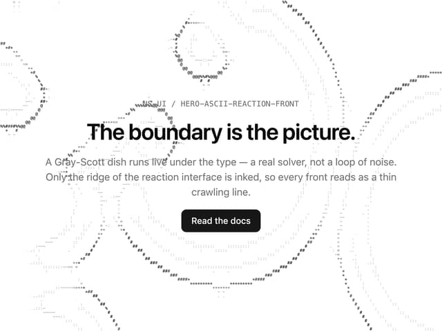
Hero ASCII Reaction Front
41
More in Cards
View all
Stats cards with links
33

Course Design Cards
1.1K

Card
70
Statistics Card 2
264
Statistics Card 10
263

Card
17

Card Studio
9
The Item one
3
