
About
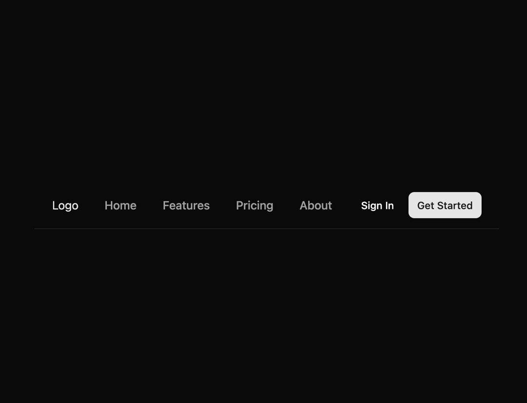
Here is Navigation Bar component
Built with React and Tailwind. Copy the prompt and paste it into Claude Code, Cursor or Lovable: your agent adds Navigation Bar to your project and fits it to your theme.
Code
How Navigation Bar is used: the demo's code. The component's own source comes with a free account.
Usage.tsx
import { Button } from "@/components/ui/button"
import {
  NavigationMenu,
  NavigationMenuItem,
  NavigationMenuLink,
  NavigationMenuList,
} from "@/components/ui/navigation-menu"
import {
  Popover,
  PopoverContent,
  PopoverTrigger,
} from "@/components/ui/popover"

// Navigation links array - removed the active property to let hover work properly
const navigationLinks = [
  { href: "#", label: "Home" },
  { href: "#", label: "Features" },
  { href: "#", label: "Pricing" },
  { href: "#", label: "About" },
]

export default function Component() {
  return (
    <header className="border-b px-4 md:px-6">
      <div className="flex h-16 justify-between gap-4">
        {/* Left side */}
        <div className="flex gap-2">
          <div className="flex items-center md:hidden">
            {/* Mobile menu trigger */}
            <Popover>
              <PopoverTrigger asChild>
                <Button className="group size-8" variant="ghost" size="icon">
                  <svg
                    className="pointer-events-none"
                    width={16}
                    height={16}
                    viewBox="0 0 24 24"
                    fill="none"
                    stroke="currentColor"
                    strokeWidth="2"
                    strokeLinecap="round"
                    strokeLinejoin="round"
                    xmlns="http://www.w3.org/2000/svg"
                  >
                    <path
                      d="M4 12L20 12"
                      className="origin-center -translate-y-[7px] transition-all duration-300 ease-[cubic-bezier(.5,.85,.25,1.1)] group-aria-expanded:translate-x-0 group-aria-expanded:translate-y-0 group-aria-expanded:rotate-[315deg]"
                    />
                    <path
                      d="M4 12H20"
                      className="origin-center transition-all duration-300 ease-[cubic-bezier(.5,.85,.25,1.8)] group-aria-expanded:rotate-45"
                    />
                    <path
                      d="M4 12H20"
                      className="origin-center translate-y-[7px] transition-all duration-300 ease-[cubic-bezier(.5,.85,.25,1.1)] group-aria-expanded:translate-y-0 group-aria-expanded:rotate-[135deg]"
                    />
                  </svg>
                </Button>
              </PopoverTrigger>
              <PopoverContent align="start" className="w-36 p-1 md:hidden">
                <NavigationMenu className="max-w-none *:w-full">
                  <NavigationMenuList className="flex-col items-start gap-0 md:gap-2">
                    {navigationLinks.map((link, index) => (
                      <NavigationMenuItem key={index} className="w-full">
                        <NavigationMenuLink
                          href={link.href}
                          className="py-1.5"
                        >
                          {link.label}
                        </NavigationMenuLink>
                      </NavigationMenuItem>
                    ))}
                  </NavigationMenuList>
                </NavigationMenu>
              </PopoverContent>
            </Popover>
          </div>
          {/* Main nav */}
          <div className="flex items-center gap-6">
            <a href="#" className="text-primary hover:text-primary/90">
              <h2> Logo </h2>
            </a>
            {/* Navigation menu - removed h-full classes and simplified styling */}
            <NavigationMenu className="max-md:hidden">
              <NavigationMenuList className="gap-2">
                {navigationLinks.map((link, index) => (
                  <NavigationMenuItem key={index}>
                    <NavigationMenuLink
                      href={link.href}
                      className="text-muted-foreground hover:text-primary border-b-2 border-transparent hover:border-b-primary px-3 py-2 font-medium transition-colors"
                    >
                      {link.label}
                    </NavigationMenuLink>
                  </NavigationMenuItem>
                ))}
              </NavigationMenuList>
            </NavigationMenu>
          </div>
        </div>
        {/* Right side */}
        <div className="flex items-center gap-2">
          <Button asChild variant="ghost" size="sm" className="text-sm">
            <a href="#">Sign In</a>
          </Button>
          <Button asChild size="sm" className="text-sm">
            <a href="#">Get Started</a>
          </Button>
        </div>
      </div>
    </header>
  )
}
Dependencies
More by Origin UI
View all
Dialog
1.2K
Avatar
951
useImageUpload
926
usePagination
622
Popover
384
Button
364
Command
321
Accordion
258
More in Buttons
View all

Button
14
Button
34
Texture Button
92
Button Save
46

Button
64

Button Group
3

App Store Button
454

Notification Button
103

