
About
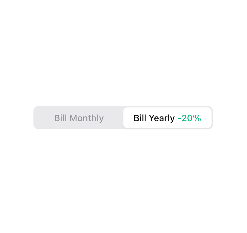
Enhanced shadcn/ui radio group
Built with React and Tailwind. Copy the prompt and paste it into Claude Code, Cursor or Lovable: your agent adds Radio Group to your project and fits it to your theme.
Code
How Radio Group is used: the demo's code. The component's own source comes with a free account.
Usage.tsx
"use client";

import { RadioGroup, RadioGroupItem } from "@/components/ui/radio-group";
import { useId, useState } from "react";

function Component() {
  const id = useId();
  const [selectedValue, setSelectedValue] = useState("on");

  return (
    <div className="inline-flex h-9 rounded-lg bg-input/50 p-0.5 max-w-[400px]">
      <RadioGroup
        value={selectedValue}
        onValueChange={setSelectedValue}
        className="group relative inline-grid grid-cols-[1fr_1fr] items-center gap-0 text-sm font-medium after:absolute after:inset-y-0 after:w-1/2 after:rounded-md after:bg-background after:shadow-sm after:shadow-black/5 after:outline-offset-2 after:transition-transform after:duration-300 after:[transition-timing-function:cubic-bezier(0.16,1,0.3,1)] has-[:focus-visible]:after:outline has-[:focus-visible]:after:outline-2 has-[:focus-visible]:after:outline-ring/70 data-[state=off]:after:translate-x-0 data-[state=on]:after:translate-x-full"
        data-state={selectedValue}
      >
        <label className="relative z-10 inline-flex h-full min-w-8 cursor-pointer select-none items-center justify-center whitespace-nowrap px-4 transition-colors group-data-[state=on]:text-muted-foreground/70">
          Bill Monthly
          <RadioGroupItem id={`${id}-1`} value="off" className="sr-only" />
        </label>
        <label className="relative z-10 inline-flex h-full min-w-8 cursor-pointer select-none items-center justify-center whitespace-nowrap px-4 transition-colors group-data-[state=off]:text-muted-foreground/70">
          <span>
            Bill Yearly{" "}
            <span className="transition-colors group-data-[state=off]:text-muted-foreground/70 group-data-[state=on]:text-emerald-500">
              -20%
            </span>
          </span>
          <RadioGroupItem id={`${id}-2`} value="on" className="sr-only" />
        </label>
      </RadioGroup>
    </div>
  );
}

export { Component };
Dependencies
More by Origin UI
View all
Dialog
1.2K
Avatar
951
useImageUpload
926
usePagination
622
Popover
384
Button
364
Command
321
Accordion
258
More in Pricing
View all
Pricing Section
582

Pricing Section
173

Pricing Card
365
pricing section
158

Pricing Cards
86
Colorful-Pricing
85
Glowing Pricing Tiers
45

RuixenPricing05
102


