About
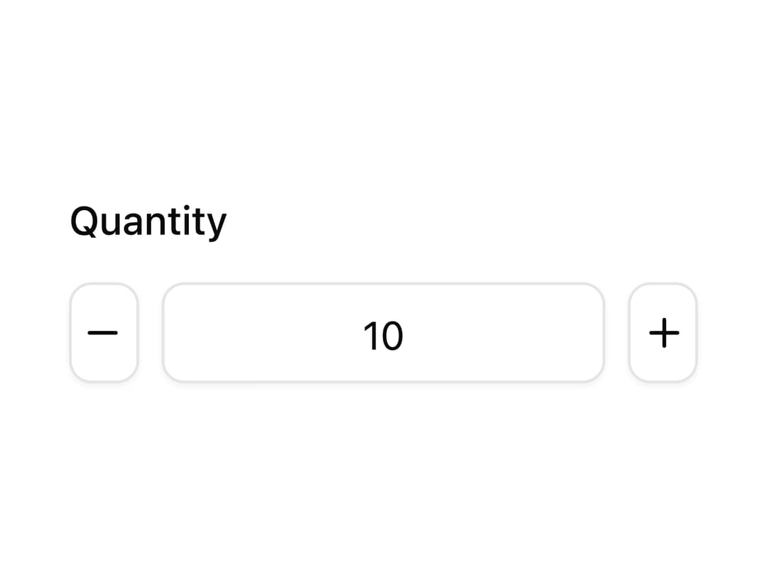
An accessible number input field with increment and decrement steppers, built on React Aria Components with shadcn styling.
Built with React and Tailwind. Copy the prompt and paste it into Claude Code, Cursor or Lovable: your agent adds Number Field to your project and fits it to your theme.
Code
How Number Field is used: the demo's code. The component's own source comes with a free account.
Usage.tsx
"use client";

import NumberField from "@/components/ui/oui-number-field";
import { Label, Input, Button, Group } from "react-aria-components";
import { Minus, Plus } from "lucide-react";

export default function Demo() {
  return (
    <NumberField defaultValue={10} minValue={0} className="w-56">
      <Label className="text-sm font-medium">Quantity</Label>
      <Group className="flex items-center gap-2">
        <Button
          slot="decrement"
          className="inline-flex size-9 items-center justify-center rounded-md border bg-background shadow-xs data-[hovered]:bg-accent"
        >
          <Minus className="size-4" />
        </Button>
        <Input className="h-9 w-full min-w-0 rounded-md border border-input bg-transparent px-3 py-1 text-center text-sm shadow-xs outline-none" />
        <Button
          slot="increment"
          className="inline-flex size-9 items-center justify-center rounded-md border bg-background shadow-xs data-[hovered]:bg-accent"
        >
          <Plus className="size-4" />
        </Button>
      </Group>
    </NumberField>
  );
}
Dependencies
More by oui
View all

Text Field
5
Text Area
4
Popover

Select
Keyboard
Dialog
More in Forms
View all

Premium Auth
500

Login 1
52
Authentication Card
47

Book A Demo 3
83
Book A Demo 1
69

Contact Card
1K

Login Card
32

Login 2
7
