About
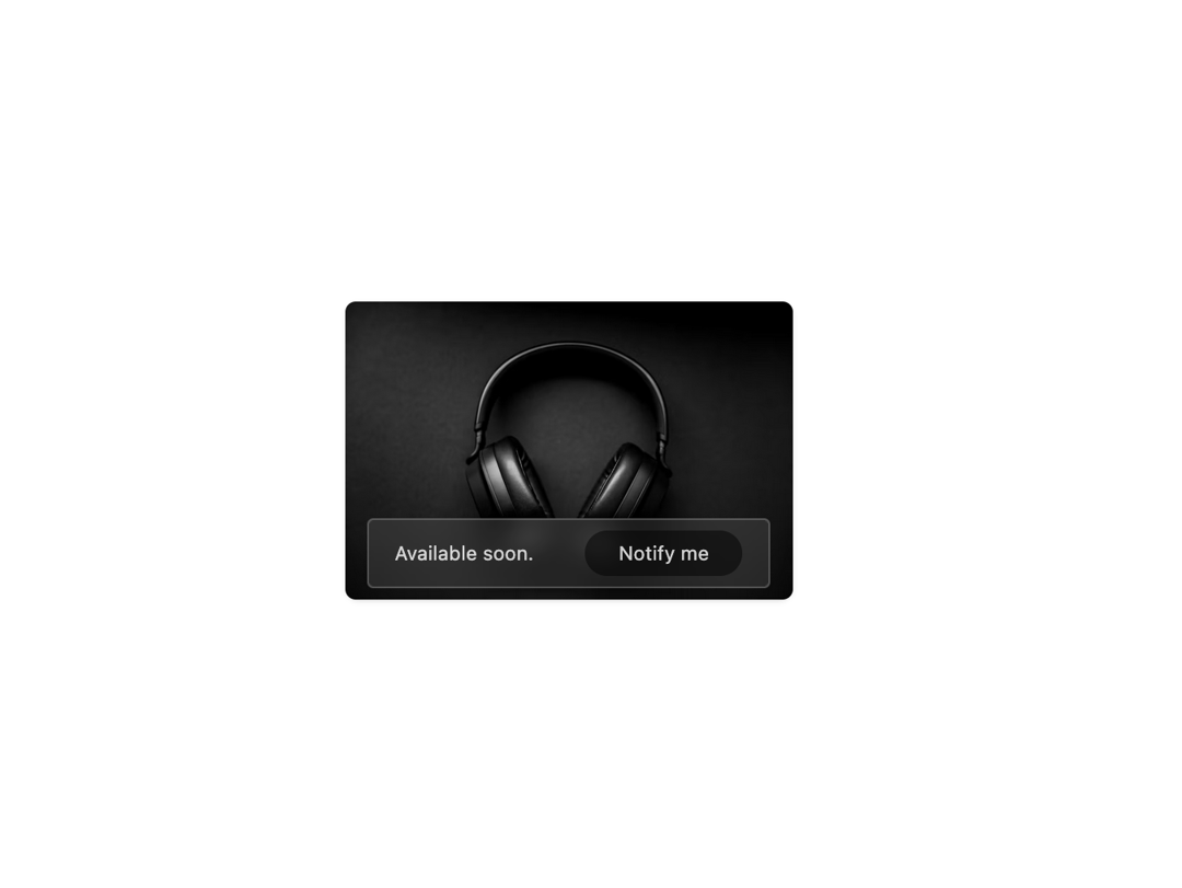
Here is Blog Card Component
Built with React and Tailwind. Copy the prompt and paste it into Claude Code, Cursor or Lovable: your agent adds Cards to your project and fits it to your theme.
Code
How Cards is used: the demo's code. The component's own source comes with a free account.
Usage.tsx
import React from "react";


export default function Example() {
    return (
        <div className="relative flex items-center justify-center text-sm text-white/80 rounded-lg shadow-sm max-w-80">
            <div className="absolute bottom-2 flex items-center justify-around backdrop-blur-sm w-full max-w-72 rounded bg-white/10 border border-white/20 py-2">
                <p className="text-center">Available soon.</p>
                <button type="button" className="bg-black/50 rounded-full px-6 py-1.5">Notify me</button>
            </div>
            <img className="rounded-md" src="https://cdn.21st.dev/assets/mirror/25/25f584062f55cce1ae49c8c6d6403cfc3ed50289dcee0cdbae0c31106d96547c.jpg" alt="" />
        </div>
    );
};More by prebuiltui
View all

Image Gallery
1.3K
Hero Section
412
Feature Sections
344
Testimonial
303
FAQ Sections
177
Form
136
Login Form
125
Pricing Cards
86
More in Cards
View all

Statistics Card 2
264

Course Design Cards
1.1K
Card
70
Stats cards with links
39
The Item one
3

Card Studio
7
Statistics Card 7
292

Item
10
