
About
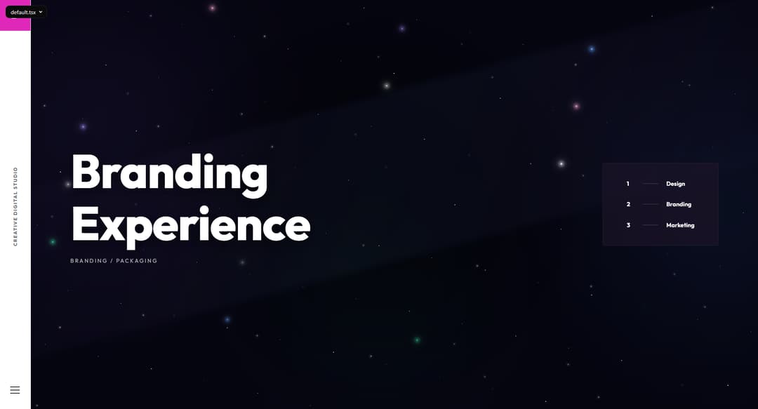
Pre-built, customizable hero section components for landing pages and websites — ready to drop into your project with minimal setup. Includes responsive layouts, headline/CTA variants, and image/illustration support.
Built with React and Tailwind. Copy the prompt and paste it into Claude Code, Cursor or Lovable: your agent adds Hero Component to your project and fits it to your theme.
Code
How Hero Component is used: the demo's code. The component's own source comes with a free account.
Usage.tsx
import BrandingHero from "@/components/ui/hero-component";

export default function Demo() {
  return <BrandingHero />;
}
More by Muhammad Asif
View all
Modern Login & Signup
1.3K
Apple Calendar Picker
576
Image Expansion
307
Apple Color Picker
124
Apple Emoji Picker
68
More in Heroes
View all

SaaS Template
2.4K
Centered Hero with Image Fan
930

Hero
1.2K

Responsive Hero Banner
2K

Minimalist Hero Fashion
285

Home Section
66

Hero Section 6
881
Hero Golden Spiral
101
