
About
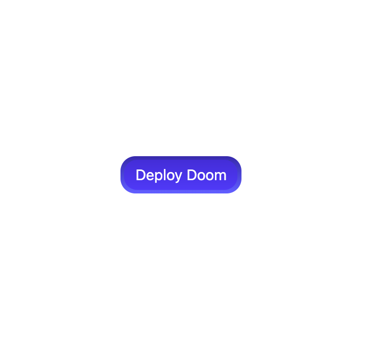
A glossy indigo button with a layered gradient bezel and an inner panel that sinks with an inset glow on press, giving a polished, candy-like depth. Theme-agnostic indigo finish.
Built with React and Tailwind. Copy the prompt and paste it into Claude Code, Cursor or Lovable: your agent adds Shiny Button to your project and fits it to your theme.
Code
How Shiny Button is used: the demo's code. The component's own source comes with a free account.
Usage.tsx
"use client";

import ShinyButton from "@/components/ui/shiny-button";

export default function Default() {
  return (
    <div className="flex min-h-screen w-full items-center justify-center bg-background p-12">
      <ShinyButton>Deploy Doom</ShinyButton>
    </div>
  );
}
More by jay sharma
View all

Live Orb
218
Chrome Button
182
Frame Button
132
Highlight Button
76
ASCII Fluid
73
Motion Button
59
Brutal Button
56
Shader Metal
49
More in Buttons
View all
Button Save
46

Button
20

Eclipse Button
5

Button
6

Button
14

Button Group
37

Button
32
Split Button
32

