
About
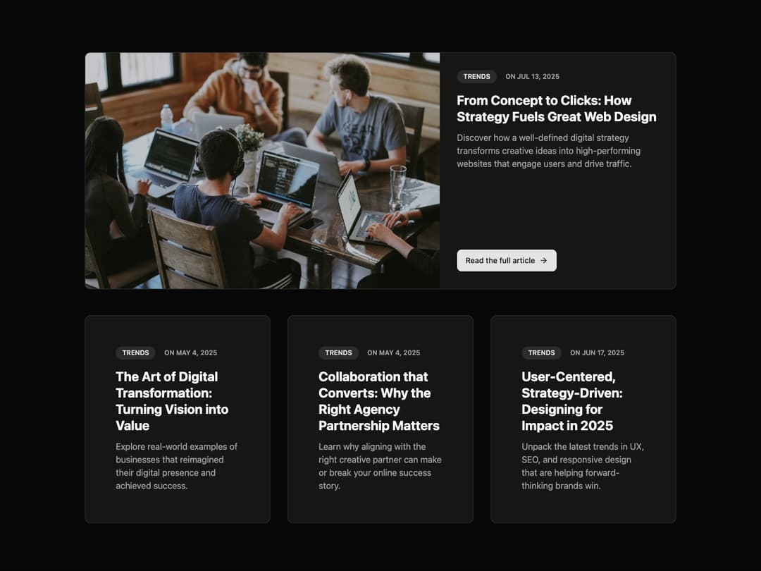
BlogPostCard This component is designed to display blog post information. It features two main variants: featured (large with an image) and default (compact, text-focused). It's responsive and theme-aware right out of the box.
Built with React and Tailwind. Copy the prompt and paste it into Claude Code, Cursor or Lovable: your agent adds Card to your project and fits it to your theme.
Code
How Card is used: the demo's code. The component's own source comes with a free account.
Usage.tsx
import { BlogPostCard } from '@/components/ui/card-18';
import { motion } from 'framer-motion';

// Mock data for blog posts
const posts = [
  {
    tag: 'Trends',
    date: 'ON MAY 4, 2025',
    title: 'The Art of Digital Transformation: Turning Vision into Value',
    description: 'Explore real-world examples of businesses that reimagined their digital presence and achieved success.',
    href: '#',
  },
  {
    tag: 'Trends',
    date: 'ON MAY 4, 2025',
    title: 'Collaboration that Converts: Why the Right Agency Partnership Matters',
    description: 'Learn why aligning with the right creative partner can make or break your online success story.',
    href: '#',
  },
  {
    tag: 'Trends',
    date: 'ON JUN 17, 2025',
    title: 'User-Centered, Strategy-Driven: Designing for Impact in 2025',
    description: 'Unpack the latest trends in UX, SEO, and responsive design that are helping forward-thinking brands win.',
    href: '#',
  },
];

const featuredPost = {
    tag: 'Trends',
    date: 'ON JUL 13, 2025',
    title: 'From Concept to Clicks: How Strategy Fuels Great Web Design',
    description: 'Discover how a well-defined digital strategy transforms creative ideas into high-performing websites that engage users and drive traffic.',
    href: '#',
    imageUrl: 'https://cdn.21st.dev/assets/mirror/03/03c7b1fa6166ecc3cfa69547197b6f0d6408819c8a99e9e1df1d0d593555fe61.jpg',
};

// Animation variants for the container to stagger children
const containerVariants = {
  hidden: {},
  visible: {
    transition: {
      staggerChildren: 0.15,
    },
  },
};

// Animation variants for child items
const itemVariants = {
  hidden: { opacity: 0, y: 20 },
  visible: {
    opacity: 1,
    y: 0,
    transition: {
      duration: 0.5,
      ease: 'easeOut',
    },
  },
};


export default function BlogPostCardDemo() {
  return (
    <div className="w-full max-w-6xl mx-auto p-4 md:p-8">
      {/* Featured Post */}
      <motion.div variants={itemVariants} initial="hidden" animate="visible" className="mb-8 md:mb-12">
        <BlogPostCard
          variant="featured"
          {...featuredPost}
        />
      </motion.div>

      {/* Grid of Default Posts */}
      <motion.div
        className="grid grid-cols-1 gap-8 md:grid-cols-2 lg:grid-cols-3"
        variants={containerVariants}
        initial="hidden"
        animate="visible"
      >
        {posts.map((post, index) => (
          <motion.div key={index} variants={itemVariants}>
            <BlogPostCard {...post} />
          </motion.div>
        ))}
      </motion.div>
    </div>
  );
}
Dependencies
More by Ravi Katiyar
View all

Animated Shader Hero
3.7K
Hero
3.1K
Circular Gallery
2.7K
Minimalist Hero
2.5K
Floating Icons Hero Section
1.9K
Glass Calendar
1.8K
Feature Carousel
1.7K
AI Image Generator Hero
1.4K
More in Cards
View all

Card
70
Statistics Card 2
262
Stats cards with links
39

Course Design Cards
1.1K

Card Studio
7
The Item one
3
Statistics Card 7
289

Card
17
