
About
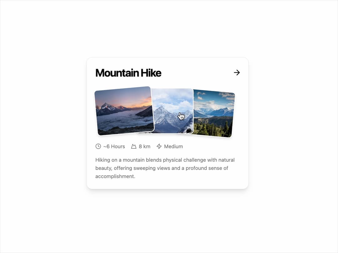
Activity Card – Showcase adventures. Engaging UI element to display activities with images, duration, distance, and difficulty. Perfect for travel, fitness, and experience booking apps.
Built with React and Tailwind. Copy the prompt and paste it into Claude Code, Cursor or Lovable: your agent adds Card to your project and fits it to your theme.
Code
How Card is used: the demo's code. The component's own source comes with a free account.
Usage.tsx
import { AnimatedHikeCard, Stat } from "@/components/ui/card-25";
import { Clock, Zap, Mountain } from "lucide-react";

export default function AnimatedHikeCardDemo() {
  // Sample props to demonstrate the component's reusability
  const hikeProps = {
    title: "Mountain Hike",
    images: [
      "https://cdn.21st.dev/assets/mirror/0b/0b9ef6fff23ee3255a419d5ad0e5c6610d9a4e54a3441136e15f01b255594567.jpg",
      "https://cdn.21st.dev/assets/mirror/fa/fa990e27e24f85bb298dbfac93c4d755bcf6114e42db1c4ed0c1facdfffe295d.jpg",
      "https://cdn.21st.dev/assets/mirror/b3/b38d5a16fdd42ba0ca83609e8270ed11388d73949585f7389c411d5476924579.jpg",
    ],
    stats: [
      {
        icon: <Clock className="h-4 w-4" />,
        label: "~6 Hours",
      },
      {
        icon: <Mountain className="h-4 w-4" />,
        label: "8 km",
      },
      {
        icon: <Zap className="h-4 w-4" />,
        label: "Medium",
      },
    ] as Stat[],
    description:
      "Hiking on a mountain blends physical challenge with natural beauty, offering sweeping views and a profound sense of accomplishment.",
    href: "#",
  };

  return (
    <div className="flex h-screen w-full items-center justify-center bg-background p-4">
      <AnimatedHikeCard {...hikeProps} />
    </div>
  );
}
Dependencies
More by Ravi Katiyar
View all

Animated Shader Hero
3.7K
Hero
3.1K
Circular Gallery
2.7K
Minimalist Hero
2.5K
Floating Icons Hero Section
1.9K
Glass Calendar
1.8K
Feature Carousel
1.7K
AI Image Generator Hero
1.4K
More in Cards
View all

Statistics Card 2
264

Course Design Cards
1.1K
Card
70
Stats cards with links
39
The Item one
3

Card Studio
7
Statistics Card 7
292

Item
10
