
About
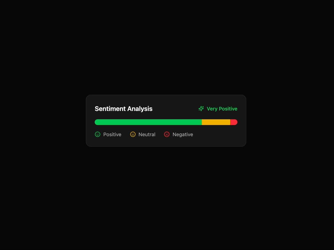
Sentiment Analysis Card A visually engaging card component to display sentiment analysis results with an animated, segmented progress bar. It's built to be fully reusable by accepting data through props.
Built with React and Tailwind. Copy the prompt and paste it into Claude Code, Cursor or Lovable: your agent adds Card to your project and fits it to your theme.
Code
How Card is used: the demo's code. The component's own source comes with a free account.
Usage.tsx
import { SentimentAnalysisCard, SentimentData } from '@/components/ui/card-9';
import { Smile, Meh, Frown, Sparkles } from 'lucide-react'; // Using lucide-react for icons

// Main demo component
const SentimentAnalysisCardDemo = () => {
  // Sample data to be passed to the component via props
  const sentimentData: SentimentData[] = [
    {
      label: 'Positive',
      value: 75,
      color: 'bg-green-500',
      icon: <Smile className="h-4 w-4 text-green-500" />,
    },
    {
      label: 'Neutral',
      value: 20,
      color: 'bg-yellow-500',
      icon: <Meh className="h-4 w-4 text-yellow-500" />,
    },
    {
      label: 'Negative',
      value: 5,
      color: 'bg-red-500',
      icon: <Frown className="h-4 w-4 text-red-500" />,
    },
  ];

  return (
    <div className="flex h-full w-full items-center justify-center bg-background p-4">
      <SentimentAnalysisCard
        title="Sentiment Analysis"
        overallSentiment="Very Positive"
        overallSentimentIcon={<Sparkles className="h-4 w-4 text-green-500" />}
        data={sentimentData}
      />
    </div>
  );
};

export default SentimentAnalysisCardDemo;
Dependencies
More by Ravi Katiyar
View all

Animated Shader Hero
3.7K
Hero
3.1K
Circular Gallery
2.7K
Minimalist Hero
2.5K
Floating Icons Hero Section
1.9K
Glass Calendar
1.8K
Feature Carousel
1.7K
AI Image Generator Hero
1.4K
More in Cards
View all

Statistics Card 2
264

Course Design Cards
1.1K
Card
70
Stats cards with links
39
The Item one
3

Card Studio
7
Statistics Card 7
292

Item
10
