
About
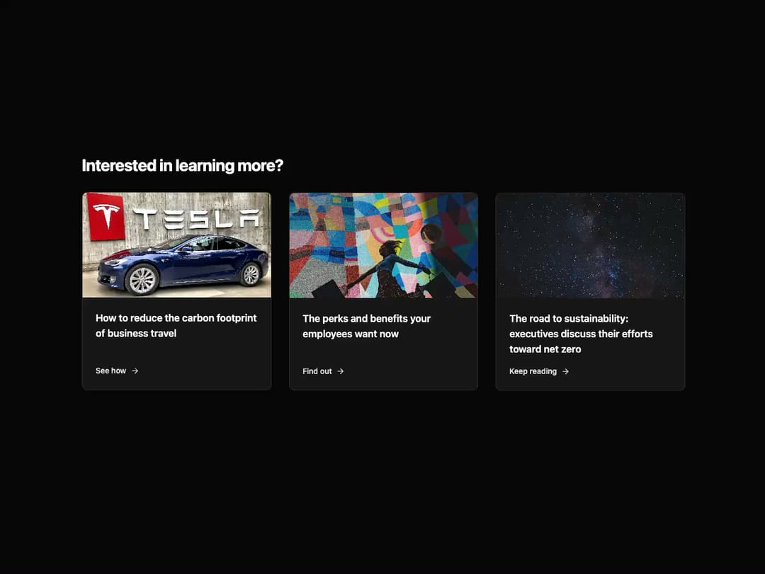
Article Card Grid This component displays a title and a responsive grid of article cards. It's designed to be easily populated with data via props, making it highly reusable for different sections of your application, such as blog post listings, feature showcases, or resource centers.
Built with React and Tailwind. Copy the prompt and paste it into Claude Code, Cursor or Lovable: your agent adds Card Grid to your project and fits it to your theme.
Code
How Card Grid is used: the demo's code. The component's own source comes with a free account.
Usage.tsx
import React from 'react';
import { ArticleCardGrid } from '@/components/ui/card-grid'; // Adjust the import path as needed

const ArticleCardGridDemo = () => {
  // Sample data for the article cards
  const articles = [
    {
      id: 1,
      imageSrc: 'https://cdn.21st.dev/assets/mirror/01/018551b29fd418d21297adfd4bce7264094e0a8c035b1410b559e2ca43c47dac.jpg',
      title: 'How to reduce the carbon footprint of business travel',
      linkText: 'See how',
      linkHref: '#',
    },
    {
      id: 2,
      imageSrc: 'https://cdn.21st.dev/assets/mirror/d8/d853679affe99c59ca7a6c562d4dc04c48cf114813272787171e5e5b1324b8ad.jpg',
      title: 'The perks and benefits your employees want now',
      linkText: 'Find out',
      linkHref: '#',
    },
    {
      id: 3,
      imageSrc: 'https://cdn.21st.dev/assets/mirror/dd/dd9ff83a61f8fc04c30f637608c7d1ab827e8893815894fcdbac74a44888b625.jpg',
      title: 'The road to sustainability: executives discuss their efforts toward net zero',
      linkText: 'Keep reading',
      linkHref: '#',
    },
  ];

  return (
    <div className="flex items-center justify-center w-full bg-background">
      <ArticleCardGrid title="Interested in learning more?" articles={articles} />
    </div>
  );
};

export default ArticleCardGridDemo;
Dependencies
More by Ravi Katiyar
View all

Animated Shader Hero
3.7K
Hero
3.1K
Circular Gallery
2.7K
Minimalist Hero
2.5K
Floating Icons Hero Section
1.8K
Glass Calendar
1.8K
Feature Carousel
1.7K
AI Image Generator Hero
1.4K
More in Cards
View all

Course Design Cards
1.1K
Stats cards with links
79

Statistics Card 2
259
Card
56

Card Studio
9
The Item one
3
Statistics Card 7
289

Weather Card
54
