
About
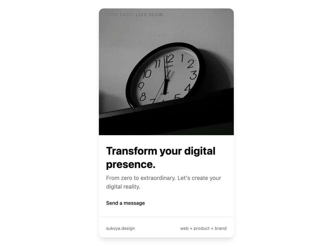
Animated Presence Card Description: A visually striking card component designed to showcase a primary message or product. It features a prominent image, clear typography, and an interactive 3D tilt effect on mouse hover, powered by framer-motion. The component is fully responsive and uses shadcn/ui theme variables for seamless light and dark mode integration.
Built with React and Tailwind. Copy the prompt and paste it into Claude Code, Cursor or Lovable: your agent adds Presence Card to your project and fits it to your theme.
Code
How Presence Card is used: the demo's code. The component's own source comes with a free account.
Usage.tsx
// demo.tsx

import { AnimatedPresenceCard } from '@/components/ui/presence-card';

export default function AnimatedPresenceCardDemo() {
  return (
    <div className="flex h-screen w-full items-center justify-center bg-background p-4">
      <AnimatedPresenceCard
        topText="Work fast. Live slow."
        imageUrl="https://cdn.21st.dev/assets/mirror/97/9710815e63969519a93332872bf423d60aef89e29daf60fca28a7a112bde688c.jpg"
        title="Transform your digital presence."
        description="From zero to extraordinary. Let's create your digital reality."
        buttonText="Send a message"
        buttonHref="#"
        footerLeft="sukoya.design"
        footerRight="web + product + brand"
      />
    </div>
  );
}
Dependencies
More by Ravi Katiyar
View all

Animated Shader Hero
3.7K
Hero
3.1K
Circular Gallery
2.7K
Minimalist Hero
2.5K
Floating Icons Hero Section
1.8K
Glass Calendar
1.8K
Feature Carousel
1.7K
AI Image Generator Hero
1.4K
More in Cards
View all

Course Design Cards
1.1K
Stats cards with links
79

Statistics Card 2
259
Card
56

Card Studio
9
The Item one
3
Statistics Card 7
289

Weather Card
54
