
About
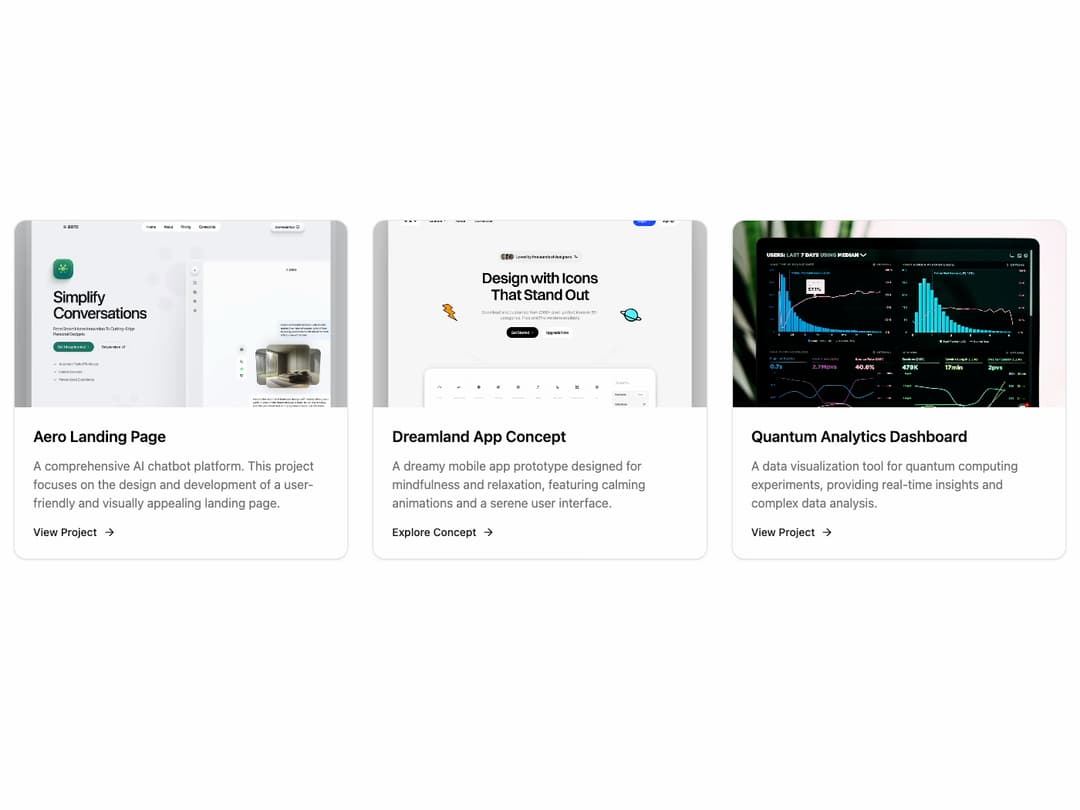
A visually appealing card component designed to showcase projects. It features a hover-to-zoom image effect, a clear content section, and a call-to-action link, all while adapting to both light and dark themes using shadcn's CSS variables.
Built with React and Tailwind. Copy the prompt and paste it into Claude Code, Cursor or Lovable: your agent adds Project Card to your project and fits it to your theme.
Code
How Project Card is used: the demo's code. The component's own source comes with a free account.
Usage.tsx
import { ProjectCard } from "@/components/ui/project-card";

export default function ProjectCardDemo() {
  return (
    <div className="grid grid-cols-1 gap-8 p-8 md:grid-cols-2 lg:grid-cols-3">
      <ProjectCard
        title="Aero Landing Page"
        description="A comprehensive AI chatbot platform. This project focuses on the design and development of a user-friendly and visually appealing landing page."
        imgSrc="https://cdn.21st.dev/assets/mirror/68/683949ac7c0e47277edf08144b47c7da19ab3dc05e33a1eee89ff02a9c6129e7.jpg"
        link="#"
      />
      <ProjectCard
        title="Dreamland App Concept"
        description="A dreamy mobile app prototype designed for mindfulness and relaxation, featuring calming animations and a serene user interface."
        imgSrc="https://cdn.21st.dev/assets/mirror/22/22f929e70c1742491b80a3ebf9922aab4e588b38b7fd70569ca64e0d96cd52f7.jpg"
        link="#"
        linkText="Explore Concept"
      />
       <ProjectCard
        title="Quantum Analytics Dashboard"
        description="A data visualization tool for quantum computing experiments, providing real-time insights and complex data analysis."
        imgSrc="https://cdn.21st.dev/assets/mirror/2b/2bc4b1033d895687392e259e99def817bfb7892c9f85216f7ccb3ccb66056ccd.jpg"
        link="#"
      />
    </div>
  );
}
Dependencies
More by Ravi Katiyar
View all

Animated Shader Hero
3.7K
Hero
3.1K
Circular Gallery
2.7K
Minimalist Hero
2.5K
Floating Icons Hero Section
1.8K
Glass Calendar
1.8K
Feature Carousel
1.7K
AI Image Generator Hero
1.4K
More in Cards
View all

Course Design Cards
1.1K
Stats cards with links
79

Statistics Card 2
259
Card
56

Card Studio
9
The Item one
3
Statistics Card 7
289

Weather Card
54
