
About
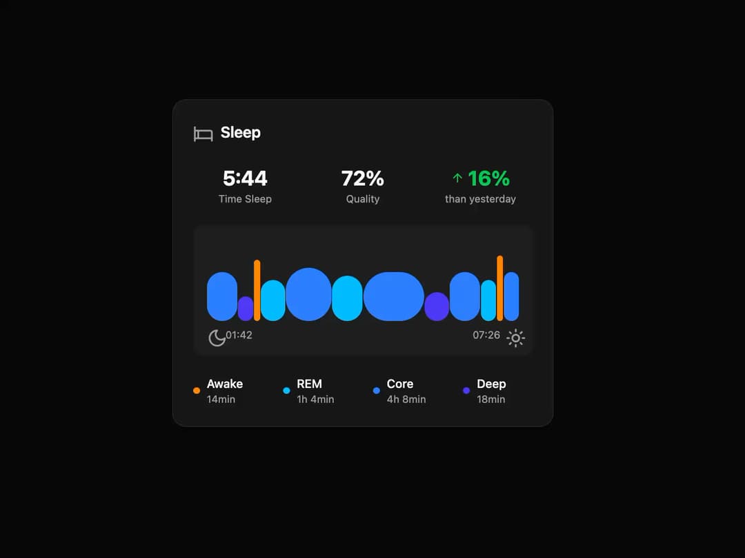
Sleep Tracker Card A visually polished card component for displaying sleep analysis data, including key statistics, an animated sleep-stage graph, and a detailed breakdown of sleep cycles.
Built with React and Tailwind. Copy the prompt and paste it into Claude Code, Cursor or Lovable: your agent adds Sleep Tracker Card to your project and fits it to your theme.
Code
How Sleep Tracker Card is used: the demo's code. The component's own source comes with a free account.
Usage.tsx
// demo.tsx
import {
  SleepTrackerCard,
  type SleepData,
} from "@/components/ui/sleep-tracker-card";
import { Bed, Moon, Sun, ArrowUp } from "lucide-react";
import { cn } from "@/lib/utils"; // Corrected: Added this import

// Icon wrapper for consistent styling
const Icon = ({ children, className }: { children: React.ReactNode, className?: string }) => (
  <div className={cn("h-5 w-5 text-muted-foreground", className)}>{children}</div>
);

// Sample data to populate the component
const sleepData: SleepData = {
  timeSlept: "5:44",
  quality: 72,
  changePercent: 16,
  startTime: "01:42",
  endTime: "07:26",
  stages: {
    Awake: "14min",
    REM: "1h 4min",
    Core: "4h 8min",
    Deep: "18min",
  },
  // This data simulates the visual graph from the image
  graphData: [
    { stage: "Core", duration: 10, height: 60 },
    { stage: "Deep", duration: 5, height: 30 },
    { stage: "Awake", duration: 2, height: 75 },
    { stage: "REM", duration: 8, height: 50 },
    { stage: "Core", duration: 15, height: 65 },
    { stage: "REM", duration: 10, height: 55 },
    { stage: "Core", duration: 20, height: 60 },
    { stage: "Deep", duration: 8, height: 35 },
    { stage: "Core", duration: 10, height: 60 },
    { stage: "REM", duration: 5, height: 50 },
    { stage: "Awake", duration: 2, height: 80 },
    { stage: "Core", duration: 5, height: 60 },
  ],
};

// Icons object to be passed as a prop
const cardIcons = {
  sleep: <Icon><Bed /></Icon>,
  moon: <Icon className="h-4 w-4"><Moon /></Icon>,
  sun: <Icon className="h-4 w-4"><Sun /></Icon>,
  arrowUp: <ArrowUp className="h-4 w-4" />,
};

// The demo component
export default function SleepTrackerCardDemo() {
  return (
    <div className="flex h-full w-full items-center justify-center bg-background p-4">
      <SleepTrackerCard data={sleepData} icons={cardIcons} />
    </div>
  );
}
Dependencies
More by Ravi Katiyar
View all

Animated Shader Hero
3.7K
Hero
3.1K
Circular Gallery
2.7K
Minimalist Hero
2.5K
Floating Icons Hero Section
1.9K
Glass Calendar
1.8K
Feature Carousel
1.7K
AI Image Generator Hero
1.4K
More in Cards
View all

Statistics Card 2
264

Course Design Cards
1.1K
Card
70
Stats cards with links
39
The Item one
3

Card Studio
7
Statistics Card 7
292

Item
10
