
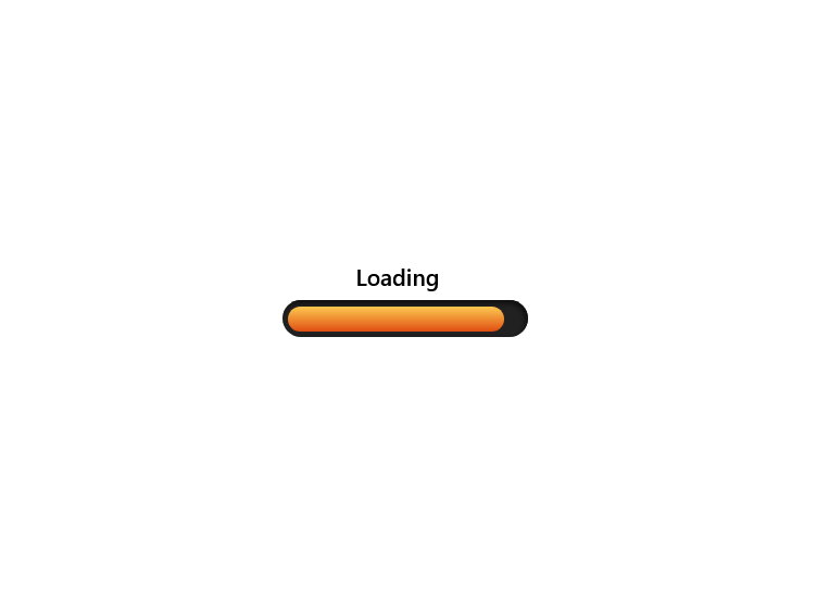
This LoaderProgressiveBar component is a visually appealing radar-style loading animation built using React and styled with Tailwind CSS. It creates a circular radar effect with concentric rings and a rotating scanning beam to simulate a real radar sweep. The animation is powered by CSS keyframes that rotate the beam continuously in a 360-degree loop, giving users a dynamic and modern loading indicator. Its clean and lightweight design makes it perfect for dashboards, data-heavy applications, or any interface that requires an engaging loading state while maintaining good performance and responsiveness.
Built with React and Tailwind. Copy the prompt and paste it into Claude Code, Cursor or Lovable: your agent adds LoaderProgressiveBar to your project and fits it to your theme.
Code
How LoaderProgressiveBar is used: the demo's code. The component's own source comes with a free account.
Usage.tsx
import LoaderProgressiveBar from "@/components/ui/loader-progressive-bar";

export default function DemoOne() {
  return <LoaderProgressiveBar />;
}
More by ruhith
View all
LoadingLines
145
Health Stat Card
138
LoadingRadar
119
LoadingBottle
114
BarLoader
90
Loader
71
BouncingCirclesLoader
50
LoaderGrid
42