
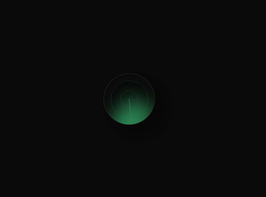
The LoadingRadar component is a sleek radar-style loading animation built with React, TypeScript, and Tailwind CSS. It creates a circular scanner effect that continuously rotates, resembling a radar sweep. The outer container is a large dark-bordered circle with inset shadows that give it a 3-D depth. Inside it, there’s a smaller dashed ring and a central dashed circle to mimic radar grid lines. The rotating “sweep” is made using a half-circle span with a glowing green blur and drop-shadow to create a smooth scanning beam. The animation is handled using a custom keyframe named radar81, which spins the sweep 360 degrees every two seconds. This component is entirely responsive, requires no external libraries other than Tailwind, and adds a visually appealing loader for dashboards, analytics pages, or any data-intensive UI where a radar-like loading effect is desired.
Built with React and Tailwind. Copy the prompt and paste it into Claude Code, Cursor or Lovable: your agent adds LoadingRadar to your project and fits it to your theme.
Code
How LoadingRadar is used: the demo's code. The component's own source comes with a free account.
Usage.tsx
import LoadingRadar from "@/components/ui/loading-radar";

export default function DemoOne() {
  return <LoadingRadar />;
}
More by ruhith
View all
LoadingLines
145
Health Stat Card
138
LoadingBottle
114
BarLoader
90
Loader
71
BouncingCirclesLoader
50
LoaderProgressiveBar
49
LoaderGrid
42