
About
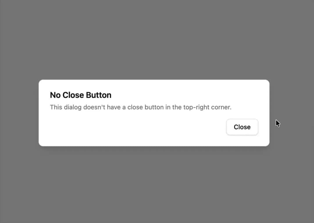
A modal dialog that hides the default top-right close icon and relies on explicit footer buttons to confirm or dismiss it.
Built with React and Tailwind. Copy the prompt and paste it into Claude Code, Cursor or Lovable: your agent adds Dialog Without Close Button to your project and fits it to your theme.
Code
How Dialog Without Close Button is used: the demo's code. The component's own source comes with a free account.
Usage.tsx
import Component from "@/components/ui/c-dialog-4";

export default function DialogNoCloseButtonDemo() {
  return <Component />;
}
More by Sean Hello
View all

3D Testimonails
3.3K
Line Charts 9
637
Alert
492
Area Charts 1
385
Line Charts 6
384
Scroll Area
376
Area Charts 2
317
Navigation Menu
305
More in Buttons
View all
Button
14
Button
34
Texture Button
92
Button Save
46

Button
64

Button Group
3

App Store Button
454

Notification Button
103

