
About
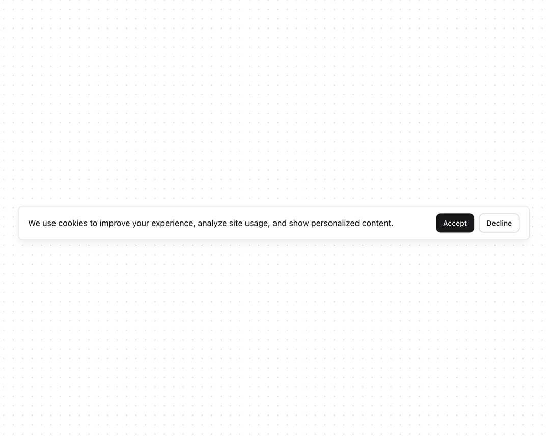
Banner alert inspired by shadcn/ui format
Built with React and Tailwind. Copy the prompt and paste it into Claude Code, Cursor or Lovable: your agent adds Banner to your project and fits it to your theme.
Code
How Banner is used: the demo's code. The component's own source comes with a free account.
Usage.tsx
import { Banner } from "@/components/ui/banner"
import { Button } from "@/components/ui/button"

function BannerCookie() {
  return (
    <Banner rounded="default" className="shadow-lg shadow-black/5">
      <div className="w-full">
        <div className="flex flex-col justify-between gap-3 md:flex-row md:items-center">
          <p className="text-sm">
            We use cookies to improve your experience, analyze site usage, and show personalized content.
          </p>
          <div className="flex shrink-0 gap-2 max-md:flex-wrap">
            <Button size="sm">Accept</Button>
            <Button variant="outline" size="sm">Decline</Button>
          </div>
        </div>
      </div>
    </Banner>
  )
}

export { BannerCookie }
Dependencies
More by Serafim
View all
Spline Scene
9.5K
Testimonials with Marquee
2.3K
Gradient Button
1.9K
Pixel Canvas
900
Animated Blur Number
830
Empty State
775
Balloons
755
Status Badge
646
More in Buttons
View all

Button
14
Button
34
Texture Button
92
Button Save
46

Button
64

Button Group
3

App Store Button
454

Notification Button
103

