
About
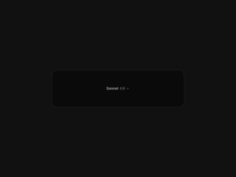
Standalone model picker pill button with built-in popover. Renders model name + version split (e.g. Sonnet 4.6). Supports controlled and uncontrolled modes. Self-contained port from 21st.dev Agent Elements.
Built with React and Tailwind. Copy the prompt and paste it into Claude Code, Cursor or Lovable: your agent adds Model Picker to your project and fits it to your theme.
Code
How Model Picker is used: the demo's code. The component's own source comes with a free account.
Usage.tsx
import { ModelPicker, type ModelOption } from "@/components/ui/model-picker";

const models: ModelOption[] = [
  { id: "sonnet-4-6", name: "Sonnet", version: "4.6" },
  { id: "opus-4-7", name: "Opus", version: "4.7" },
  { id: "haiku-4-5", name: "Haiku", version: "4.5" },
];

export default function Demo() {
  return (
    <div className="flex items-center justify-center w-full min-h-screen bg-background p-8 overflow-hidden">
      <div className="rounded-2xl border border-neutral-200 dark:border-neutral-800 bg-neutral-50 dark:bg-neutral-950 p-12 w-full max-w-md flex items-center justify-center">
        <ModelPicker models={models} defaultValue="sonnet-4-6" />
      </div>
    </div>
  );
}
Dependencies
More by 21st
View all
Spline Scene
9.5K
Testimonials with Marquee
2.3K
Gradient Button
1.9K
Pixel Canvas
900
Animated Blur Number
830
Empty State
775
Balloons
755
Status Badge
646

More in AI chats
View all

AI Actions
319
Agent Chat
17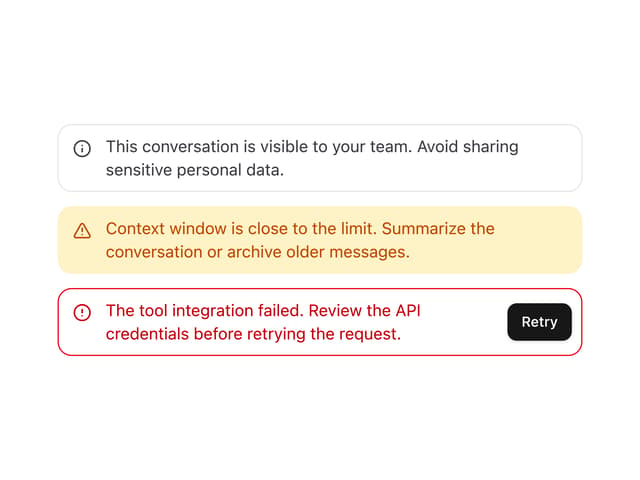

System Message
54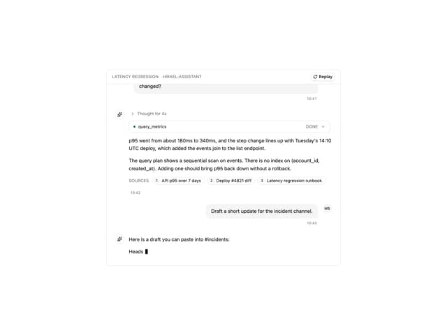
Message Thread
35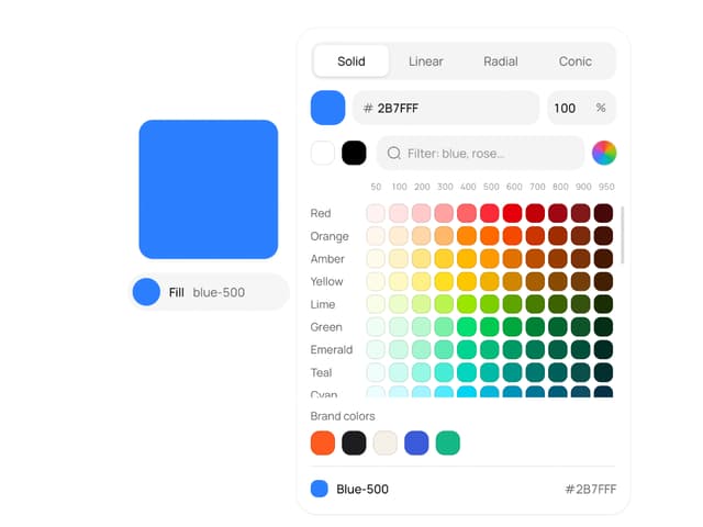
Color Picker
81

AI Task List
160

Modal Card
101
Quota Banner
21

