About
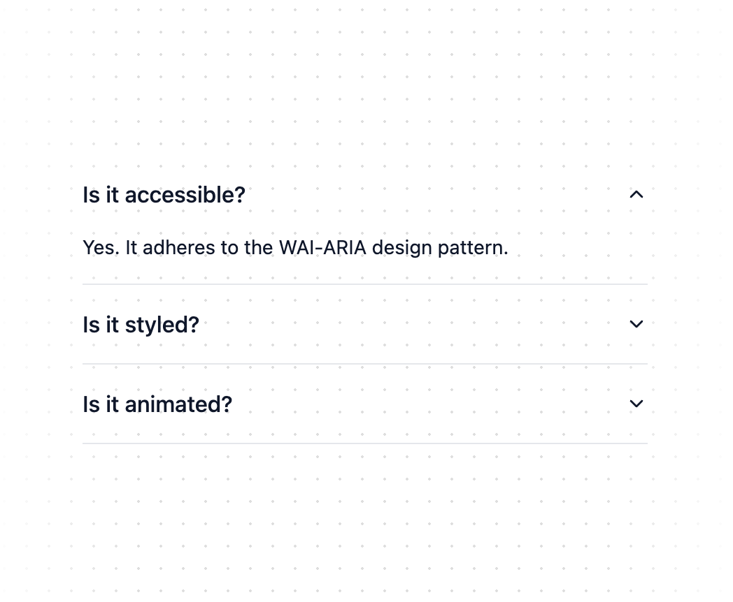
A vertically stacked set of interactive headings that each reveal a section of content.
Built with React and Tailwind. Copy the prompt and paste it into Claude Code, Cursor or Lovable: your agent adds Accordion to your project and fits it to your theme.
Code
How Accordion is used: the demo's code. The component's own source comes with a free account.
Usage.tsx
import {
Accordion,
AccordionContent,
AccordionItem,
AccordionTrigger,
} from "@/components/ui/accordion"
export function AccordionDemo() {
return (
<Accordion type="single" collapsible className="w-full">
<AccordionItem value="item-1">
<AccordionTrigger>Is it accessible?</AccordionTrigger>
<AccordionContent>
Yes. It adheres to the WAI-ARIA design pattern.
</AccordionContent>
</AccordionItem>
<AccordionItem value="item-2">
<AccordionTrigger>Is it styled?</AccordionTrigger>
<AccordionContent>
Yes. It comes with default styles that matches the other
components' aesthetic.
</AccordionContent>
</AccordionItem>
<AccordionItem value="item-3">
<AccordionTrigger>Is it animated?</AccordionTrigger>
<AccordionContent>
Yes. It's animated by default, but you can disable it if you
prefer.
</AccordionContent>
</AccordionItem>
</Accordion>
)
}
Dependencies
More by shadcn
View all

Navigation menu
771
Calendar with time pressets
504
Sidebar
339
Sonner
231
Chart
216
Icons
178
Dropdown Menu
150
Calendar with event slots
116