
About
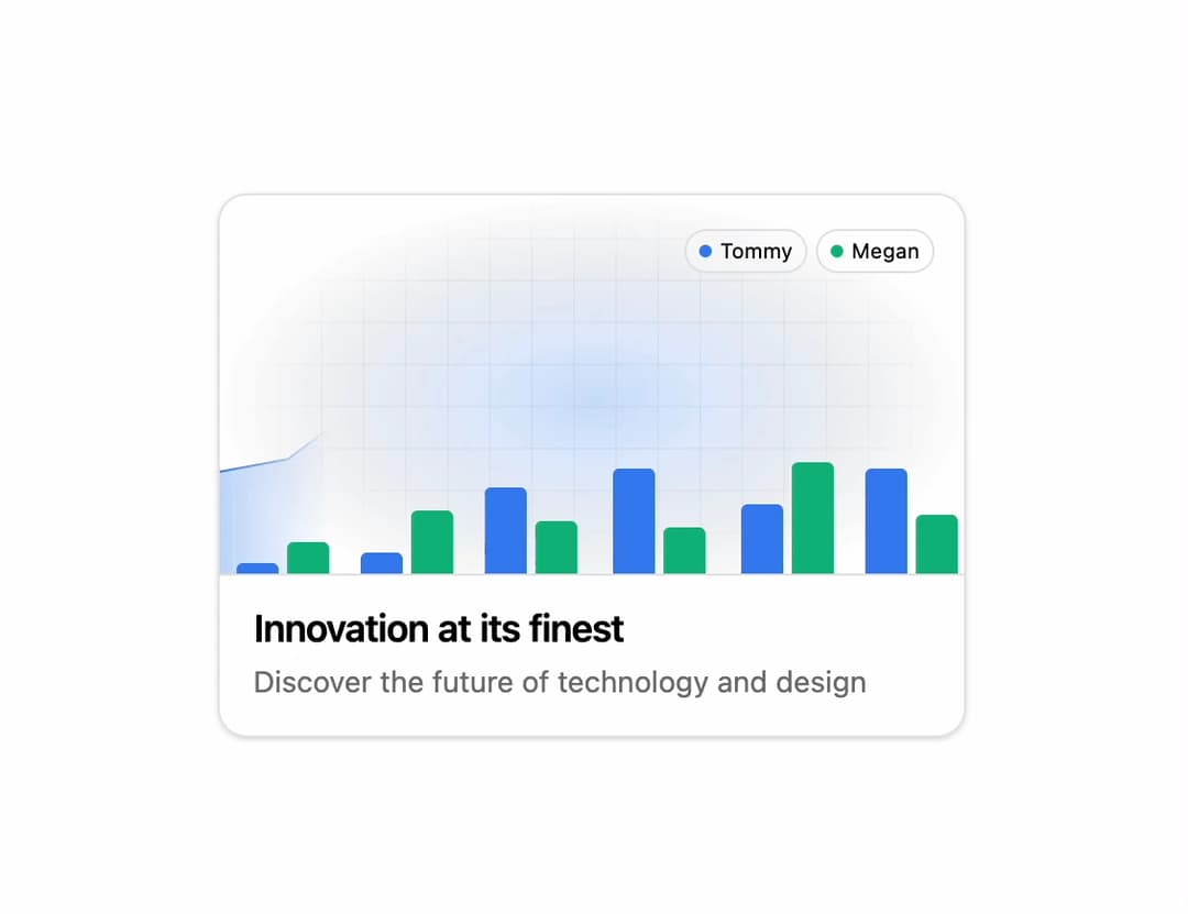
An animated hover card that can showcase almost anything—it all comes down to the caption you choose.
Built with React and Tailwind. Copy the prompt and paste it into Claude Code, Cursor or Lovable: your agent adds Animated Feature Card to your project and fits it to your theme.
Code
How Animated Feature Card is used: the demo's code. The component's own source comes with a free account.
Usage.tsx
"use client";

import {
  AnimatedCard,
  CardVisual,
  CardBody,
  CardTitle,
  CardDescription,
} from "@/components/ui/animated-card-1";


interface Visual1Props {
  mainColor?: string;
  secondaryColor?: string;
  gridColor?: string;
}

function Visual1({
  mainColor = "#8b5cf6",
  secondaryColor = "#fbbf24",
  gridColor = "#80808015",
}: Visual1Props) {
  return (
    <div
      aria-hidden
      className="h-full w-full rounded-t-lg relative overflow-hidden"
    >
      <Layer1 color={mainColor} secondaryColor={secondaryColor} />
      <Layer2 color={mainColor} />
      <Layer3 color={mainColor} secondaryColor={secondaryColor} />
      <Layer4 />
      <EllipseGradient color={mainColor} />
      <GridLayer color={gridColor} />
    </div>
  );
}

interface GridLayerProps {
  color: string;
}

const GridLayer = ({ color }: GridLayerProps) => {
  return (
    <div
      style={
        {
          "--grid-color": color,
        } as React.CSSProperties
      }
      className="absolute z-[4] inset-0 h-full w-full bg-transparent bg-[linear-gradient(to_right,var(--grid-color)_1px,transparent_1px),linear-gradient(to_bottom,var(--grid-color)_1px,transparent_1px)] bg-[size:20px_20px] pointer-events-none bg-center [mask-image:radial-gradient(ellipse_50%_50%_at_50%_50%,#000_60%,transparent_100%)] opacity-70"
    />
  );
};

interface EllipseGradientProps {
  color: string;
}

const EllipseGradient = ({ color }: EllipseGradientProps) => {
  return (
    <div className="w-full h-full z-[5] absolute inset-0 flex items-center justify-center">
      <svg
        width="356"
        height="196"
        viewBox="0 0 356 180"
        fill="none"
        xmlns="http://www.w3.org/2000/svg"
      >
        <rect width="356" height="180" fill="url(#paint)" />
        <defs>
          <radialGradient
            id="paint"
            cx="0"
            cy="0"
            r="1"
            gradientUnits="userSpaceOnUse"
            gradientTransform="translate(178 98) rotate(90) scale(98 178)"
          >
            <stop stopColor={color} stopOpacity="0.25" />
            <stop offset="0.34" stopColor={color} stopOpacity="0.15" />
            <stop offset="1" stopOpacity="0" />
          </radialGradient>
        </defs>
      </svg>
    </div>
  );
};

interface LayerProps {
  color: string;
  secondaryColor?: string;
}

const Layer1 = ({ color, secondaryColor }: LayerProps) => {
  return (
    <div className="absolute top-0 left-0 transition-transform duration-500 ease-[cubic-bezier(0.6, 0.6, 0, 1)] transform group-hover/animated-card:translate-x-[-50%] z-[6]">
      <svg
        className="w-[712px]"
        viewBox="0 0 712 180"
        fill="none"
        xmlns="http://www.w3.org/2000/svg"
      >
        <path
          d="M8 178C8 176.343 9.34315 175 11 175H25C26.6569 175 28 176.343 28 178V196H8V178Z"
          fill={color}
        />
        <path
          d="M32 168C32 166.343 33.3431 165 35 165H49C50.6569 165 52 166.343 52 168V196H32V168Z"
          fill={secondaryColor}
        />
        <path
          d="M67 173C67 171.343 68.3431 170 70 170H84C85.6569 170 87 171.343 87 173V196H67V173Z"
          fill={color}
        />
        <path
          d="M91 153C91 151.343 92.3431 150 94 150H108C109.657 150 111 151.343 111 153V196H91V153Z"
          fill={secondaryColor}
        />
        <path
          d="M126 142C126 140.343 127.343 139 129 139H143C144.657 139 146 140.343 146 142V196H126V142Z"
          fill={color}
        />
        <path
          d="M150 158C150 156.343 151.343 155 153 155H167C168.657 155 170 156.343 170 158V196H150V158Z"
          fill={secondaryColor}
        />
        <path
          d="M187 133C187 131.343 188.343 130 190 130H204C205.657 130 207 131.343 207 133V196H187V133Z"
          fill={color}
        />
        <path
          d="M211 161C211 159.343 212.343 158 214 158H228C229.657 158 231 159.343 231 161V196H211V161Z"
          fill={secondaryColor}
        />
        <path
          d="M248 150C248 148.343 249.343 147 251 147H265C266.657 147 268 148.343 268 150V196H248V150Z"
          fill={color}
        />
        <path
          d="M272 130C272 128.343 273.343 127 275 127H289C290.657 127 292 128.343 292 130V196H272V130Z"
          fill={secondaryColor}
        />
        <path
          d="M307 133C307 131.343 308.343 130 310 130H324C325.657 130 327 131.343 327 133V196H307V133Z"
          fill={color}
        />
        <path
          d="M331 155C331 153.343 332.343 152 334 152H348C349.657 152 351 153.343 351 155V196H331V155Z"
          fill={secondaryColor}
        />
        <path
          d="M363 161C363 159.343 364.343 158 366 158H380C381.657 158 383 159.343 383 161V196H363V161Z"
          fill={color}
        />
        <path
          d="M387 144C387 142.343 388.343 141 390 141H404C405.657 141 407 142.343 407 144V196H387V144Z"
          fill={secondaryColor}
        />
        <path
          d="M423 126C423 124.343 424.343 123 426 123H440C441.657 123 443 124.343 443 126V196H423V126Z"
          fill={color}
        />
        <path
          d="M447 142C447 140.343 448.343 139 450 139H464C465.657 139 467 140.343 467 142V196H447V142Z"
          fill={secondaryColor}
        />
        <path
          d="M483 125.461C483 124.102 484.343 123 486 123H500C501.657 123 503 124.102 503 125.461V196H483V125.461Z"
          fill={color}
        />
        <path
          d="M507 137.507C507 136.122 508.343 135 510 135H524C525.657 135 527 136.122 527 137.507V196H507V137.507Z"
          fill={secondaryColor}
        />
        <path
          d="M543 108.212C543 106.438 544.343 105 546 105H560C561.657 105 563 106.438 563 108.212V196H543V108.212Z"
          fill={color}
        />
        <path
          d="M567 116.485C567 115.112 568.343 114 570 114H584C585.657 114 587 115.112 587 116.485V196H567V116.485Z"
          fill={secondaryColor}
        />
        <path
          d="M603 79.8333C603 78.2685 604.343 77 606 77H620C621.657 77 623 78.2685 623 79.8333V196H603V79.8333Z"
          fill={color}
        />
        <path
          d="M627 91.8919C627 90.2947 628.343 89 630 89H644C645.657 89 647 90.2947 647 91.8919V196H627V91.8919Z"
          fill={secondaryColor}
        />
        <path
          d="M661 66.7887C661 65.2485 662.343 64 664 64H678C679.657 64 681 65.2485 681 66.7887V196H661V66.7887Z"
          fill={color}
        />
        <path
          d="M685 55.7325C685 54.2233 686.343 53 688 53H702C703.657 53 705 54.2233 705 55.7325V196H685V55.7325Z"
          fill={secondaryColor}
        />
      </svg>
    </div>
  );
};

const Layer2 = ({ color }: LayerProps) => {
  return (
    <div className="w-[356px] h-full absolute top-0 left-[-1px]">
      <svg
        className="w-[356px] h-full"
        viewBox="0 0 356 180"
        fill="none"
        xmlns="http://www.w3.org/2000/svg"
      >
        <g clipPath="url(#clip0_25_384)">
          <path
            d="M1 131.5L33.5 125.5L64 102.5L93.5 118.5L124.5 90L154 100.5L183.5 76L207.5 92L244.5 51L274.5 60.5L307.5 46L334.5 28.5L356.5 1"
            stroke={color}
          />
          <path
            d="M33.5 125.5L1 131.5V197H356.5V1L335 28.5L306.5 46L274.5 60.5L244.5 51L207.5 92L183.5 76L154 100.5L124.5 90L93.5 118.5L64 102.5L33.5 125.5Z"
            fill={color}
            fillOpacity="0.3"
          />
        </g>
        <defs>
          <clipPath id="clip0_25_384">
            <rect width="356" height="180" fill="white" />
          </clipPath>
        </defs>
      </svg>
      <div className="bg-gradient-to-r from-transparent from-0% dark:to-black to-white to-15% absolute inset-0 transition-transform duration-500 ease-[cubic-bezier(0.6, 0.6, 0, 1)] transform group-hover/animated-card:translate-x-full z-[3]"></div>
    </div>
  );
};

const Layer3 = ({ color, secondaryColor }: LayerProps) => {
  return (
    <div
      className="absolute right-4 top-4 z-[8] flex items-center gap-1"
      style={
        {
          "--color": color,
          "--secondary-color": secondaryColor,
        } as React.CSSProperties & {
          "--color": string;
          "--secondary-color": string;
        }
      }
    >
      <div className="rounded-full flex items-center dark:bg-black/25 bg-white/25 backdrop-blur-sm py-0.5 px-1.5 shrink-0 transition-opacity duration-300 ease-in-out group-hover/animated-card:opacity-0 border dark:border-zinc-800 border-zinc-200">
        <div className="h-1.5 w-1.5 bg-[var(--color)] rounded-full " />
        <span className="text-[10px] ml-1 dark:text-white text-black">
          Tommy
        </span>
      </div>
      <div className="rounded-full flex items-center py-0.5 px-1.5 shrink-0 transition-opacity duration-300 ease-in-out group-hover/animated-card:opacity-0 dark:bg-black/25 bg-white/25 backdrop-blur-sm border dark:border-zinc-800 border-zinc-200 ">
        <div className="h-1.5 w-1.5 bg-[var(--secondary-color)] rounded-full " />
        <span className="text-[10px] ml-1 dark:text-white text-black">
          Megan
        </span>
      </div>
    </div>
  );
};

const Layer4 = () => {
  return (
    <div className="relative w-[356px] h-full group">
      <div className="bg-transparent absolute inset-0 max-w-[356px] -translate-y-full transition-transform duration-500 ease-[cubic-bezier(0.6, 0.6, 0, 1)] group-hover/animated-card:translate-y-0 z-[7] flex p-4 items-start justify-start">
        <div className="border dark:border-zinc-800 border-zinc-200 rounded-md p-1.5 backdrop-blur-sm opacity-0 transition-opacity duration-500 ease-[cubic-bezier(0.6, 0.6, 0, 1)] group-hover/animated-card:opacity-100 dark:bg-black/25 bg-white/25 ">
          <p className="dark:text-white text-black text-xs font-semibold mb-1">
            Random Data Visualization
          </p>
          <p className="text-neutral-500 dark:text-neutral-400 text-xs">
            Displaying some interesting stats.
          </p>
        </div>
      </div>
    </div>
  );
};


export default function AnimatedCardDemo() {
  return (
    <AnimatedCard>
      <CardVisual>
        <Visual1 mainColor="#3b82f6" secondaryColor="#10b981" />
      </CardVisual>
      <CardBody>
        <CardTitle>Innovation at its finest</CardTitle>
        <CardDescription>
          Discover the future of technology and design
        </CardDescription>
      </CardBody>
    </AnimatedCard>
  );
} More by SO called
View all

Developer Sign-In Flow
3.2K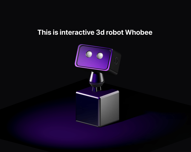
Interactive 3D Robot
2.1K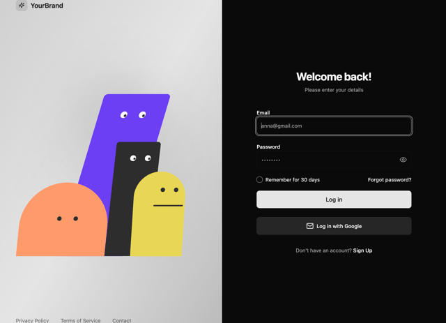
Animated Characters Login Page
1.6K
Interactive Galaxy Hero
1.4K
Product Mockup Section
1.4K
3D Boxes Hero
995
Expandable Content Card
990
AI Prompt Input
617
More in Cards
View all
Stats cards with links
120

Course Design Cards
1.1K

Statistics Card 2
259
Card
56

Card Studio
9
The Item one
3
Statistics Card 7
289

Weather Card
53
