
About
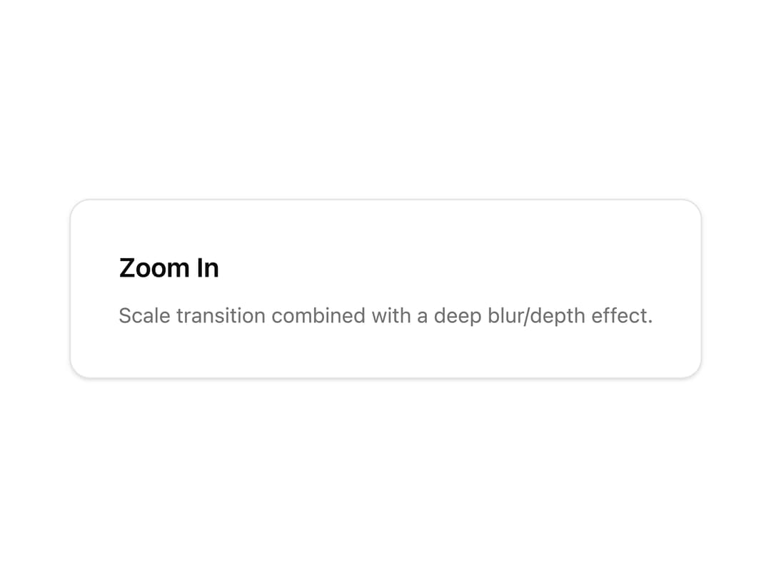
A wrapper component that animates its children in with a combined scale-up and blur-to-focus transition, useful for revealing hero content, cards, or images on mount.
Built with React and Tailwind. Copy the prompt and paste it into Claude Code, Cursor or Lovable: your agent adds Zoom In to your project and fits it to your theme.
Code
How Zoom In is used: the demo's code. The component's own source comes with a free account.
Usage.tsx
import { ZoomIn } from "@/components/ui/zoom-in";

export default function ZoomInDemo() {
  return (
    <div className="flex h-screen w-full items-center justify-center bg-background">
      <ZoomIn>
        <div className="rounded-xl border bg-card p-8 text-card-foreground shadow-sm">
          <h3 className="text-lg font-semibold">Zoom In</h3>
          <p className="mt-2 text-sm text-muted-foreground">
            Scale transition combined with a deep blur/depth effect.
          </p>
        </div>
      </ZoomIn>
    </div>
  );
}
Dependencies
More by Subhan Uddin
View all

Dither Donut Chart
75
Interactive 3D Card Carousel
58
Dither Growth Chart
25
Dots Ring
23
Waveform Loader
15
Page Transition
12
Bouncing Square
12
Intersecting Rings
11