About
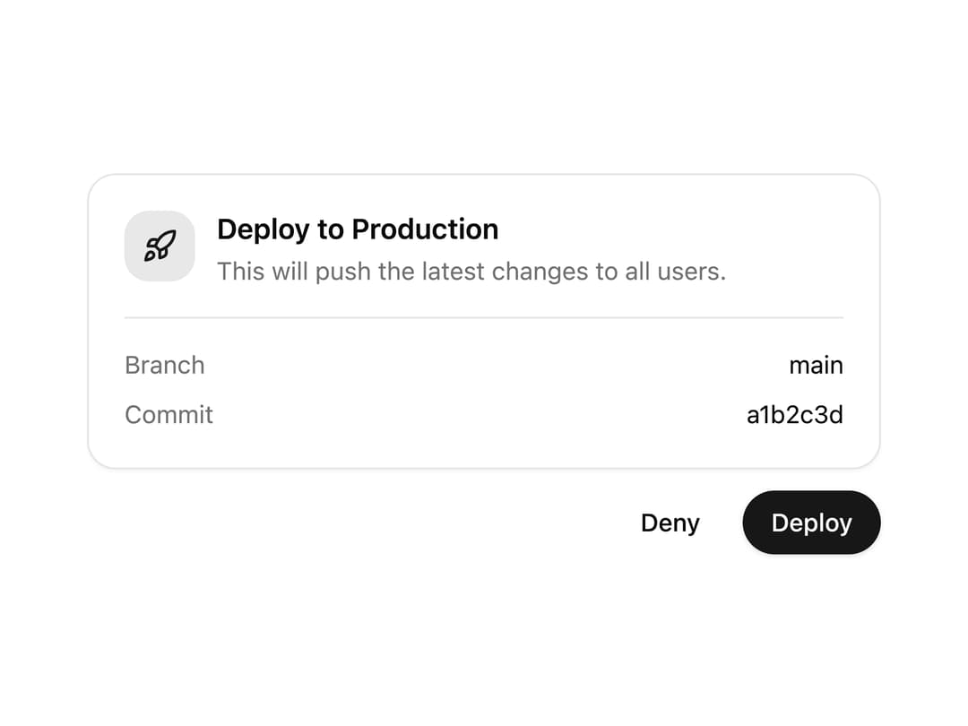
A confirmation card that asks a user to approve or deny a proposed action, showing context, metadata, and a compact read-only receipt once a decision is made.
Built with React and Tailwind. Copy the prompt and paste it into Claude Code, Cursor or Lovable: your agent adds Approval Card to your project and fits it to your theme.
Code
How Approval Card is used: the demo's code. The component's own source comes with a free account.
Usage.tsx
"use client";

import * as React from "react";
import { ApprovalCard } from "@/components/ui/approval-card";

export default function ApprovalCardDemo() {
  const [choice, setChoice] = React.useState<"approved" | "denied" | undefined>(
    undefined,
  );

  return (
    <div className="flex w-full items-center justify-center p-8">
      <ApprovalCard
        id="approval-card-deploy"
        title="Deploy to Production"
        description="This will push the latest changes to all users."
        icon="rocket"
        confirmLabel="Deploy"
        metadata={[
          { key: "Branch", value: "main" },
          { key: "Commit", value: "a1b2c3d" },
        ]}
        choice={choice}
        onConfirm={() => setChoice("approved")}
        onCancel={() => setChoice("denied")}
      />
    </div>
  );
}
Dependencies
More by tool-ui
View all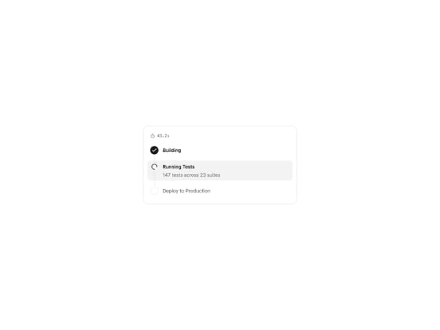
Progress Tracker
11
Message Draft
9
Citation
4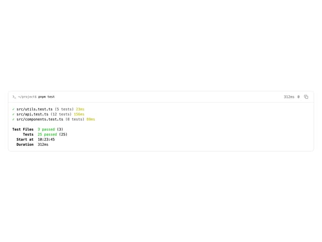
Terminal
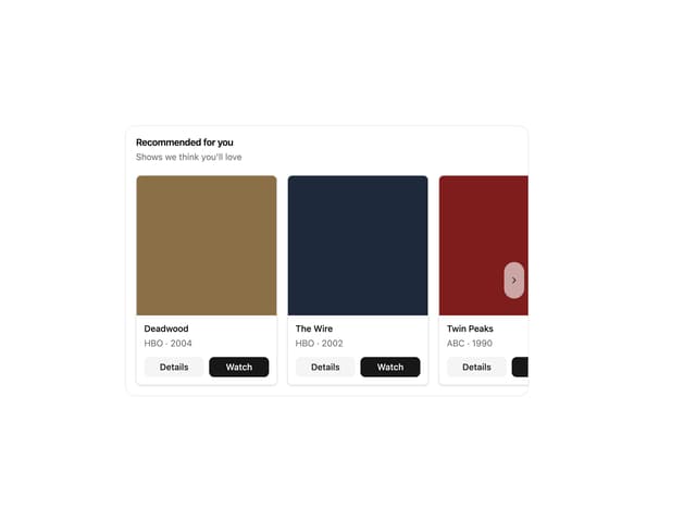
Item Carousel