
About
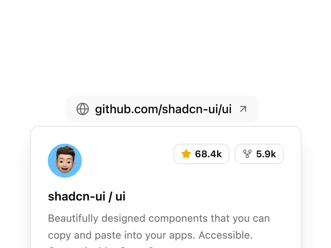
A link that reveals a rich preview card with an avatar, stats badges and a short description when hovered, similar to GitHub's repo link previews.
Built with React and Tailwind. Copy the prompt and paste it into Claude Code, Cursor or Lovable: your agent adds Hover Card Link Preview to your project and fits it to your theme.
Code
How Hover Card Link Preview is used: the demo's code. The component's own source comes with a free account.
Usage.tsx
import {
Avatar,
AvatarFallback,
AvatarImage,
} from "@/components/ui/hover-card-link-preview-utils/avatar";
import { Badge } from "@/components/ui/badge";
import {
HoverCard,
HoverCardContent,
HoverCardTrigger,
} from "@/components/ui/hover-card-link-preview-utils/hover-card";
import { ArrowUpRight, GitFork, Globe, Star } from "lucide-react";
export default function HoverCardLinkPreviewDemo() {
return (
<div className="flex items-center justify-center py-6">
<HoverCard defaultOpen>
<HoverCardTrigger
delay={200}
closeDelay={150}
render={
<a
href="https://github.com/shadcn-ui/ui"
target="_blank"
rel="noreferrer noopener"
className="group inline-flex items-center gap-1.5 rounded-lg bg-muted/60 px-3 py-1.5 text-sm font-medium text-foreground transition-colors hover:bg-primary/10 hover:text-primary"
/>
}
>
<Globe className="size-4 text-muted-foreground transition-colors group-hover:text-primary" />
<span className="underline-offset-4 group-hover:underline">
github.com/shadcn-ui/ui
</span>
<ArrowUpRight className="size-3.5 opacity-60 transition-transform duration-200 group-hover:translate-x-0.5 group-hover:-translate-y-0.5 group-hover:opacity-100" />
</HoverCardTrigger>
<HoverCardContent className="w-80 p-5 shadow-xl">
<div className="flex justify-between space-x-4">
<Avatar className="size-10 rounded-lg after:border-none">
<AvatarImage
src="https://cdn.21st.dev/assets/localized/1c076ea7a3864b2bd954edf44e9dbe45c8d893884da090bb4027af9e44166116.jpg"
alt="shadcn avatar"
/>
<AvatarFallback className="rounded-lg bg-primary/10 text-primary">
SC
</AvatarFallback>
</Avatar>
<div className="flex gap-1.5">
<Badge variant="outline" className="h-6 gap-1 px-2 text-[11px]">
<Star className="size-3 fill-yellow-500 text-yellow-500" />
<span>68.4k</span>
</Badge>
<Badge variant="outline" className="h-6 gap-1 px-2 text-[11px]">
<GitFork className="size-3 text-muted-foreground" />
<span>5.9k</span>
</Badge>
</div>
</div>
<div className="mt-3 space-y-1.5">
<h4 className="text-sm font-semibold text-foreground">
shadcn-ui / ui
</h4>
<p className="text-xs leading-relaxed text-muted-foreground">
Beautifully designed components that you can copy and paste into
your apps. Accessible. Customizable. Open Source.
</p>
</div>
<div className="mt-4 flex flex-wrap items-center gap-x-2 gap-y-1.5 text-xs text-muted-foreground">
<div className="flex items-center gap-1.5 font-medium text-foreground">
<span className="size-2 shrink-0 rounded-full bg-primary" />
<span>TypeScript</span>
</div>
<span className="text-muted-foreground/40">•</span>
<span>MIT License</span>
<span className="text-muted-foreground/40">•</span>
<span>Updated yesterday</span>
</div>
</HoverCardContent>
</HoverCard>
</div>
);
}
Dependencies
More by uiable
View all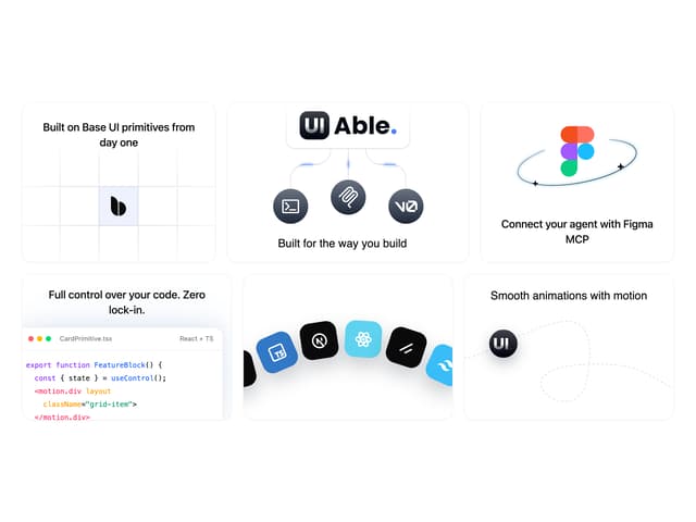

Feature Highlights Grid
341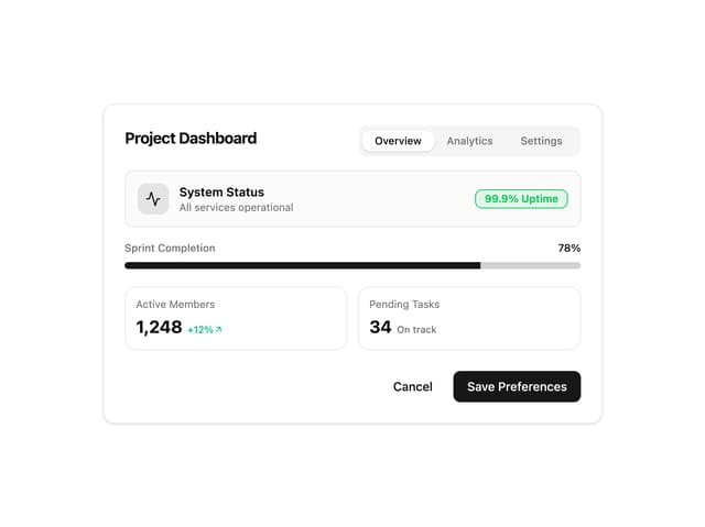
Card Tabs
101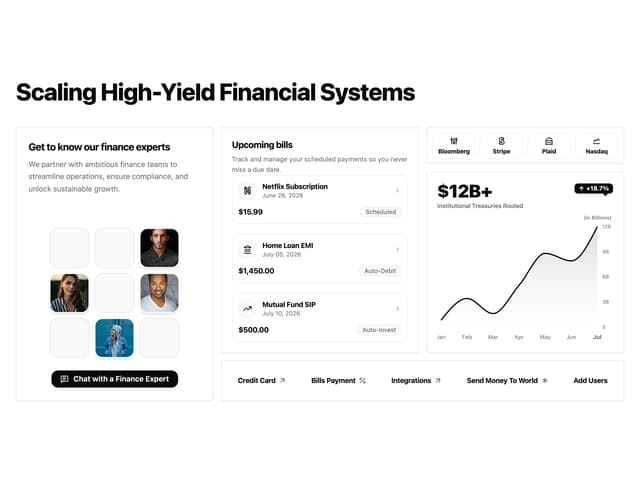
Financial Bento Grid
71
Chart Tooltip
67
Portfolio Showcase Grid
58
Marketing Hero Section
58
Sidebar with Search and Profile
50
Position Sonner
48
More in Cards
View all
Stats cards with links
33

Course Design Cards
1.1K

Card
70
Statistics Card 2
264
Statistics Card 10
263

Card
17

Card Studio
9
The Item one
3
