
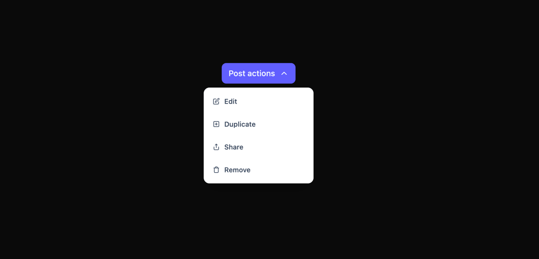
This code implements a visually appealing and interactive dropdown component using animation libraries. It addresses the need for a more engaging user experience compared to a standard dropdown. The component displays a list of options when a button is clicked. The animation is achieved using the `motion` library from Framer Motion, providing a staggered, smooth opening and closing animation for each list item. The dropdown's functionality is built using React's useState hook to manage its open/closed state. The component utilizes React Icons for its icons, offering a customizable and visually consistent experience. The `wrapperVariants`, `iconVariants`, `itemVariants`, and `actionIconVariants` objects define the animation properties for the dropdown wrapper, chevron icon, list items, and action icons respectively, controlling the timing and appearance of animations. Each option is rendered as a separate list item within a motion.ul. Upon clicking an option, the dropdown closes, and the corresponding action could be triggered (though that logic is not included in this example; it would be added within the Option component). The component is highly customizable via props (though not demonstrated here). The example uses a set of predefined icons and options, but these can be easily replaced or extended. This component can be used in various applications where a visually appealing and interactive dropdown menu is needed, such as within a settings menu, a post-management interface, or any context menu where multiple actions are available.
Built with React and Tailwind. Copy the prompt and paste it into Claude Code, Cursor or Lovable: your agent adds Animated Staggered Dropdown to your project and fits it to your theme.
Code
How Animated Staggered Dropdown is used: the demo's code. The component's own source comes with a free account.
Usage.tsx
import StaggeredDropDown from "@/components/ui/animated-staggered-dropdown";

export default function DemoOne() {
  return <StaggeredDropDown />;
}
Dependencies
More by Sonu kumar
View all
Dashboard with Collapsible Sidebar
2.4K
Modern Hero
1.4K
Text Parallax Content (scroll)
1.2K
About Us section
1.2K
Modern Animated Hero Section
1.1K
Animated Hero Section
689
Cuisine Selector Chips
585
Bounce card features
573